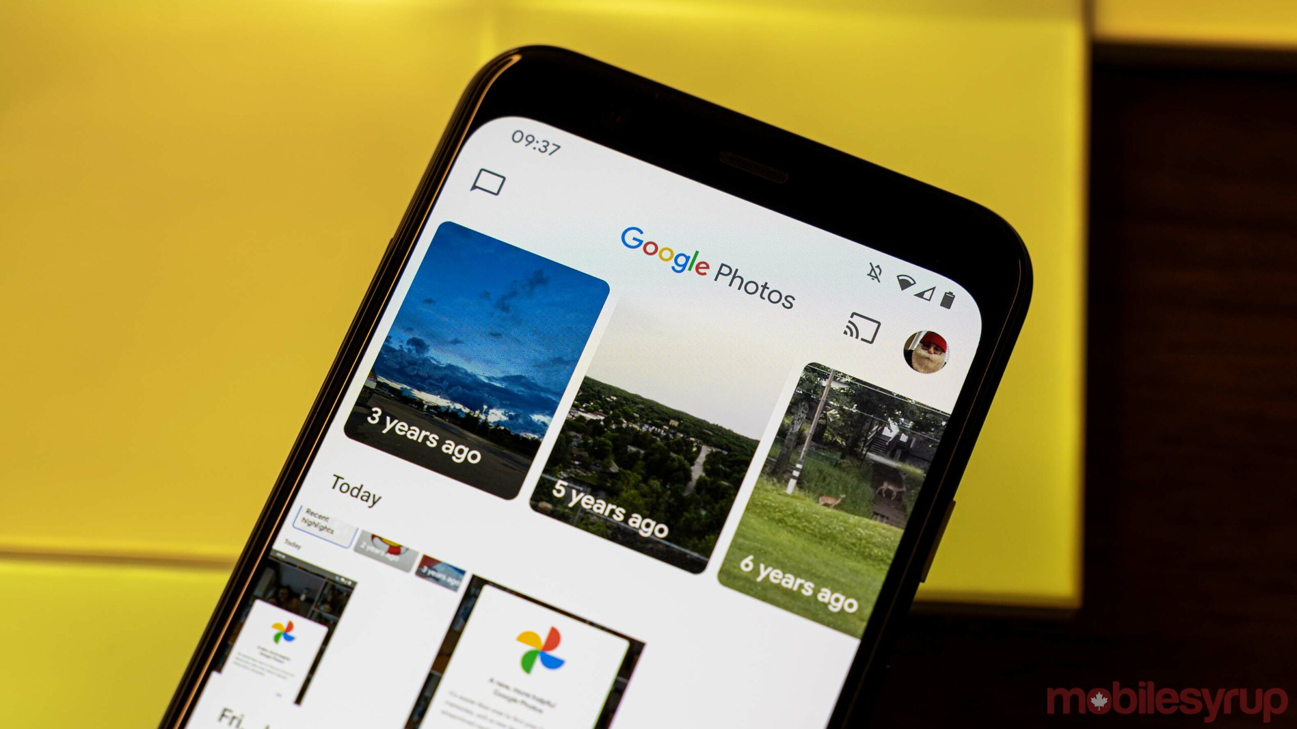
Google Photos for Android is getting a new interface that is optimized for tablets in order to take advantage of large screens.
Prior to this, the tablet interface was similar to the mobile one with a bottom bar spread across the entire screen and had lots of wasted space. Although Google redesigned the app on mobile last year, it remained the same on tablets.
It now seems that Google has optimized the app for Android tablets. 9to5Google reports that the new interface includes a search field in the top bar called ‘Explore.’ The placement of the bar depends on the width of your screen.
On smaller tablets, it’s placed next to your profile image and on bigger devices, it’s on the left side alongside an ‘Upload’ button. Further, the new interface replaces the bottom bar with a navigation rail.
With the new interface, users can now get quick access to Utilities, Archive and Trash with each option opening up as a fullscreen page.
It appears that the new interface is slowly rolling out and isn’t widely available just yet. The iOS app has yet to be updated.
Source: 9to5Google
MobileSyrup may earn a commission from purchases made via our links, which helps fund the journalism we provide free on our website. These links do not influence our editorial content. Support us here.


