
In classic Google fashion, the search giant has created an entirely new Google Pay interface with limited ways to access it. Plus, the new interface is a nicer version of the current Google Pay UI.
Android Police discovered the new interface hidden within the newly added power menu quick access UI for Google Pay. Google adjusted the power menu on Pixel phones with the last Pixel feature drop. Now, when users hold down on the power button, they get access to buttons for shutting down or restarting the phone, taking a screenshot and more. There’s also a carousel of Google Pay cards, letting users quickly swap the card they want to use for payment.
However, if you swipe all the way to the right-most card, there’s a ‘view all’ option. Tapping this opens the new Google Pay interface. This UI ditches Google Pay’s bottom navigation bar in favour of a floating action button (FAB) for quickly adding new payment methods. Additionally, the new layout groups debit and credit cards with loyalty and gift cards, making it easy to swap between them.
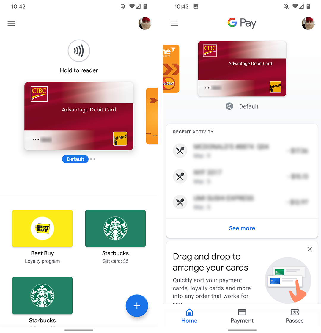
Left: New Google Pay UI. Right: Old Google Pay UI.
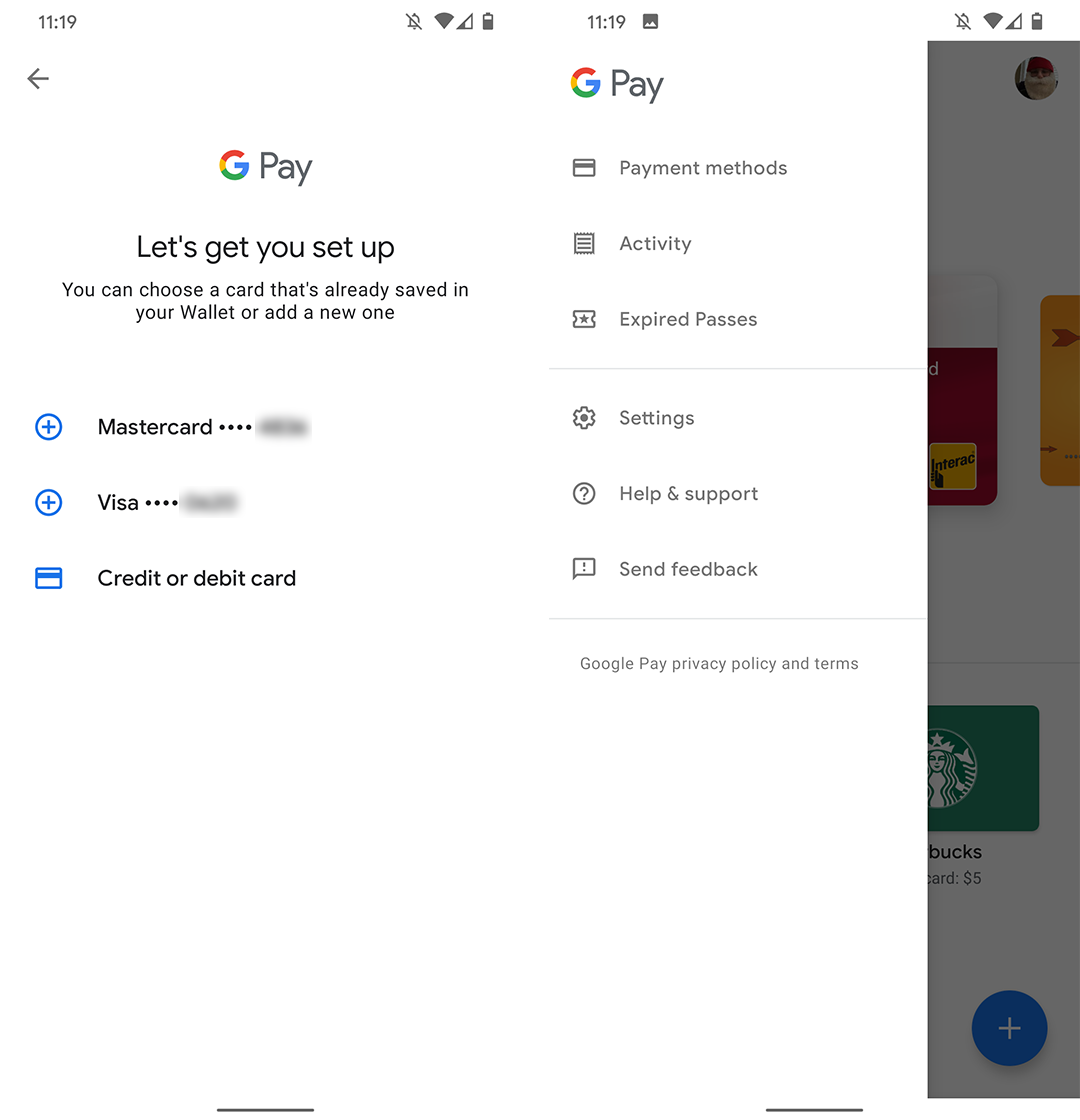
Unfortunately, it seems the new interface isn’t complete yet. There are odd things missing that suggest it’s not ready for primetime yet. For example, the FAB doesn’t allow you to add loyalty cards. Further, the interface forces users to head to the ‘Payment methods’ section in the side menu to change the default card, both things that can be easily done from the main Pay app.
Another indicator that this interface isn’t quite ready is that the first time you launch it, it acts as if you’ve never added a payment method and asks you to set up a card. Closing and reopening the interface makes it work, however. On top of that, Android Police notes that UI is part of Google Play Services and not the actual Google Pay app.
While it isn’t immediately clear why Google added a whole new interface for Google Pay, I’d guess that it’s working towards updating the UI across the board. Likely, this is an initial test and we’ll see the Google Pay app UI updated to reflect this (or vice versa, depending on what Google decides).
Of course, Google could also just maintain two separate interfaces for the next while because that wouldn’t be out of bounds for the search giant at all.
Source: Android Police
MobileSyrup may earn a commission from purchases made via our links, which helps fund the journalism we provide free on our website. These links do not influence our editorial content. Support us here.
