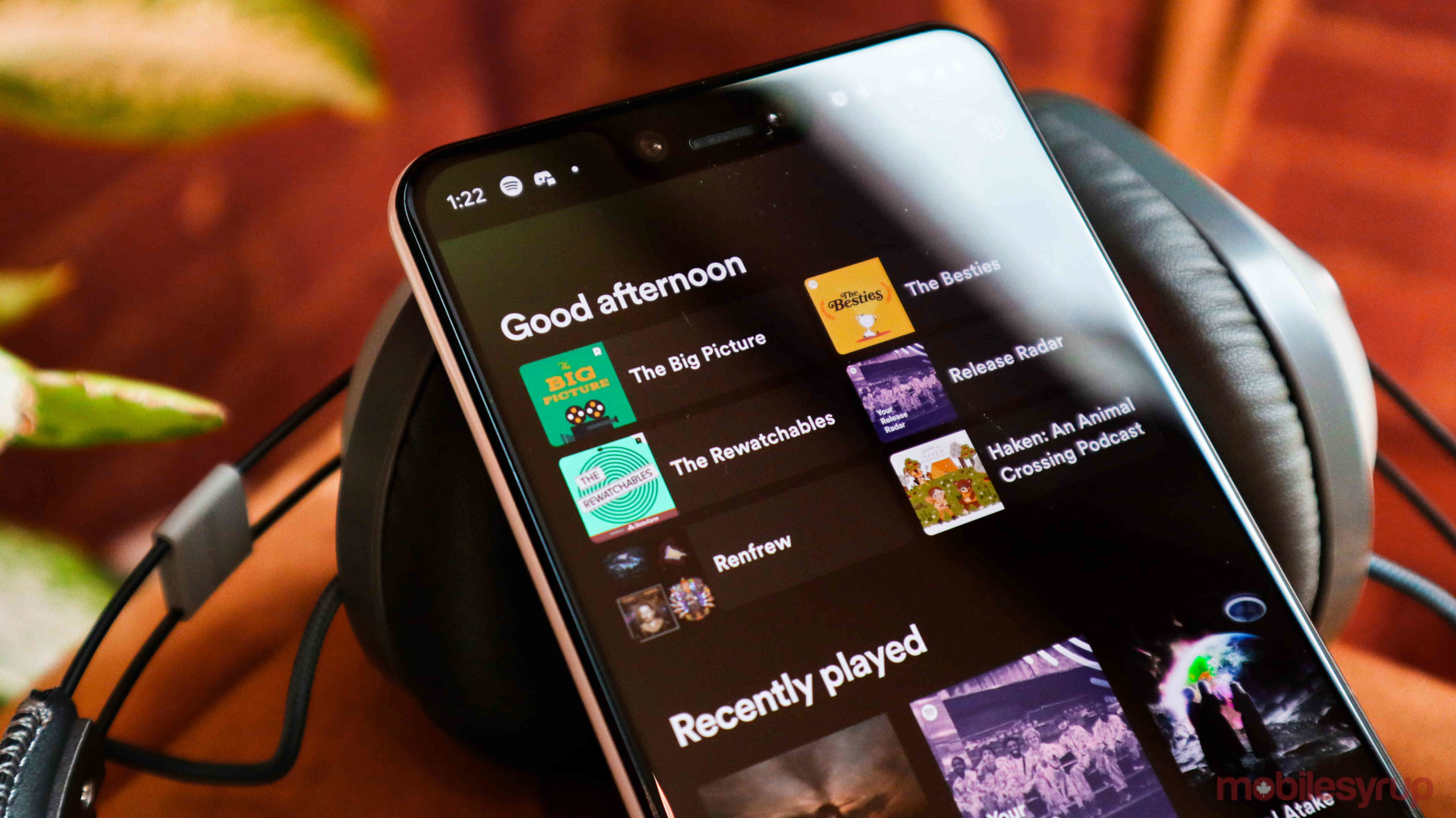
Spotify is redesigning its ‘Home’ screen on mobile to better recommend content to users based on what they usually do during that time of the day.
For instance, if you always listen to podcasts in the morning, then the new Home screen layout might suggest some of your favourite podcasts. If you listen to more music later in the day, your afternoon recommendations may be more music-focused.
Ready to move in? Your new Spotify Home is here 🏠 https://t.co/ADCYkRRr40 pic.twitter.com/ZKZJ4JvNsv
— Spotify (@Spotify) March 9, 2020
Spotify will always highlight six different things in this section that it thinks you’re most likely to listen to. Below this new section will be lists of content that will be familiar to Spotify users. This includes the ‘Recently played’ list and ‘Your top podcasts.’
This change comes a week after Spotify announced that it’s rolling out a new artist page design. That said, MobileSyrup writer Jon Lamont has had the new Home screen on his Pixel 4 for over a week already.
This isn’t a huge change, but anything that makes Spotify’s recommendation algorithm more prevalent for users is likely a good thing.
Source: Spotify
MobileSyrup may earn a commission from purchases made via our links, which helps fund the journalism we provide free on our website. These links do not influence our editorial content. Support us here.


