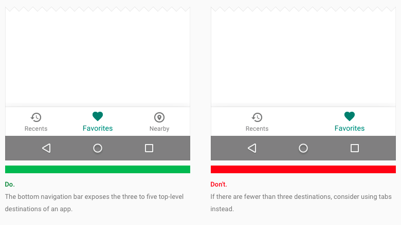
Bottom navigation bars, a design feature seen in many iOS apps, are now an official part of Google’s Material Design specifications.
The search giant updated its Material Design guidelines earlier today, noting “Bottom navigation bars make it easy to explore and switch between top-level views in a single tap.”
That said, we probably won’t see every single Android app adopt a bottom navigation bar. For apps that have three to five destinations users need to reach, Google suggests developers adopt the design feature.
However, for apps with either two or more than five top-level destinations, the company recommends sticking with the current tab approach many current Android apps adopt. In addition, the company recommends developers only use this feature with their smartphone apps, not any tablet programs they may support as well.
We’ve already seen a number of Google’s own first-party apps, including Photos and Google+, adopt add a bottom navigation bar to their own user interface, so it’s not exactly a surprise to see Google decided to address some of the design inconsistencies that mark its Material Design spec.
[source]Google[/source][via]9to5Google[/via]
MobileSyrup may earn a commission from purchases made via our links, which helps fund the journalism we provide free on our website. These links do not influence our editorial content. Support us here.


