If there is an infotainment system that has some form of recognizance with general consumers, it may be Ford’s Sync. Launched back in 2007, this year marks the deployment of its third iteration, Sync 3.
I got some hands-on time with it at Ford Canada’s headquarters in Oakville, Ontario, and took away some initial impressions at this new-look version that has been “built from the ground up.”
Sync 1 may have seemed advanced for its time, but the rapid pace of mobile development since has put the entire auto industry on its back heel, and that includes Ford, which is keen on maintaining some consumer confidence in this arena. Something needed to be done to close the gap with the changes on the mobile side, and that required a totally new design and user interface.

Building this from the ground up is easier to understand because the developer behind it is now BlackBerry’s QNX, having supplanted Microsoft as the sole software provider on the backend. QNX powers an array of infotainment systems for other automakers, so it doesn’t have a distinctive “style” in how an interface looks and functions. Sync 3 is meant to be simpler, less cluttered and more user-friendly, regardless of who’s driving.
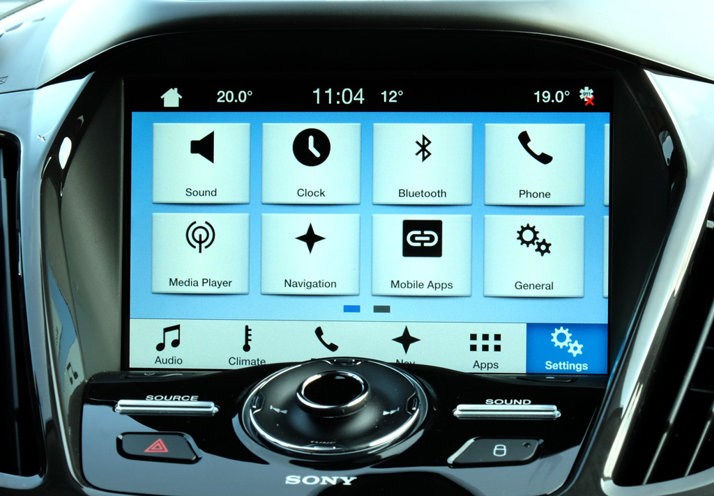
Some of these are basic. Day and night palettes, better fonts and more gesture controls. Sync 3 marks the first time Ford is using an 8-inch capacitive touchscreen for its system, which partly explains why there is no backward compatibility with older vehicles. Previous Sync versions use resistive touchscreens.
This opens up better control, particularly for maps and navigation. Pinching to zoom in or out of a map is the kind of convenience you never really see in factory infotainment systems (the aftermarket is different). Dragging along a map to find something is another move that is easy to take for granted on a phone, but is new territory on a car dash.

That dichotomy could be described as a microcosm of how much ground Ford and other automakers are trying to make up. So as not to alienate other drivers, arrow buttons onscreen are also laid out to do the same thing. Generally speaking, there always seems to be at least two ways to get something done through the system — touch or voice, or sometimes a hard button on the dash itself.
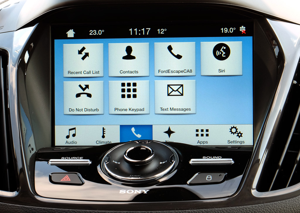
Voice recognition now becomes a dance between two platforms. iOS users have access to Siri Eyes Free on Sync 3, which lives side-by-side with Sync’s own. A longer press on the voice button on the steering wheel brings Siri to life. A quick press defaults to Ford’s.
My initial impressions are that Siri functions much as I would expect it to. It can easily make calls, play music stored on the phone or read and respond to incoming messages. More testing will be needed to see how much deeper the integration goes, and if there are any surprises. Thanks to Siri, the iPhone is the only device capable of responding to a test message through voice. Sync’s voice recognition can read out incoming messages, but can’t respond to them, thereby nullifying Android, BlackBerry and Windows Phone.

Ford says it does recognize more words and commands than before, allowing drivers to speak to it more naturally. Sync was also rare in that it allowed stringed commands, where you could say, “Climate, set temperature to 22 degrees.” That may seem basic, but other infotainment systems require prompts between each command. I asked Ford if this has been expanded, so that a driver could say, “Navigation, set route for (address),” but it doesn’t appear to dive that deep yet. It does take fewer steps than other vehicles, though it remains to be seen if it’s much faster than older Sync versions.
When connected through USB, music stored on the phone is searchable. It won’t work with Bluetooth streaming though. SiriusXM stations are also searchable, too.
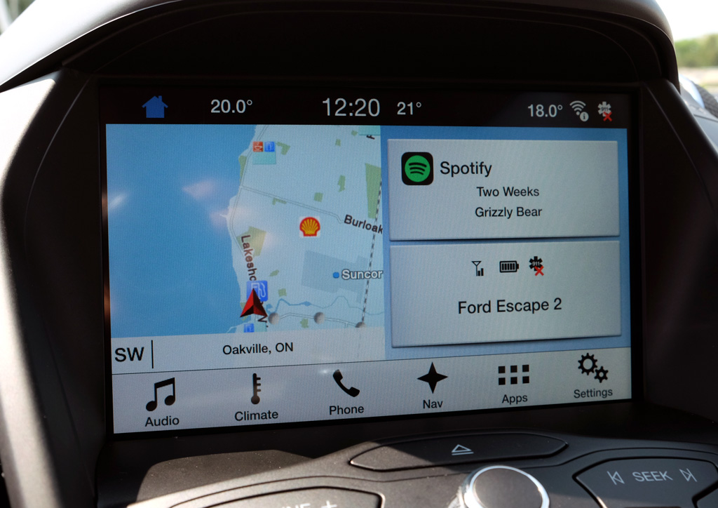
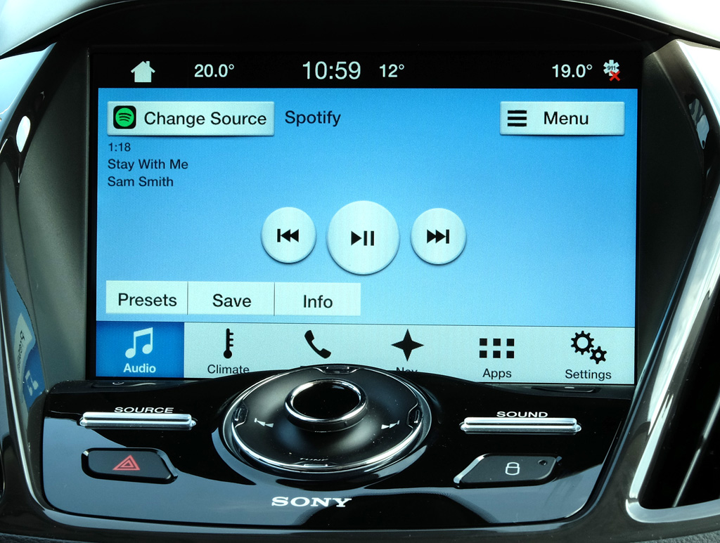
While the app presence is scarce, Spotify is pretty deeply integrated — to the point where it can be controlled by voice, a first on any platform I’ve tested. Only BMW and Mini have Spotify baked in, yet there is only manual input available in those cases. With Sync 3, it is possible to say, “Spotify, play playlist (name)” and it will oblige. Sync indexes the playlists and basic navigation, but not the artists and tracks contained within them. That metadata shows up onscreen instead. It is possible to save a song to a playlist or your music library on the fly, too.
Since no infotainment system has indexed Spotify’s entire library of 34 million songs, this is still a win for Ford. Further testing is needed to see how liberating it feels, however. I should note that only iOS and Android users can enjoy Spotify’s voice integration — it isn’t enabled for BlackBerry and Windows Phone.
Glympse is the only other app currently supported in Canada. There are several others that will be in the United States, but no word other than “soon” for when the number increases north of the border.
The 2016 Escape and 2016 Fiesta are the first two vehicles in the company’s lineup that will have Sync 3 from the factory. The company plans to roll it out across its line, probably by the end of 2016.
Though I asked, I’m still not clear on what the compatibility floor is for iOS and Android. iOS 8 and Android 4.4 KitKat seem the most logical, but we haven’t been able to get confirmation on that. When we do, we will update this article accordingly.
Ford was mum about plans for CarPlay and Android Auto, though it is highly likely that a future update will make both platforms available on vehicles with Sync 3.
MobileSyrup may earn a commission from purchases made via our links, which helps fund the journalism we provide free on our website. These links do not influence our editorial content. Support us here.


