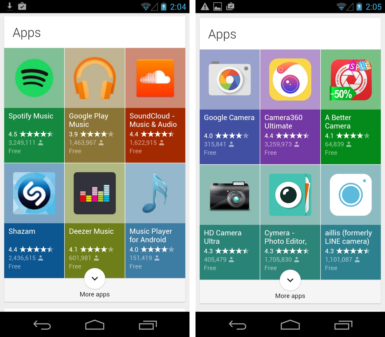
Looking to add a bit more flair to its bread and butter search engine, Google has reworked how it displays app search results.
Adding the word “apps” to a search that is done through an Android browser will now reveal a new grid layout for search results. As you can see in the image above, each app within the new layout is given a square backing that is colour matched to the colour of its icon. Below the icons are the rating each app has received, their download numbers and price. Scrolling past the grid reveals a more traditional set of search results.
Google appears to be in the process of rolling out the update to the large multitude of Android devices that can access its search engine through Chrome and the many other browsers that are available on its mobile operating system. Visiting the marketplace from a non-Android source, like say an iPhone, doesn’t reveal the updated layout—likely for good reason.
Does your Android phone display the new results?
[source]Android Police[/source]
MobileSyrup may earn a commission from purchases made via our links, which helps fund the journalism we provide free on our website. These links do not influence our editorial content. Support us here.


