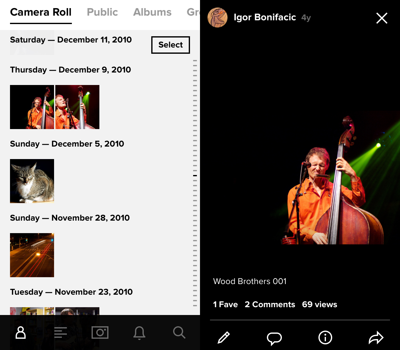
Almost a year to the date since it last reworked its popular photo sharing app, Yahoo is back once again back with a new redesign for Flickr. This time, however, there are some significant changes to service’s mobile app.
The most notable change is that the entire look and feel of the app has changed. Flickr’s main screen now resembles Apple’s own Photos app; images are arranged in chronological order, with newer photos taking precedence at the top.
Additionally, the focus of the service has shifted. It’s clear from the amount of storage Yahoo is giving away and from the actual interactions within the app that Flickr now wants to be the place where people upload all their smartphone photos. As soon as the new app is launched for the first time, a prompt shows up saying that the best way to use the app is to give it access to the phone’s camera roll and enable automatic uploads. The app also allows users to edit photos and apply filters while within the app.
All told, Flickr has come a long way from the service that launched in out of Vancouver in 2004.
The new Flickr is available on the App Store and Google Play store.
[source]Flickr[/source][via]The Next Web[/via]
MobileSyrup may earn a commission from purchases made via our links, which helps fund the journalism we provide free on our website. These links do not influence our editorial content. Support us here.


