Pinterest users are, by their very nature, extremely visual people, so the company has to go the extra mile to make sure its mobile applications look as good as the content users are pinning on their boards.
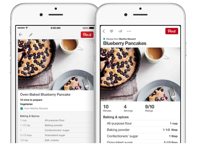
Pinterest this week announced a completely revamped iPhone app with simplified navigation, a streamlined layout, and an increased focused on the thing users care about most: pins. Tools for searching or uploading new pins have been moved to the top of the screen and the images themselves have more room on the screen.
The good news is that while Pinterest 4.0 is only for iPhone, Pinterest intends to bring this new, updated look to iPad users and eventually Android users. We’ll keep you posted on that.
MobileSyrup may earn a commission from purchases made via our links, which helps fund the journalism we provide free on our website. These links do not influence our editorial content. Support us here.


