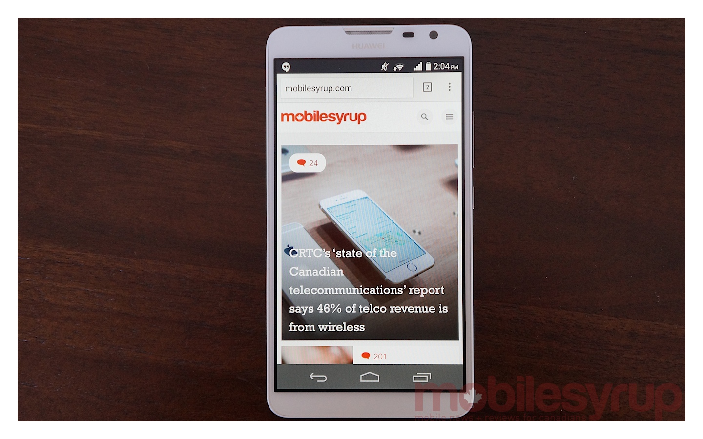
The Ascend Mate 2 was announced earlier this year, at CES 2014, and shown off again at MWC in March. Despite this, it didn’t make it to North America until July, and it didn’t come to Canada until August.
So how did Huawei do with its second crack at the phablet market? Let’s find out!
Specs
- Android 4.3 with Emotion UI 2.0 Lite
- 6.1-inch 1280 x 720p IPS+ LCD (241 ppi)
- Qualcomm Snapdragon 400 SoC @ 1.6 Ghz (four cores)
- 2GB RAM / 16GB internal storage (microSD slot)
- 13MP rear camera
- 1080p video recording @ 30fps
- 5MP front-facing camera
- 3,900mAh non-removable battery
- WiFi (b/g/n), Bluetooth 4.0, A-GPS, GLONASS, Micro SIM slot
- 161mm x 84.7mm x 9.5mm
- 202 grams
- HSDPA 850 / 1700 / 1900 / 2100
- LTE 700 / 850 / 1700 / 1900 / 2100
Hardware
When the original Ascend Mate came out, its 6.1-inch display made a huge splash. Fast forward a year, to a world where 5-inch phones are no big deal, and suddenly 6.1 inches doesn’t seem so crazy. The 6.3-inch Galaxy Mega made its debut just a few months after we were introduced to the original Ascend Mate, and phablet-sized smartphones are no longer a sight to behold. Lucky for us small-handed folk, Huawei didn’t increase the size of the screen for the sequel so we have the same 6.1-inch panel on the Ascend Mate 2 that we saw on the original Ascend Mate.
This time around, Huawei has swapped out its own Cortex-A9 Huawei K3V2 SoC for a Snapdragon 400 with Adreno 305 graphics from Qualcomm. The switch from Huawei’s chip, which started sampling in 2012, to the Snapdragon 400 is a welcome change. While the original Ascend Mate was sometimes jittery, performance during daily tasks with the Ascend Mate 2 is pretty smooth.
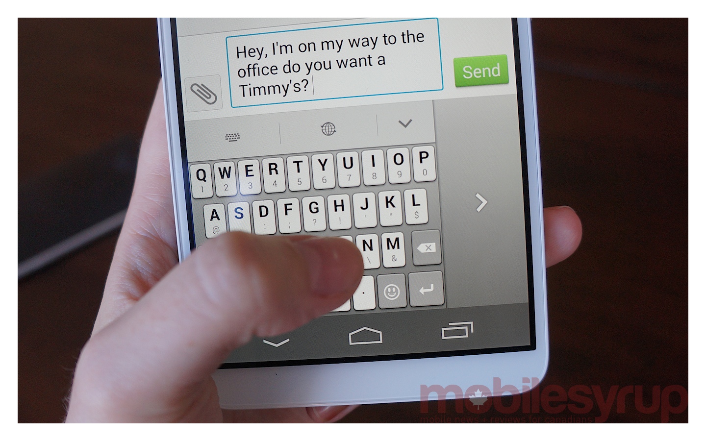
The average smartphone user shopping for a phablet on a budget won’t feel like they’re trading performance for value with this phone. That said, one thing I noticed as a pretty consistent problem was that the keyboard often had problems keeping up if I was typing even moderately quickly. It wasn’t a huge sticking point, and it was never a problem to the point where it caused a complete interruption, but it did have an impact on the overall experience and it could become quite irritating over time.
There’s also double the internal storage, up from 8 GB to 16 GB. Like its predecessor, the Ascend Mate 2 has the option for expansion via MicroSD. You might not need to take it to the maximum (64GB), but I definitely advise adding some additional storage. The integrated 16 GB won’t go too far once you start snapping pictures, sharing video via WhatsApp and installing apps, especially since the OS itself is going to soak up a decent chunk of the onboard storage.
Design
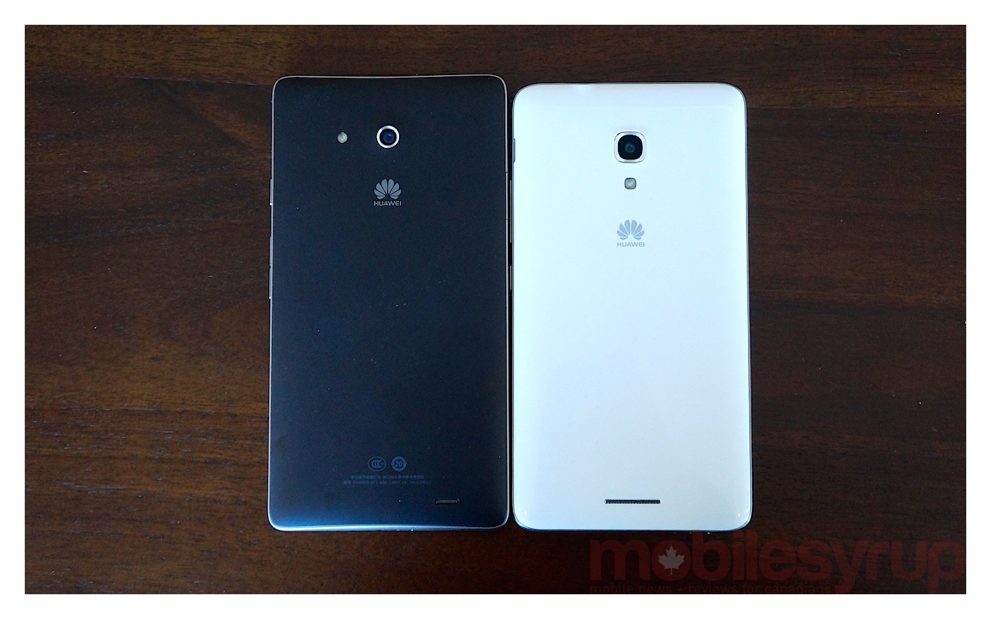
The Ascend Mate 2 is also aesthetically quite different from the 2013 Ascend Mate. At 9.5 mm thick, it’s about 0.4 mm thinner than last year’s model. More importantly, it’s a full 2.5 mm shorter and a millimetre narrower. That doesn’t sound like a lot, but it matters when it comes to fitting this device in your pocket or purse, or even just making a phone call. These differences in size, along with the minor difference in thickness, mean the Ascend Mate 2 sits a lot nicer in the hand than the original ever did.
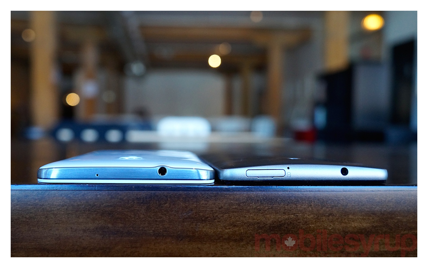
Unfortunately, Huawei didn’t get the build entirely right. While the original model had some clever tricks in play to fool you into thinking the device was thinner and more stylish than it actually was, it seems Huawei has seen fit to ditch these touches now that the device is actually physically smaller. Gone is the gentle sloping of the curved back, replaced instead by slightly sharper tapered edges on the Ascend Mate 2.
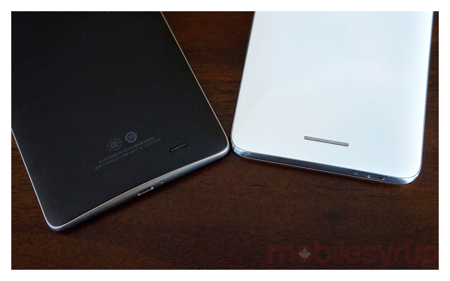
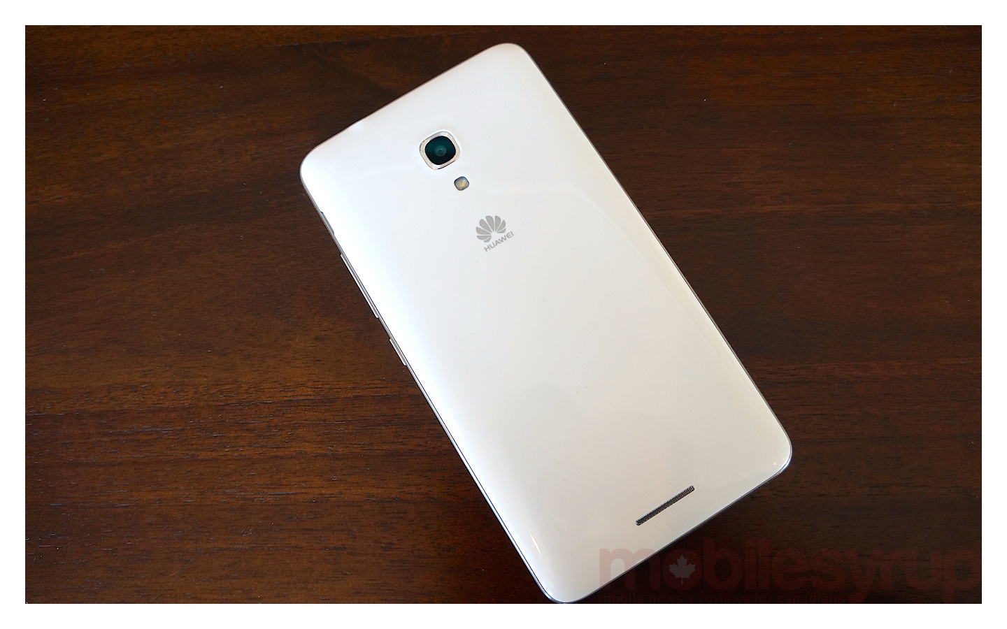
We also miss the curved accents in the grey framing of the 2013 Ascend Mate, which we felt were more pleasing to the eye and offered something unique in terms of design. Instead, we have a faux metal frame (it’s still plastic, but shiny and silver instead of matte grey). That’s married to a glossy, white plastic backing that looks a lot like the Galaxy Note 2. Overall, the Ascend Mate 2 feels more solid, and we prefer the quality of the materials this year, we just wish the phone didn’t look so generic.
Emotion UI
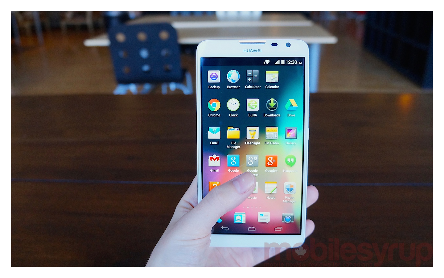
The Ascend Mate 2 runs Android 4.3 with Huawei’s Emotion UI 2.0 Lite baked in. Huawei has spoken of its efforts to create an experience that is better than stock Android in the past and it’s certainly gone to great lengths to offer not only a uniquely Huawei-flavoured experience, but one that actually offers the user something in return. This is evident in the Motion Control options that allow you to mute the phone simply by flipping it over (similar to Flip – Silent, FlipTone, and Flip to Mute for Android), reduce the ringer volume by picking the phone up, and answer the phone by raising it to your ear. You’ll also see it with Gloves mode, which allows you to use your phone while wearing gloves.
Buried within the settings menu, Huawei has hidden a special one-handed UI that takes the dialler and keyboard to the left or right of the massive screen (it’s up to you which side and this can be easily changed on the fly). Easier accessibility is something Apple has dabbled in with the iPhone 6 and its Reachability feature so no doubt many more people will begin to recognize and appreciate these features, even if they have been around for a while (the Ascend Mate 1 also had a one-handed UI).
Though a great idea in theory, the one-handed experience is not too comfortable in practice. You’ll still find the phone occasionally wobbling precariously as you type because you don’t have your other hand to stabilize the near-half pound of phone you’re wielding. Gender shouldn’t matter here (it goes without saying that it’s in a manufacturer’s best interest to manufacturer a phone that is usable by both sexes) but if these larger-than-average female hands can’t handle one-handed mode, there’s little hope for women of daintier stature.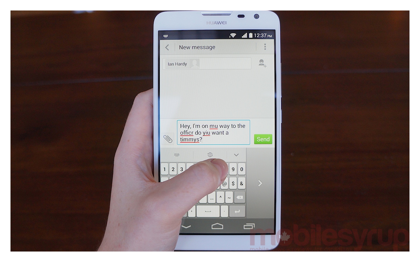
The keyboard is obviously also a lot more cramped, and this, combined with Huawei’s less-than-satisfactory autocorrect software, makes for messages that are just riddled with mistakes. What’s more, you often have to reach all the way across the screen with your thumb to tap to correct, which defeats the purpose of one-handed mode to begin with.
With two hands, it’s another story, especially if you’re using Google’s keyboard as your input method of choice. Typing is extremely comfortable on the large, roomy keyboard and you don’t get that tell-tale pain in the muscles responsible for pulling your thumb away from your palm when you go for those buttons right at the edge of the display. Huawei’s own keyboard is just as comfortable but we shied away simply because we prefer Google’s implementation of autocorrect — and emoji.
Note that the only way to use one-handed mode is if you have the Huawei input method selected as your keyboard. If not, you’ll get the one-handed dialler but the keyboard will be the regular, full-size Google keyboard. I actually found this set up to be the best of both worlds, given you can unlock the device and dial with one hand while using two hands for email, Twitter, IM and SMS.
That’s not the end of Emotion, though. Huawei’s take on Android also adds backup and power saving tools, which allow you to set a mode for the phone’s power consumption depending on your activity (the pre-defined profiles include Smart, Endurance, and Normal) and offers a list of safe or ‘protected’ apps that are allowed to run in the background, even when the display is off.
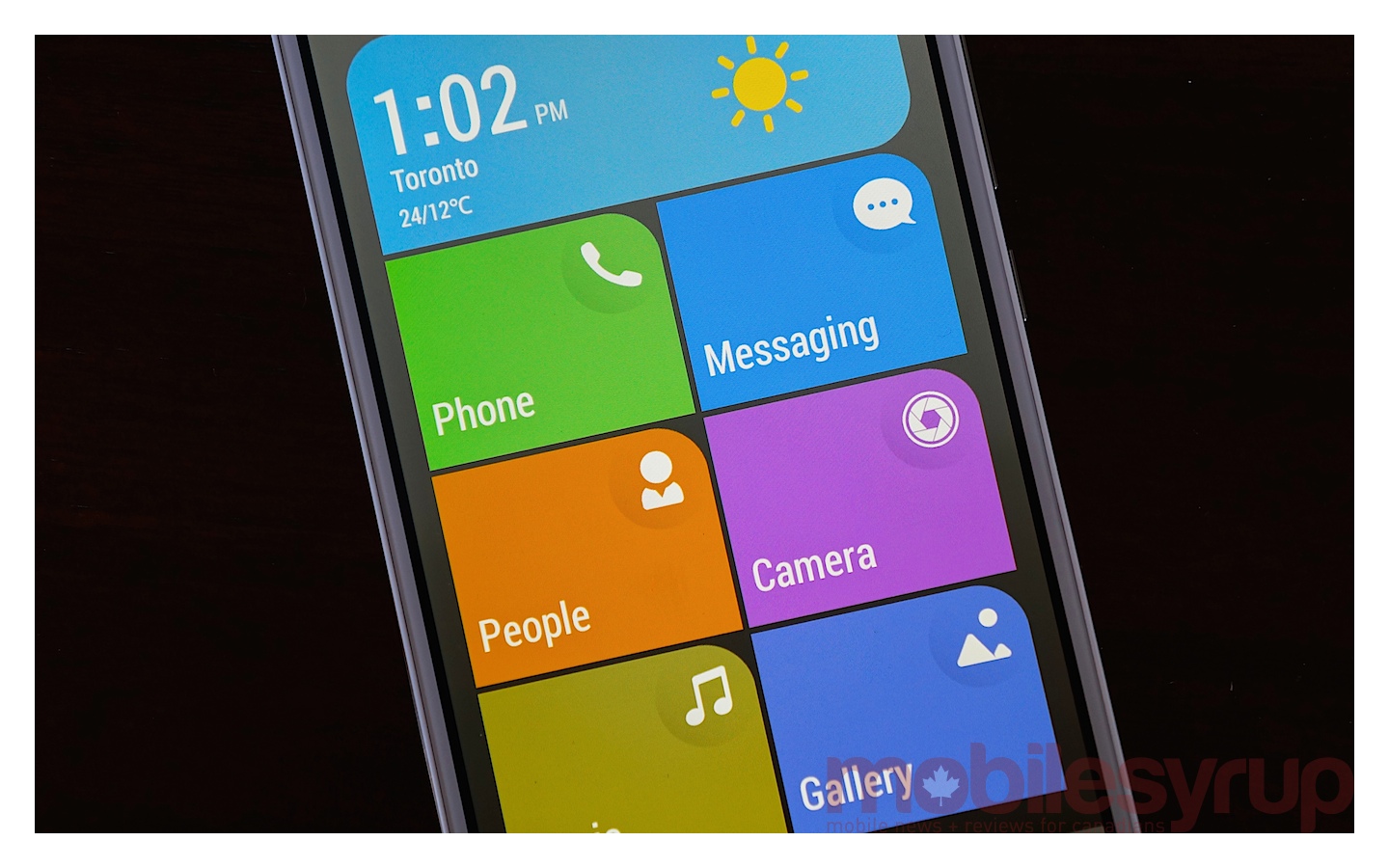
That’s where you should stop with Emotion UI. Proceed no further. The software has a “Simple Screen” home screen that you can switch to if you want easy access to apps like the camera, messaging and music in the ugliest manner possible.
To say it looks a little bit like Windows Phone would be an insult to the elegance Microsoft has achieved with the Windows Phone’s tile interface. That said, that’s what we think of when we see the coloured panels with large icons and a weather widget across the top of the display. Ugly Windows Phone.
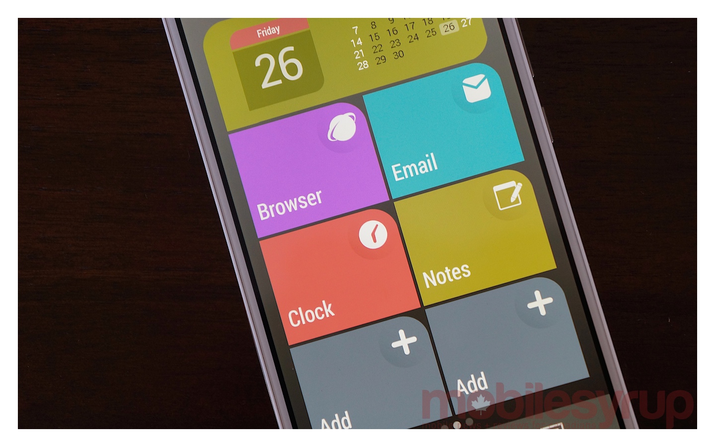
Really, it’s probably best suited (and maybe even useful) for the less tech-savvy crowd that just want to be able to push a big green picture of a phone or a big blue messaging icon to make a call or send a message. For anyone used to the Android interface, it’s pretty garish. It has all the main functionality displayed in these giant tile icons, but just reverts back to a regular app drawer-like set up once you click the massive ‘Other’ button.
Camera
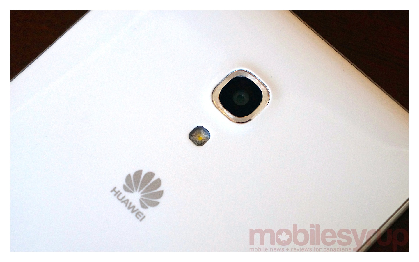
Huawei has also paid special attention to the camera, which makes the jump from an 8MP to a 13MP sensor. In addition, selfie fans will be pleased to hear that the front facing camera on the Ascend Mate 2 now packs 5MP compared to the 1MP sensor on the original. This is a massive improvement and will no doubt appeal to the younger, budget-conscious, selfie-crazed demographic.
The rear-facing camera does well in well-lit areas, particularly inside. As you can see in the photo of the hydrant, the colours are just a tad washed out when you compare shots from the Ascend Mate 2 with outdoor shots from the iPhone 6, HTC One M8, and Nexus 5. This is only barely noticeable when capturing shots in well-lit areas indoors, but is most apparent with the close up shot of the sweetener. That’s not Splenda yellow!
For dimly-lit shots, the Ascend Mate 2 fights grain by darkening all but the subject of the photo, while other devices (like the Nexus 5) accept a certain amount of grain in exchange for showing the detail in the brick work. We see that the HTC One M8 almost over-compensates, while the iPhone 6 (the “premium” phone of the testing cohort) exhibits the most balanced result. All told, the camera in the Ascend Mate 2 is more than serviceable in all aspects but low-light. Your photos might just look a little bit more muted than in real life.
The front facing camera has a beauty mode with a sliding scale for severity of application. This will smooth out your skin and make your eyes pop (or in my case make it look like you showered before you started writing the review). It’s nice if you want to send a quick selfie to that someone special (someone you think you can fool with smudged out skin) and don’t want to mess around with filters, but it doesn’t really add a whole lot and you can take much more flattering photos with third-party editing app.

Display
Sometime around the launch of the original Moto G, smartphone makers and consumers copped on to the fact that you don’t need the highest possible specs for a really great smartphone experience. Though there are plenty of people who will argue that they have been happily using mid-range phones for years, or point to the raft of low-end and mid-range phones smartphone manufacturers have been pumping out since about 2008, it’s only in the last couple of years that mid-range stopped meaning ‘old’ and started meaning ‘less powerful.’ For a long time, mid-range and entry-level phones meant hardware so low-end, it had no hope of keeping up with software updates. Now, mobile technology has advanced to a point where today’s most current software can run on what was considered flagship hardware two years ago. Not only that, but that hardware is actually perfectly sufficient for most people in terms of power and performance.
This is something to keep in mind when you consider the LCD display on the Ascend Mate 2. It’s a 720p resolution panel with mostly accurate colours and fantastic viewing angles. If you’re dropping down from AMOLED, it might seem a bit subdued but that’s because those offer a vibrancy that can’t be matched by an LCD screen.

Text is crisp and clear, and browsing the web is a pleasurable experience, especially given the sheer size of the display. The only area where I feel the screen does the device a disservice is media consumption. If you’re buying this device as both phone and a tablet (and the 6.1-inch display means it handily straddles and serves both categories very well) and intend to consume a lot of multimedia, there’s no hiding the fact that content simply won’t look as good on this 720p 240 ppi screen as it would on a 1080p display.
In that sense, it’s a shame this big, beautiful phone is saddled with a lower resolution panel. However, in the grand scheme of things, most people won’t notice the difference, especially if they’re just consuming content on the go, which is quite comfortable on the Ascend Mate 2.
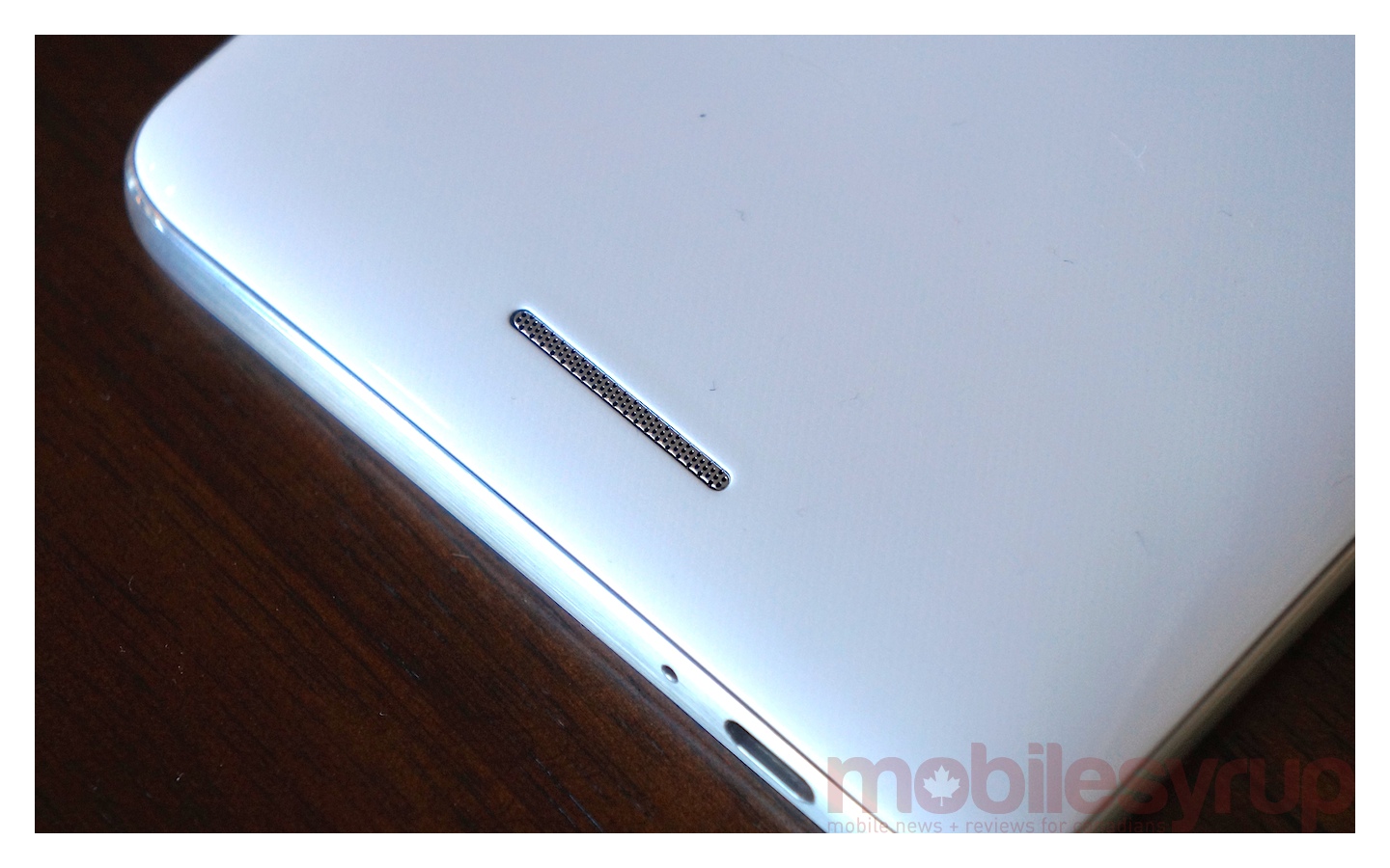
As an aside, if you are watching videos, you’ll need to know that the external speaker is loud enough to go without headphones, the sound quality isn’t stellar. Higher pitched noises were sometimes harsh or tinny and heavy bass at full volume would sound like it was topping out at a certain point and become slightly muffled and ill-defined.
Battery
The hero feature of this phone, without a doubt, is the battery. Smartphone batteries are a lot better than they used to be but it’s still something that smartphone users struggle with in the sense that if you have a particularly intensive day for smartphone activity, you might only make it to dinnertime as opposed to bedtime. Huawei’s concessions in the hardware department along with a 3900mAh cell allow for at least a day and a half per charge. We actually got two full days, even with brightness turned all the way up, heavy use of the camera, and Google Play Music going during the daily commute.
I initially scoffed at Huawei’s proud proclamations that this phone could charge other phones or devices (provided you have the correct cable for the job). The very idea that I would allow another device to slurp away at my smartphone’s battery life seemed ridiculous. However, with a battery that can easily be stretched out to another day, there’s no reason why I wouldn’t hook a friend up with some Huawei juice if they found themselves eyeing up their battery indicator halfway through the day.
Call Quality
Call quality and network speeds are always going to be carrier and tower dependent to an extent, so it’s a very subjective piece of criteria that’s going to differ based on your location and cell tower capacity.
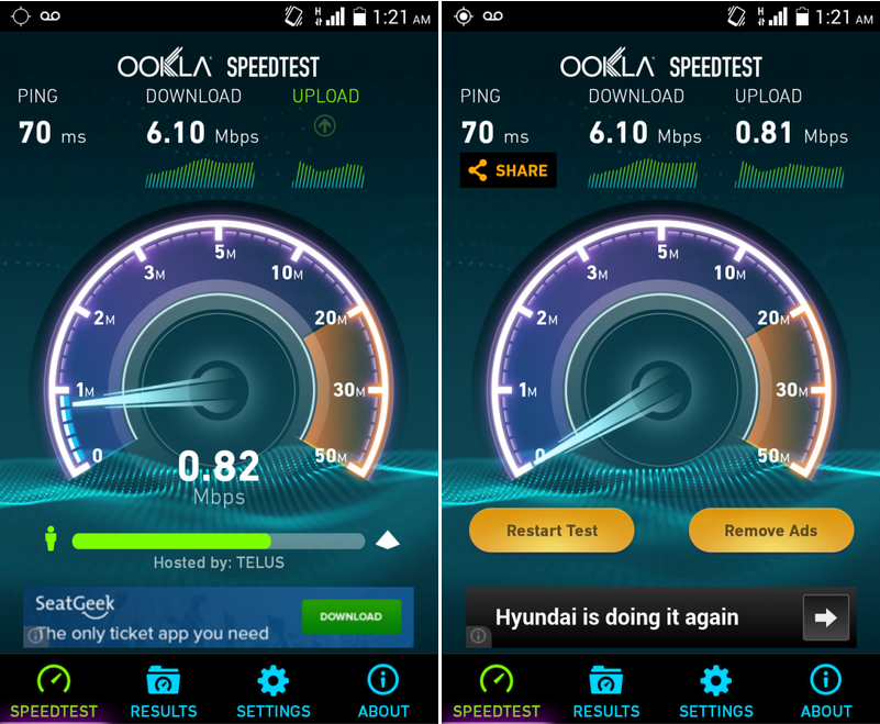
WIND Mobile’s network tends to be quite slow in more congested areas. As a result, it’s not really fair to judge the phone on a feature that is so variable and heavily determined by the network. Browsing the web was slow during the day in downtown Toronto, but at 1am on a Friday night, Ookla SpeedTest gave us 70 ms ping and 6.10 Mbps down with 0.81 Mbps up.
As for the phone itself, calls were, for the most part, a great experience. The only issue I noticed was a small amount of fuzzing or white noise in the background when the person on the other end spoke. This was barely noticeable (in fact, I only noticed once I started looking for a nit to pick about the call quality) but my friend on the phone said they heard it on their end when I spoke as well.
In reality, this is a pretty negligible issue, because it all comes back to the size of the phone. Really, no one purchasing a 6-inch phone is buying it so they can sit with it held against their face all day. It’s just not practical. This is, first and foremost, a media consumption and web-browsing device that just happens to double as a phone so you don’t have to carry two devices.
Conclusion
Overall, the Ascend Mate 2 is a great mid-range solution. Priced at $399 outright on WIND, this device is a great example of more than adequate performance balanced with a great price. Huawei has made sacrifices where they won’t be missed (like the lower resolution display) and really pushed forward in areas where you’ll notice a difference (the battery). For those eyeing up the Note 3 (or even the upcoming Note 4) but balking at the high price, the Ascend Mate 2 is a great alternative. You get the same big screen and absolutely unbeatable battery without the hefty price tag. That’s not to say $400 is cheap — there are certainly plenty of cheaper, budget phones out there — but it’s probably the best deal you’ll get on a 2014 phablet direct from a carrier.
MobileSyrup may earn a commission from purchases made via our links, which helps fund the journalism we provide free on our website. These links do not influence our editorial content. Support us here.

