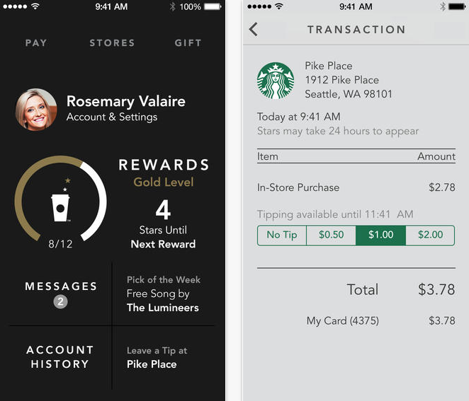
Starbucks has launched its new iOS 7 app, a day late due to issues with iTunes Connect.
The new app has a flatter, more attractive design that reflects the changes Apple made to iOS 7 as a whole, but the app is no longer siloed into various tabs like the previous version. As a result, the app feels more spacious, like there are fewer edges, something that doesn’t come through in screenshots. The Pay and Stores screens, where you dish out a virtual copy of your card, and search for nearby stores, respectively, are no longer separate screens, but overlays on top of the single home screen.
There’s also a new feed that summarizes your previous account activity, be it purchases, reloads or rewards earned. Of course, rewards play a big role in the company’s mobile payments platform, as every 12 transactions results in a free drink or food item. Last week, the company said it was generating 14% of its in-store revenue from Android and iOS payments, an uptick from 10% nine months ago, so it’s safe to say that making the mobile app as attractive and usable as possible is a priority. Based on the emergence of an updated iOS app before its Android counterpart, it’s also safe to say that Starbucks probably has more iPhone users than any other.
The new app includes a “shake-to-pay” feature, which quickly brings up your default card with a quick shake of the phone. And while not yet available in Canada, the app introduces digital tipping for US corporate stores, something that Starbucks Canada says it is working to bring over here, too.
Finally, the Starbucks Canada app is no longer being maintained, so it may be necessary to download a brand new app, which can be found below.
[source]App Store[/source]
MobileSyrup may earn a commission from purchases made via our links, which helps fund the journalism we provide free on our website. These links do not influence our editorial content. Support us here.


