
Plume for Android has always been a quiet hit on the platform, from its early days as Touiteur right up until the official Twitter app turned ugly.
But with the release of Android 4.0 and Google’s Holo guidelines for app developers, the Plume team has been pretty quiet, with nary a big update in almost six months. Today they have released an alpha build of Plume 3.0, which adheres quite closely to the new app design guidelines while staying true to the unique look that made Plume famous.
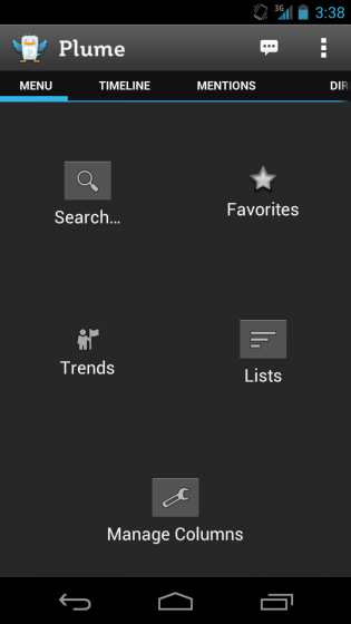
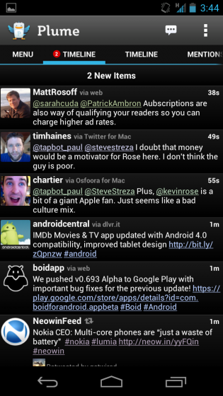
The update brings a couple new (unfinished) features like a dedicated Menu screen with quick access to lists, favourites and column management. The main timeline screen has also been updated to support native horizontal swiping, which is smoother than ever, and the Ice Cream Sandwich “action bar” navigation.


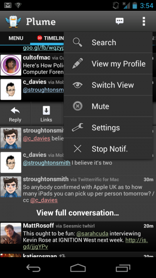
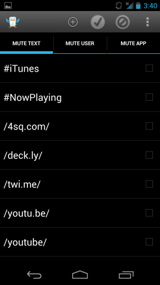
Plume is already very feature-filled, with optional Mute settings and the ability to easily view a conversation between users. Plume is the only Twitter app (that I know of) that can show you replies to a tweet.
The improvements at the moment are limited, but the potential is there for Plume to once again become the top dog in the Android Twitter sphere. Between it and Boid, Android is becoming quite a hotbed of activity once again. The only thing that’s missing, from both apps, is push notifications.
You must sign up to their beta forum to download the .apk. Check out the new Plume alpha and let us know what you think!
MobileSyrup may earn a commission from purchases made via our links, which helps fund the journalism we provide free on our website. These links do not influence our editorial content. Support us here.


