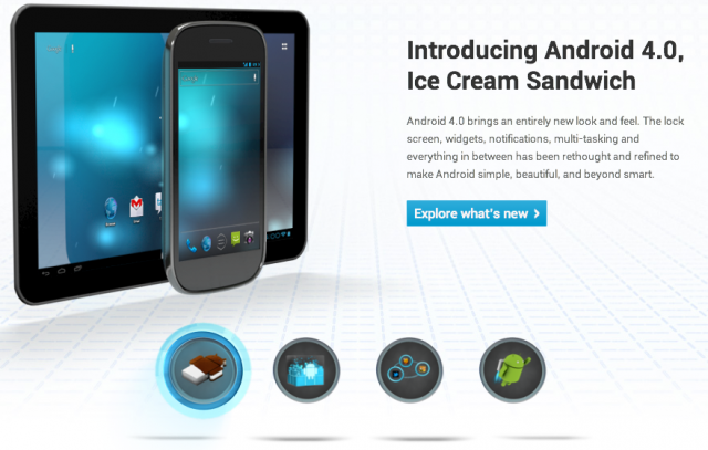
What used to be a sparse and underwhelming place has turned into a showcase for all things Android 4.0 with the relaunch of the new Android.com portal. Now a hub for app showcases, developer information and, of course, Ice Cream Sandwich, the site features some very cool HTML5 special effects on top of a rendered image of what looks like the ICS interface for Android tablets.
Though we can’t tell much from the home screen depiction, it looks like Google was speaking the truth when they said the two platforms have been consolidated into one: the back/home/menu buttons have been updated to look the same as the ones on the Galaxy Nexus, and text shares the same neon blue highlights as the phone.
We look forward to seeing what Ice Cream Sandwich brings to the tablet space, since there was no indication on what was improved for tablets when Google presented the new operating system last month.
Source: Android.com
Via: Android Community
MobileSyrup may earn a commission from purchases made via our links, which helps fund the journalism we provide free on our website. These links do not influence our editorial content. Support us here.


