Expectations are a funny thing. When there are none, disappointment seems impossible; it’s either going to fall flat with a thud or pleasantly surprise. But when expectations are high there is often nowhere to go but down, and Motorola, with its RAZR resurrection, is risking its entire brand cache on one product. So how do you reinvent one of the most popular phones of all time for the smartphone age? By making it impossibly thin, lacing it with Kevlar and a premium aluminum body, and squeezing in some impressive internals.
As a fully-formed product, though, the RAZR succeeds and fails in kind. Read on to find out whether this Rogers-exclusive should be on your wish list this season.
Specs:
– Android 2.3.5 w/ custom Motorola skin
– 960 x 540 pixel Super AMOLED display
– 1.2Ghz dual-core TI OMAP 4430 SoC
– 1GB RAM, 16GB internal storage (8GB SD storage/3.75GB app storage)
– 8MP back camera / 1.3MP front camera
– 1080p video capture
– 1780mAh internal battery (non-removable)
– WiFi (b/g/n), Bluetooth, HDMI out, GPS, Motocast streaming
– 130.7 x 68.9 x 7.1 mm
– 127g
– 14.4Mbps HSDPA / 5.76Mbps HSUPA
– Quad-band UMTS (850, 900, 1900, 2100 MHz)
The Phone
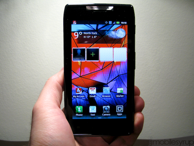
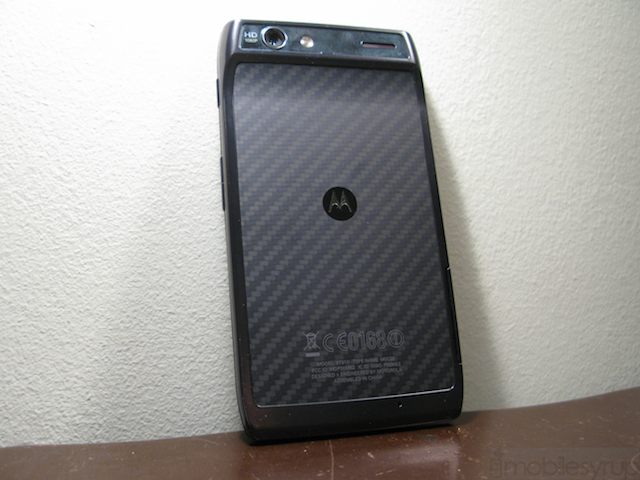
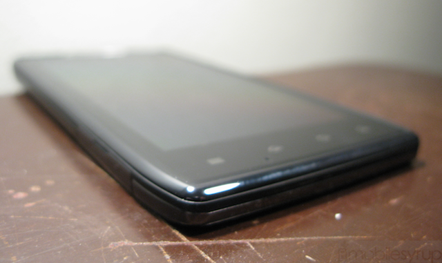
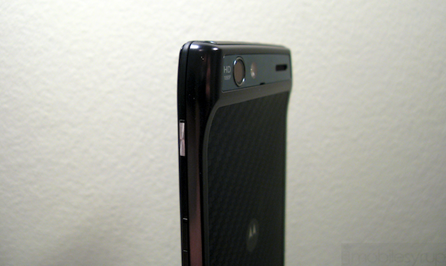
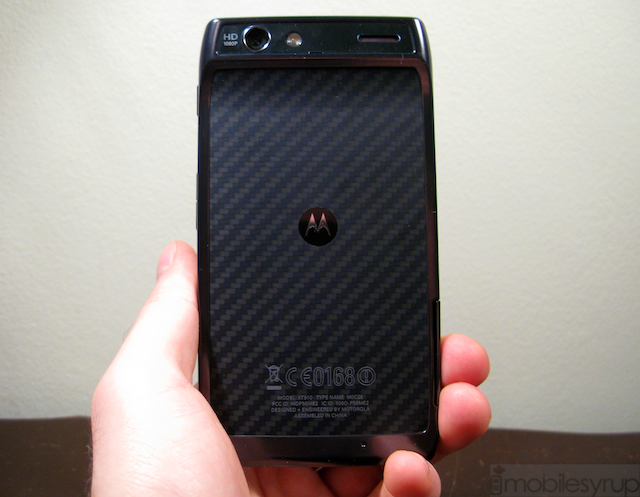
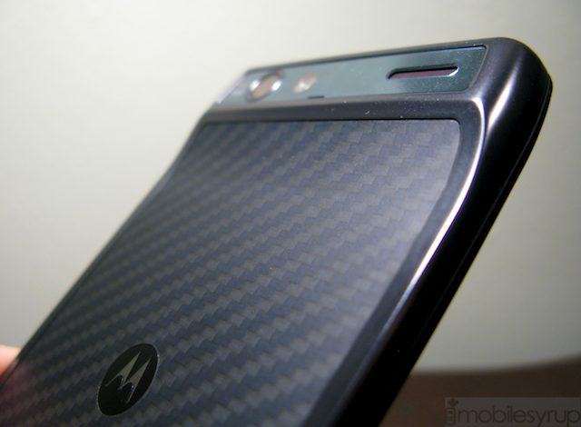
To call the RAZR this is a slight misnomer: this thing is barely there. But for the top-side chin housing the camera module and various ports, the majority of the body is 7.1mm thick. It takes a fastidious user to tell the difference between most phones on the market these days, but the RAZR’s gauntness brings it instant recognition. It’s also a unique form factor, with a 4.3″ screen that is quite a bit wider than most handsets; at almost 69mm across some users are going to have difficulty holding it comfortably. Add to that a square body with tapered edges, a Kevlar backing and aluminum frame and the RAZR is going to be a contentious — either celebrated or maligned — option for consumers.
Motorola had no choice but to put the SIM card and microSD slots on the side of the phone, likely necessitating the large bezel around the screen. And because of the reverse chin the RAZR does not lie flat, possibly exposing the camera glass to scratches. Below the screen are four capacitive touch buttons — menu, home, back, search — while above is a notification light and the 1.3MP front shooter. Though the earpiece is rather unassuming, Motorola thought it prudent to include a reflective silver logo right above it; we wish they’d thought otherwise as it brings nothing to the phone but added glare. The right side houses a satisfying power button, chiselled metal and satisfying, and a volume rocker. On the top are the headphone jack, microUSB and HDMI-out ports.
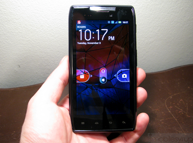
The screen LCD display is actually the first Super AMOLED qHD display, which, like its Samsung parentage, means viewing angles and contrast are almost perfect, while colours pop and brightness suffers. We noticed a slightly yellow, almost sickly tinge to plain white hues, though reds and blues are vibrant and beautiful. And let’s address the elephant in the room: PenTile exists, and it’s less distracting than expected. Before we picked up the RAZR, based on all the commotion we were expecting text to be so aliased and blurry as to be almost unusable. Instead we have a display in conflict with itself: yes, there is noticeable aliasing on individual letters — each word looks like it has tiny diagonal lines running through it — but how much you’re bothered by it depends on how far from the screen are your eyes. For a device this size we tend to keep the screen at length enough away to avoid any PenTile dissatisfaction, but to the more keen critic among you we feel the issue will never go away. Indeed, we haven’t been this distracted by a screen’s pixel matrix since the original Nexus One, but we went in there looking for it; we can’t imagine the average consumer, lacking a degree in tech masochism, is going to be turned off by the display’s few faults when it gives such a good first impression.
Though this is currently the highest-resolution Super AMOLED display available on the market in Canada this acclaim is to be yanked away from the RAZR in a few short weeks by the Galaxy Nexus. We have gone through a couple major Android screen resolution milestones since 2009, from 320×480 to 480×800 and now to 720×1280, and barring a couple iterative increases, qHD among them, it feels as if the RAZR will suffer in the long-term as a result.
We love the RAZR’s form factor, though we wish it wasn’t as wide. Whether it will pose a problem depends on the size of your hands, but most people its thinness will offset any reservations you may have about its width.
Performance
We found the RAZR to perform admirably in most of our tests. In fact it uses the same 1.2Ghz dual-core processor as the upcoming Galaxy Nexus, which speaks to the confidence Google and Motorola have in the chipset. This is also one of the most battery-friendly integration solutions at the moment, which we’ll get into a bit later.
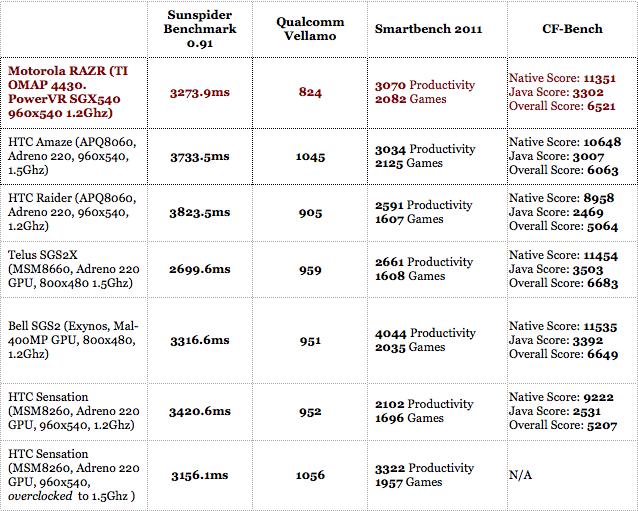
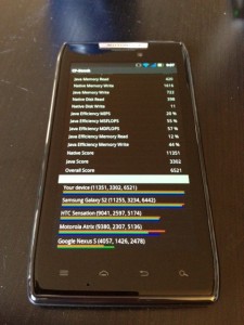
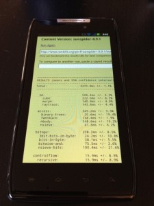
Most of the time the RAZR performs likes its namesake: cutting through apps like it’s a job. As you can tell from the benchmarks it can well compete with some of the fastest phones on the market, including the incumbent leader, Samsung’s Galaxy S II. That being said, it underperforms in the graphics department as the PowerVR SGX540 GPU is a faster-clocked variant of what was in the Nexus S’ Hummingbird processor. To its credit, though, the 1.2Ghz processor came in just behind the Amaze’s 1.5Ghz Snapdragon and kept pace with most of its dual-core ilk, despite the older GPU. This translated into dead-smooth gaming, even in graphics-intensive games such as Wind-up Knight.
In day-to-day usage, the able processor is hampered by a combination of Motorola’s bloated 3D-happy Android overlay and what we’d refer to as a stubborn screen digitizer. We experienced the same issue on the Atrix: occasionally our touches wouldn’t register on the screen or would take several seconds to do so. As a result typing turned into a frustrating and untenable experience, and made us long for the reliability of our iPhone 4S. While we’ll try to peg the performance issues on a software bug, there were too many moments of misbehaviour for us to forgive. If the problem is indeed with the touchscreen itself, then we have a bigger issue at hand and perhaps Motorola needs to look into a different vendor.
Software
As we’ve stated, the overlay that Motorola no longer refers to as MOTOBLUR is, for all intents and purposes, the same Gingerbread build that arrived on the Atrix earlier this year. Employing a 3D carousel through five homescreens and a horizontal app drawer, existing Android users are going to feel right at home here, if a little exasperated by how busy it looks.
Starting with the lock screen, you have the option of swiping left-to-right to unlock, and right-to-left to go straight into the camera app. The default home screen (there are five) shows a minimalist and functional weather widget and an expandable row of favourites that tap into your Google account to pre-load your favourite contacts. Along the bottom is a permanent four-icon dock, three of which can be changed by pressing down on the graphic.
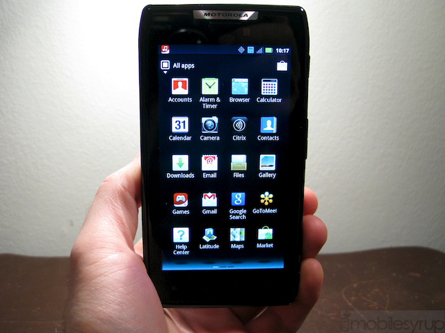
Most of the Motorola widgets can be resized, similarly by holding down for a moment anywhere on the widget and using the lines to adjust to your ideal. Built-in apps such as Social Networking and Bookmarks do a decent job and will suffice for the average user, but regular users of Twitter, Facebook or LinkedIn will want to venture into the Android Marketplace to get the official apps.
More interesting are two features brand new to the RAZR: MotoCast and Smart Actions. MotoCast is a streaming media service that ties into your PC or Mac and, like Plex or PogoPlug, streams your media files to your device or another computer. The interface is spare but functional and we had no problems playing DivX files of medium quality over our 14.4Mbps 4G connection. As with most of these services, buffering and ping times tended to be more of a roadblock than the quality of the media itself; a 30-minute TV show often took up to two minutes to buffer before playback began. Music files, which are significantly smaller, started almost instantly. The system requirements are a little steep: the download itself is 60MB and you must have at least a 1.8Ghz Core Duo with 1GB RAM for an optimal experience. You use your existing MotoCast login (read: old MotoBlur account) on both the PC and the phone; the set up is incredibly easy. You access your content not from one central location on the phone but rather, for music through the Music app, for photos through the Gallery. After the initial synchronization, this content just appears as if present on the device. Very slick.
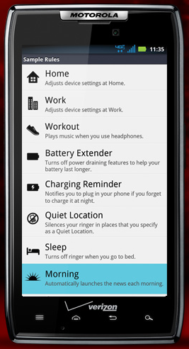
Smart Actions is an example of something that should be standard on all Android devices. The app allows you to set Triggers and Actions: for example, one of the samples is to open the music application (Action) when the headphones are plugged in (Trigger). The app is not only location-aware but context aware, so if you are running low on battery you can set it to turn off background updates and limit screen brightness. If you’d rather this didn’t happen when at home, or when connected to a WiFi hotspot this can be achieved too. The idea is good and so is the execution, and we saved a lot of battery (and time) just by enabling the default Battery Saver preferences.
—
We weren’t overly impressed with the look of the OS under Motorola’s tutelage: there are superfluous and taxing animations littered all over the interface, from screen transitions to orientation changes. Native apps themselves, however, fare better. Motorola has done a great job with its custom email application which synced not only with our IMAP accounts but had no problems with our Exchange server that poses a challenge for Samsung and HTC devices. The Gallery app has also been revamped to take advantage of cloud services and social networks; it sync with MotoCast as well as Facebook, Picasa and Twitter to bring you what’s going on around you. There are a number of ways to sort your photos, based on date, location, album name and even tags.
Speaking of sorting, we also like the way Motorola does away with the traditional multitasking menu (hold down the home button for a couple seconds) and integrates it with the overall app drawer. You can sort apps by recently-used, downloaded or in alphabetical order. We wish more vendors used this amount of customization.
That being said, much of the interface feels clumsy; there are many ideas, but there are not simply implemented. This is both the RAZR’s greatest strength and weakness: you can do so much with its granular settings (you can even monitor data usage in the settings) but for the many users it will feel cluttered and unruly.
Unlike its Samsung and HTC counterparts, it is not possible to take a screenshot from within the OS, nor can you pull down the notification bar to quickly enable WiFi or GPS. These are omissions that we now take for granted. Thankfully, Motorola has included a notification light on the front of the device and a nice vibration mechanism.
Cameras
We have not been impressed with the quality of Motorola’s optics in recent devices, and the RAZR is no exception. Though it has received a spec boost to 8MP we found the quality of photos to be lacklustre; plenty of grain in low light and noise in optimal conditions. While colours look decent in the sunlight, low-light performance is not the greatest. Auto-focus is quick, and the camera takes photos in under a second, but there is no comparison to the latest crop of HTC devices, nor to the iPhone 4S.
Motorola has spit-shined the camera UI, making it as minimal as possible with a single rolling settings bar at the bottom left. We like the one-touch access to exposure and the various modes (monochrome, sepia, etc.) but found the various scenes, such as Macro or Night Portrait, to do little more than adjust the white balance and ISO and did little to improve quality in those particular settings.
Video fares slightly better, with the optional Image Stabilization setting doing a good job keeping our shaky hand steady. The major issue we faced with 1080p video was softness; as you can tell from the sample video there is a noticeable layer of detail missing, likely from an inefficient codec or poor quality optics. We are leaning towards the latter.
Battery Life
With a 1780mAh battery and by-default battery saving modes, we’d expect the diminuitive RAZR to last a long time. Motorola touts 12.5 hours of talk-time and though we don’t have the vocal chords to challenge their claims, we found battery to be more than acceptable for a full day’s outfit of activities. We even used the device exclusively for three days, standing in for camera, home phone and internet connection, and made it through the day two of the three; the other day we used the mobile hotspot feature a little too assiduously.
Considering the RAZR is the only high-end Android device without a removable battery we’re happy with the results, though caution anyone with happy fingers to pre-set some Smart Actions before you head out for the day.
Network Speeds and Call Quality
As with most Motorola devices, the call quality, from both the earpiece and the ample back speaker, is phenomenal. Noise cancellation is employed here to great effect, and our subjects had no problem hearing us on a busy Toronto street. Speaker volume is high and one of the more full-sounding we’ve heard recently.
We did have some problems with reception; the phone would drop to 1-2 bars in some areas where our iPhone 4S on Rogers would retain 3-4 signal bars. We’re calling it a problem, as we never dropped a call, but data occasionally dropped to EDGE speeds. It took a few minutes to regain our 3G speeds, even in areas with excellent coverage (as evinced by our iPhone 4S).
Software inclusions and bloatware
Rogers has bundled its MyAccount app, Rogers Live (nee Rogers On Demand) and UrMusic, their music store app. There are also links to a Ringtone store and a Games hub. As far as music stores go, UrMusic is pretty good, offering most top singles for 99c or $1.29CAD, or albums for $9.99 to $11.99. These are high-bitrate DRM-free MP3s, or you can sign up for a monthly listening plan for $10/month. While the selection is there, it’s nowhere near as good as Rdio or Slacker, which offers their own streaming service in Canada for the same monthly price.
Also bundled on the phone, mainly for business professionals, are the Citrix and GoToMeeting apps. We see business users loving the RAZR, so their inclusion is especially welcome.
Bootloader Bonanza
The RAZR has a locked bootloader. This means that, at least for now, there will be no custom ROMs available for the device. A few cunning developers, however, have achieved permanent one-click root for the phone, so your favourite low-level files are available to play with at will. A quick Google search will bring you what you’re looking for.
Final thoughts
The Motorola RAZR tries to reinvent hardware while staying true to the company’s more recent Android software roots, while perfectly usable, the Gingerbread overlay on the RAZR is bloated, garish and at times frustrating. For the most part it works without issue, but the occasional slowdown, app crash and bout of screen unresponsiveness tips the bucket over into dissatisfaction.
We love the form factor, even though it is too wide, and found performance and battery life to exceed our expectations. If you’re looking for the thinnest Android smartphone, at least for the foreseeable future, this is it. And if you’re a fan of Motorola’s Android overlay you’re in for a treat. The company has committed to bringing Android 4.0 to the RAZR sometime in the new year, so we can only wait and see what improvements that brings. Until then, this is a solid Android phone with a gorgeous 4.3″ Super AMOLED screen, albeit in PenTile form, a poor camera, and a unique form factor that will appeal to many and turn away some.
You can get the RAZR here at Rogers, or Best Buy Mobile and Future Shop
Overall Rating: 7/10
Pros:
– Robust, unique and attractive form factor
– Gorgeous Super AMOLED display with excellent colours, viewing angles and contrast
– Excellent performance in apps
– Cool software inclusions like MotoCast and Smart Actions
– Decent battery life, especially when paired with Smart Actions
– Fantastic sound quality from earpiece and speaker
– Will be upgraded to Android OS 4.0 Ice Cream Sandwich
Cons:
– Disappointing camera quality in stills and video
– Occasional screen responsiveness issues
– Aesthetic glitches, app crashes and bugs present in software
– Too wide for some hands
– Screen has PenTile matrix, may be distracting for some
MobileSyrup may earn a commission from purchases made via our links, which helps fund the journalism we provide free on our website. These links do not influence our editorial content. Support us here.

