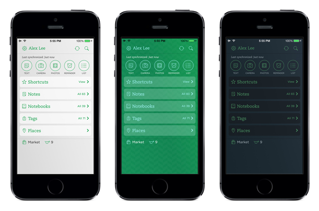
As a dedicated Evernote user, the company’s iOS app has always been a source of tension: an absolute requirement to keep my notes and note taking mobile; a rigid, limited, and sometimes sluggish experience compared to its desktop counterpart. Evernote yesterday released a significant update to its iOS app with new features and optimizations to close the gap.
With the new update, Evernote has streamlined its experience while adding much needed customization options. The home screen now features larger New Note buttons at the top of the screen, as well as filtering options to make sure your most used sections are close at hand. Evernote now has three different colour theme options for those that thought the app was simply too green.
The new version of Evernote also features some of the subtle usability boosts that make the desktop version so compelling. The app now tracks sync status, has shortcuts to recently viewed notes and notebooks, and allows for scanned business cards to be added directly to your iPhone’s contacts. It’s a delightfully polished experience that hopefully Android and BlackBerry 10 users will receive soon.
[source]Evernote[/source]
MobileSyrup may earn a commission from purchases made via our links, which helps fund the journalism we provide free on our website. These links do not influence our editorial content. Support us here.


