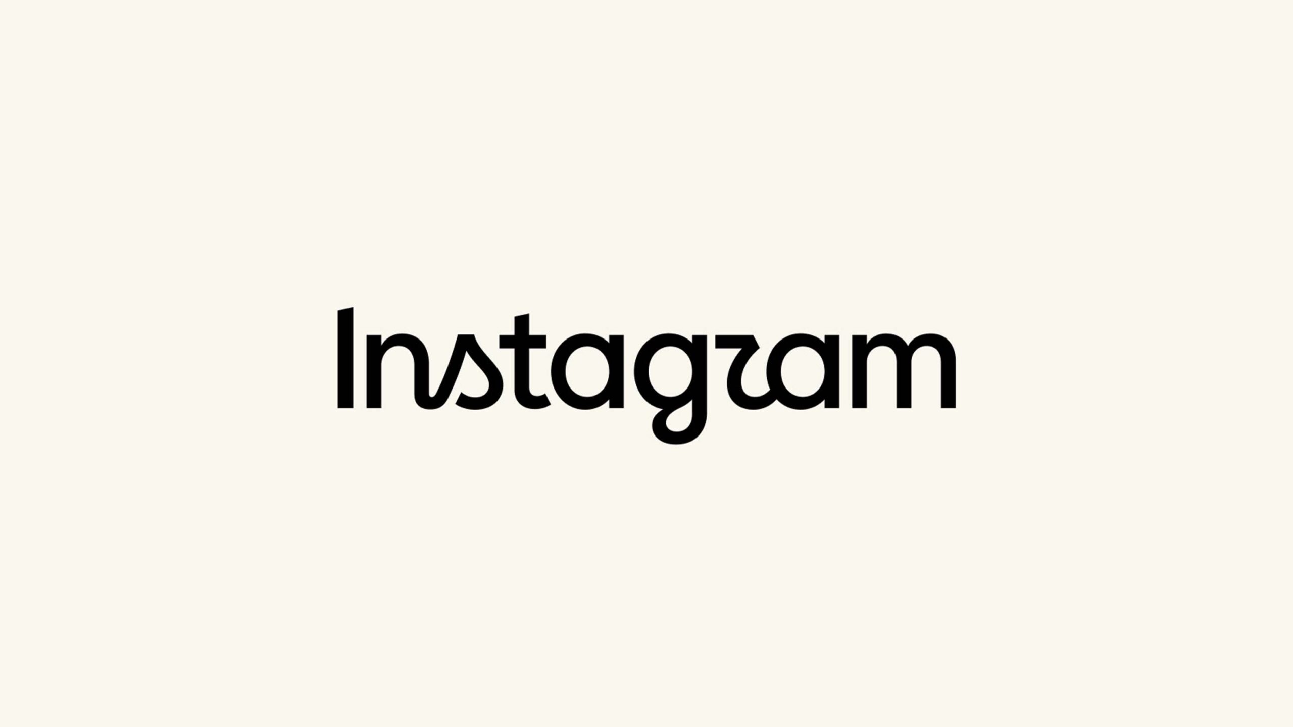
Instagram is redesigning its decade-old wordmark, and the new design is certainly a choice.
For about the last ten years, the Meta-owned social media app has had a wordmark with a cursive-style font. That’s changing now, according to Instagram head Adam Mosseri, who shared the new wordmark in a post on the social media platform.
“The wordmark at the top of the app hasn’t changed in 10 years, so it was time for a refresh. Cleaner and more modern, with references to the original and the simplicity and craft that’s always made it Instagram,” Mosseri wrote.
But I’m not sure “cleaner” or “modern” are good descriptors for the change. Bizarre and hard to read come to mind instead. The new wordmark mostly switches to a simple print font, but keeps some letters stylized like cursive, which makes for a pretty strange look.
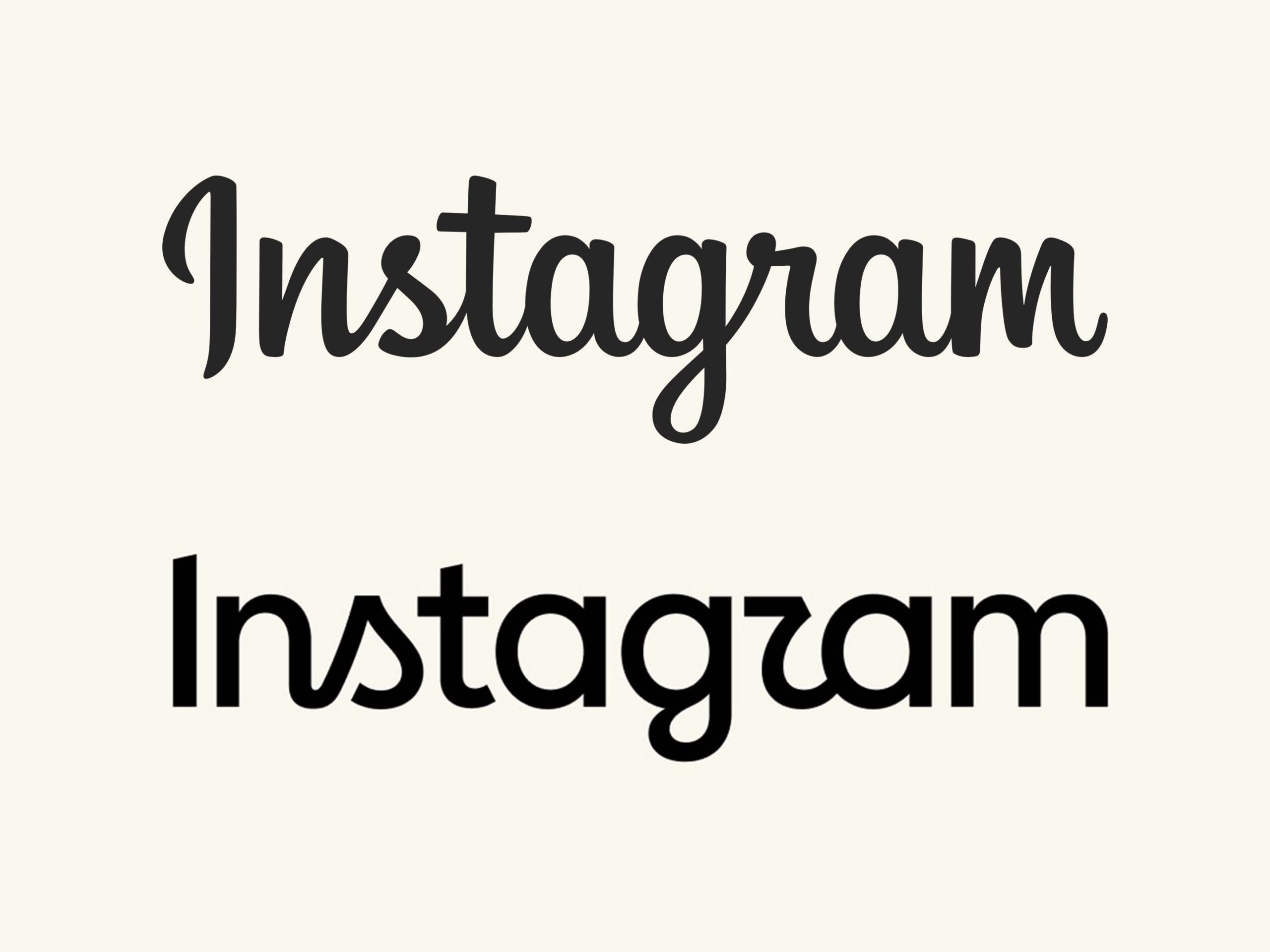
Instagram’s old (top) and new (bottom) logo.
The Verge, which first spotted the change, pointed out the new wordmark looks like it says “Instagzam” instead, and honestly, I have to agree. And we’re not alone — Mosseri’s post is full of comments complaining about the change and highlighting the ‘Instagzam’ look.
It’s not clear yet when the new wordmark will roll out to users, or if other design changes will come with it. I’m also morbidly curious if the backlash over the change will be enough to make the company change the wordmark. At the very least, it should probably try to make it look like “Instagram” again, even if they don’t go back to the old cursive look.
Source: Instagram
MobileSyrup may earn a commission from purchases made via our links, which helps fund the journalism we provide free on our website. These links do not influence our editorial content. Support us here.