The Pros
- Amazing design
- Decent battery life
- Solid app
The Cons
- Case is a little large
- Sometimes buggy moving between devices
- Double tap for play/pause is annoying
The Nothing Ear (1) wireless earbuds are special, but it’s not the sound quality that sets them apart from their competition.
When the earbuds dropped last summer, they faced criticism because the company spoke a big game about competing with AirPods Pros, when in reality, they’re just well-designed mid-range buds. This over-hyped bravado is annoying, but after a few months with the Ear (1)s, I’ve mostly forgotten about it.
People don’t love shelling out $240 on AirPods, so something with a little less wallet impact is always attractive. If they sound good and look cool, that’s an added bonus. In those regards, the Nothing earbuds check a lot of boxes.
I’m reaching for the Nothing Ear (1) buds more than I thought I would, and I think many people will feel the same.
Hitting the bar

The Nothing Ear (1)s sound fine. They have a reasonable soundscape that holds up well at average listening volumes. If you start to crank the sound, you hear a shallower bass punch, but they’re passable. For $130, I’m just thankful the tuning is balanced at all.
During my testing, I’ve found that the sound quality of wireless earbuds fall into three camps: terrible, normal and surprisingly good. Not a lot of earbuds jump from the ‘normal’ baseline into the ‘surprisingly good’ category without well-implemented new technology like Dolby Atmos or Spatial Audio.
This means that the Ear (1)s are fine by my standards. They don’t distract from my music, and I can confidently put them in my ears and know that I’ll get lost in the tunes.
If you care about wireless sound quality, I’d recommend the LG Tone Free FP9s, but I’ve been enjoying the tuning of the Nothing earbuds. After running them through my earbud test tracklist to get a basis for comparison, I don’t have many complaints. Classical music like FKJ’s Last Hour sounds beautiful with these buds. Newer tracks like Remi Wolf’s Liquor Store seemed to have some distortion in the modern 808 bass kicks, but I still found myself rocking out to it just as much as with other earbuds. When I first switched, I noticed slightly more hum in the background of some tracks and less detail than buds that cost twice as much. But compared to their closest competitor, the Beats Studio Buds, Nothing’s Ear (1)s sound remarkably similar.
Let’s make tech beautiful again
There should be essays written about Teenage Engineering’s design prowess. The Swedish electronics and design powerhouse was brought into the Nothing fold early on, and that’s probably one of the smartest moves Carl Pei made for his fledgling company.
Teenage Engineering makes headlines in gadget and music press every once in a while with its fun and quirky music-making tools or a limited edition run of other products like a PC case. However, possibly by choice, or the nature of the products the company makes, the company has yet to go truly mainstream. There’s no doubt the OP-1 and the Pocket Operator are popular, but they don’t have the potential to be in everyone’s hands or ears like Nothing products do.
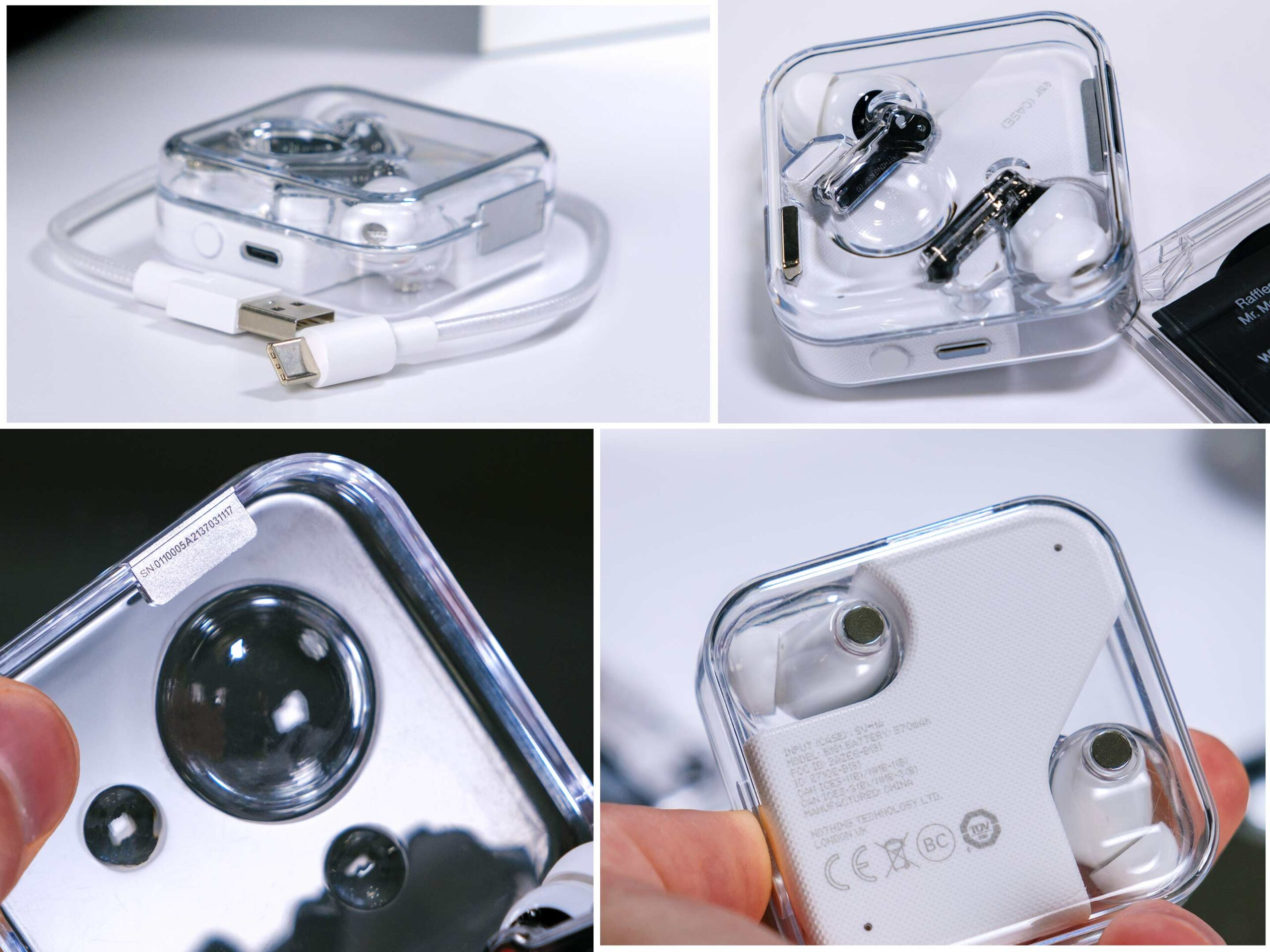
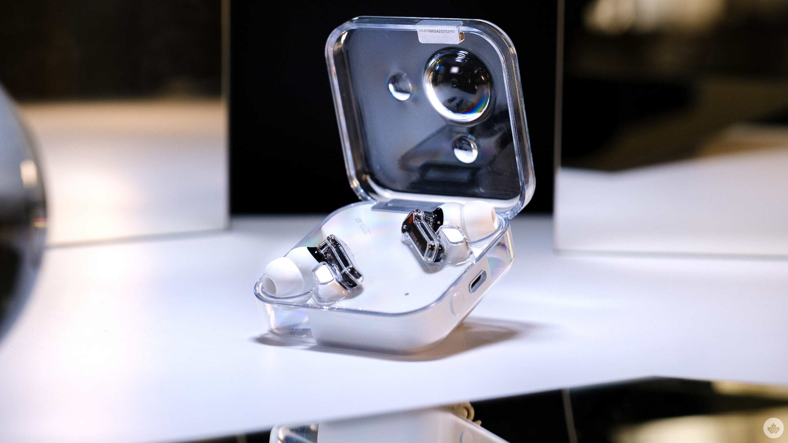
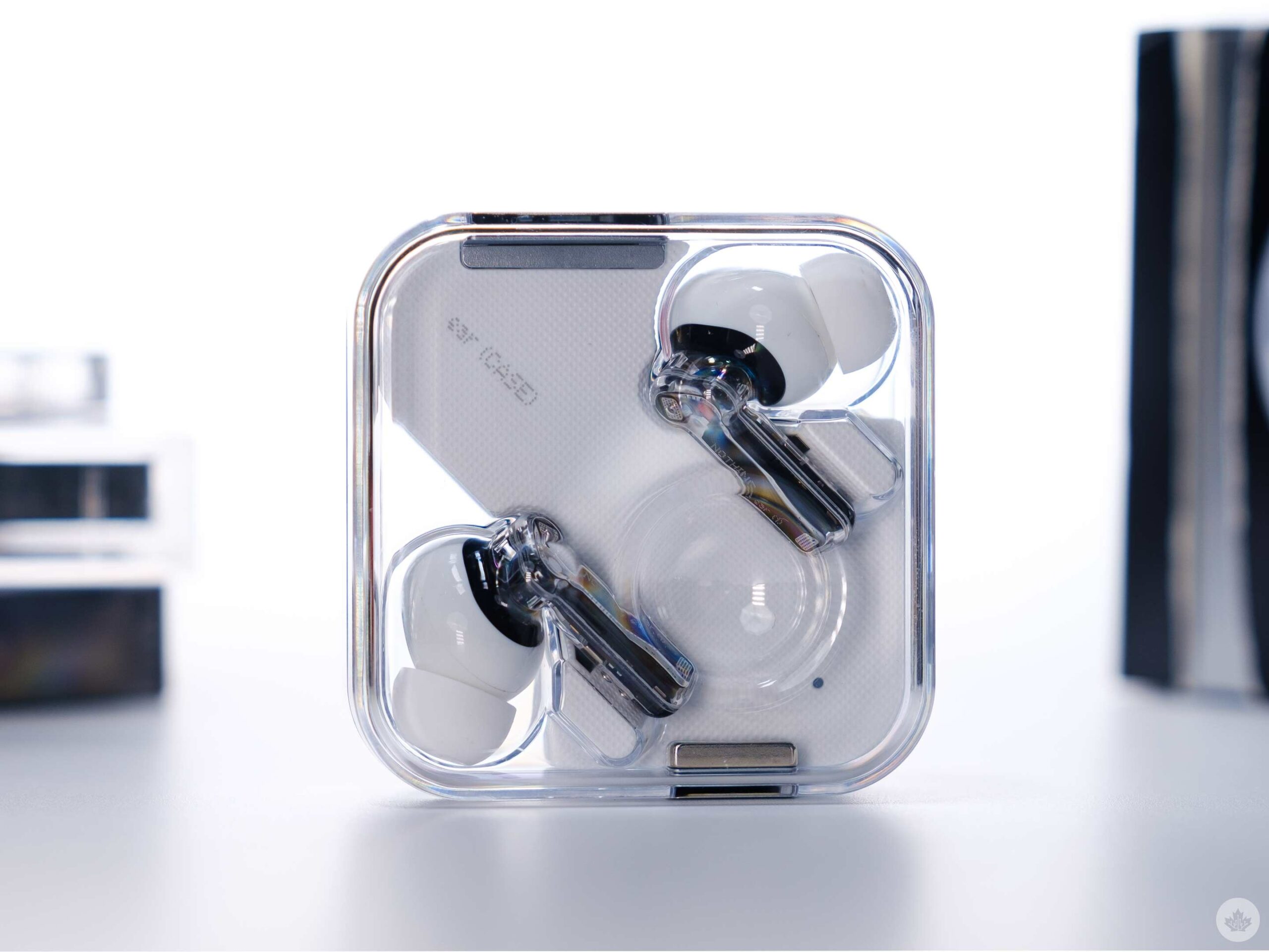
That takes us back to the Nothing Ear (1)s. The larger than average case is enclosed in clear, almost seamless plastic that looks something like a vintage sci-fi prop you might find in Alien. It retains this retroism through transparency compounded with subtly textured plastics. It’s incredibly intriguing to look at and hold in your hands. It’s the product that I’ve gotten the most questions about from friends over the past few weeks and one that I wanted to show off. There’s no denying the understated elegance of the AirPod cases, but you can get lost staring at the Nothing Ear (1)s.
That being said, this beauty doesn’t come without tradeoffs. Since the case is larger and boxy, it’s less pocketable than AirPods, Beats Fit Pro and Galaxy Buds. The clear plastic also scratches just as easily as you’d expect. I don’t usually mind a few scuffs on my earbud’s case since it’s meant to be tossed into bags and pockets with abandon, but I was sad to see my first big abrasion on the previously pristine Nothing Earbuds case. The company ships the case with a simple, almost unnoticeable, sticker protector on the top and bottom of the case, but to me, it felt silly to obstruct the beautiful design with what’s essentially a tiny screen protector. Therefore, I’ll live with the scratches and my bad choices together.
As much as I wish the case fit in my pocket a little easier, I wouldn’t trade the good looks for a smaller size so quickly. There’s something nice about the large lid on the Nothing buds’ case. It feels like you’re opening up classy cufflinks instead of the Zippo Lighter feeling that you’d get from popping open the AirPods or the meh-feeling from opening up the Beats Fit Pro. The small square-ish Galaxy Buds case Samsung offers comes close to being as satisfying since it feels like a small a ring box, but Nothing’s springy hinge is better.
Moving inside the case, each bud rests in a small alcove and is magnetized to stay in place. The left bud has a white dot on it, and the right bud is marked with red. These dots coincide with the large magnets on each side of the case. It’s a small thing, but it makes placing the Ear (1)s back into the case straightforward. As someone who still puts their AirPods in the wrong ears all the time, this is a nice touch.
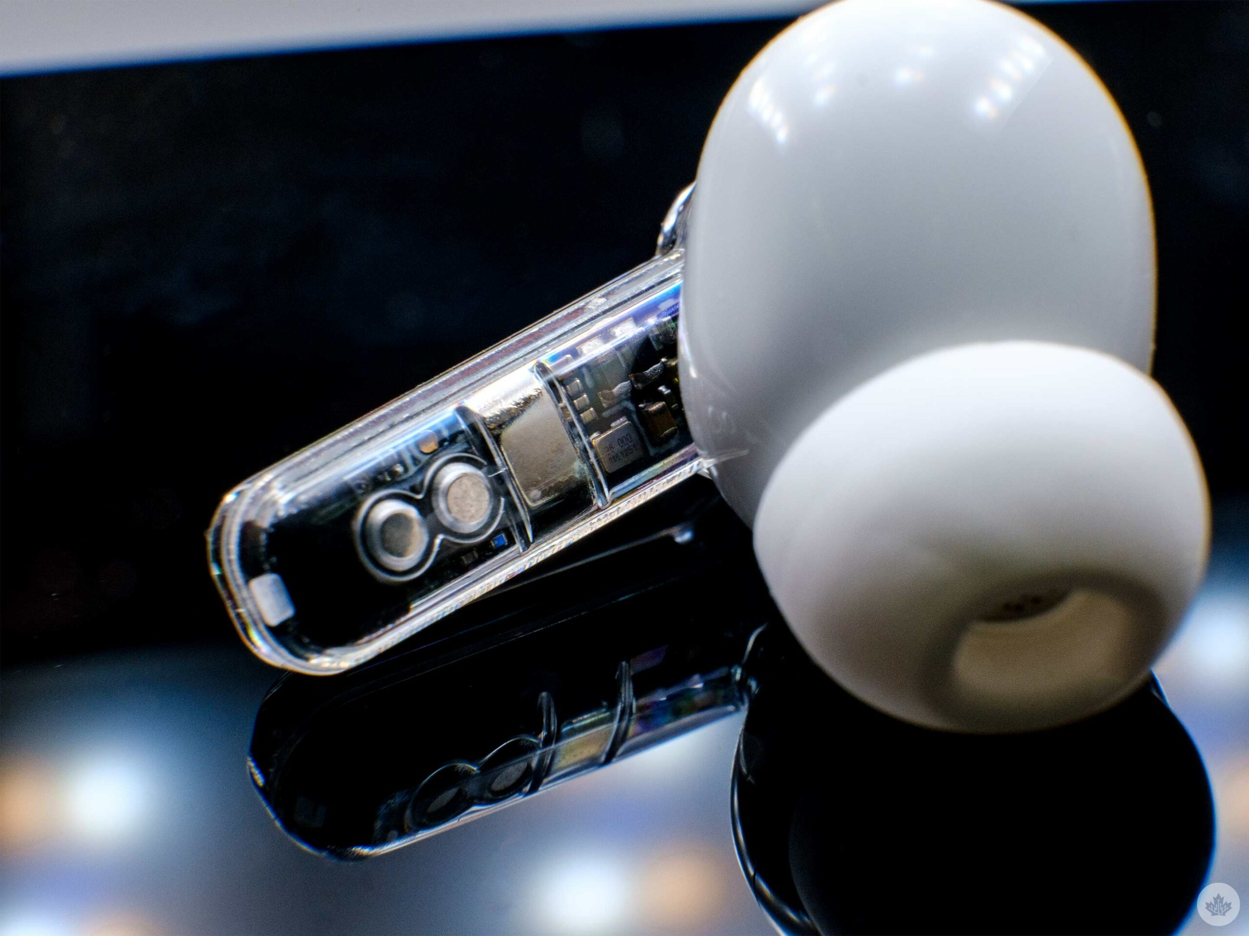
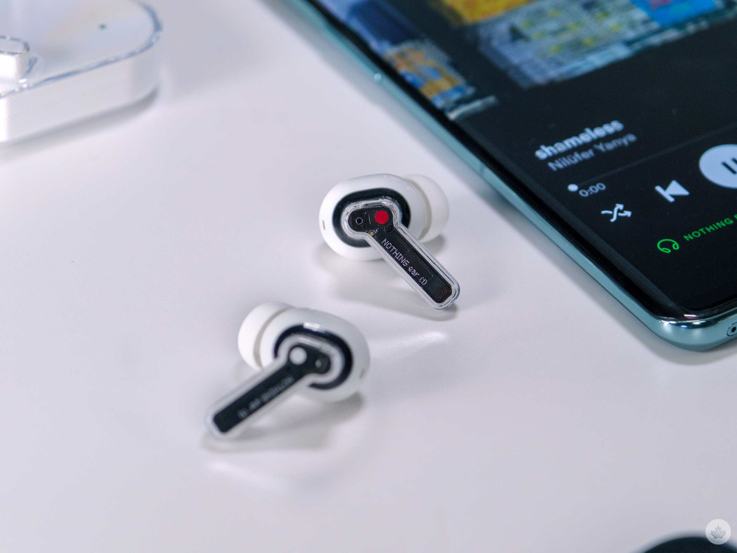
Each bud sits atop a transparent stem that says “Nothing Ear (1)” in the dot-matrix font inspired by industrial pipe marking guns. Now is also a good time to mention that the clear plastic Nothing uses has a bit of an iridescence to it. This can cast rainbows in the plastic at off angles, kind of like a pool of oil. It’s an excellent effect and comes across nicely alongside the black backdrop of the earbud stem.
The sharp contrast of the top of the buds being wrapped in glossy white to the stems being transparent and black, is a nice effect too. It makes the buds look significantly different from AirPods, while still retaining that shape that works well in many people’s ears. However, the silicon tip is more like the AirPods Pro than traditional AirPods.
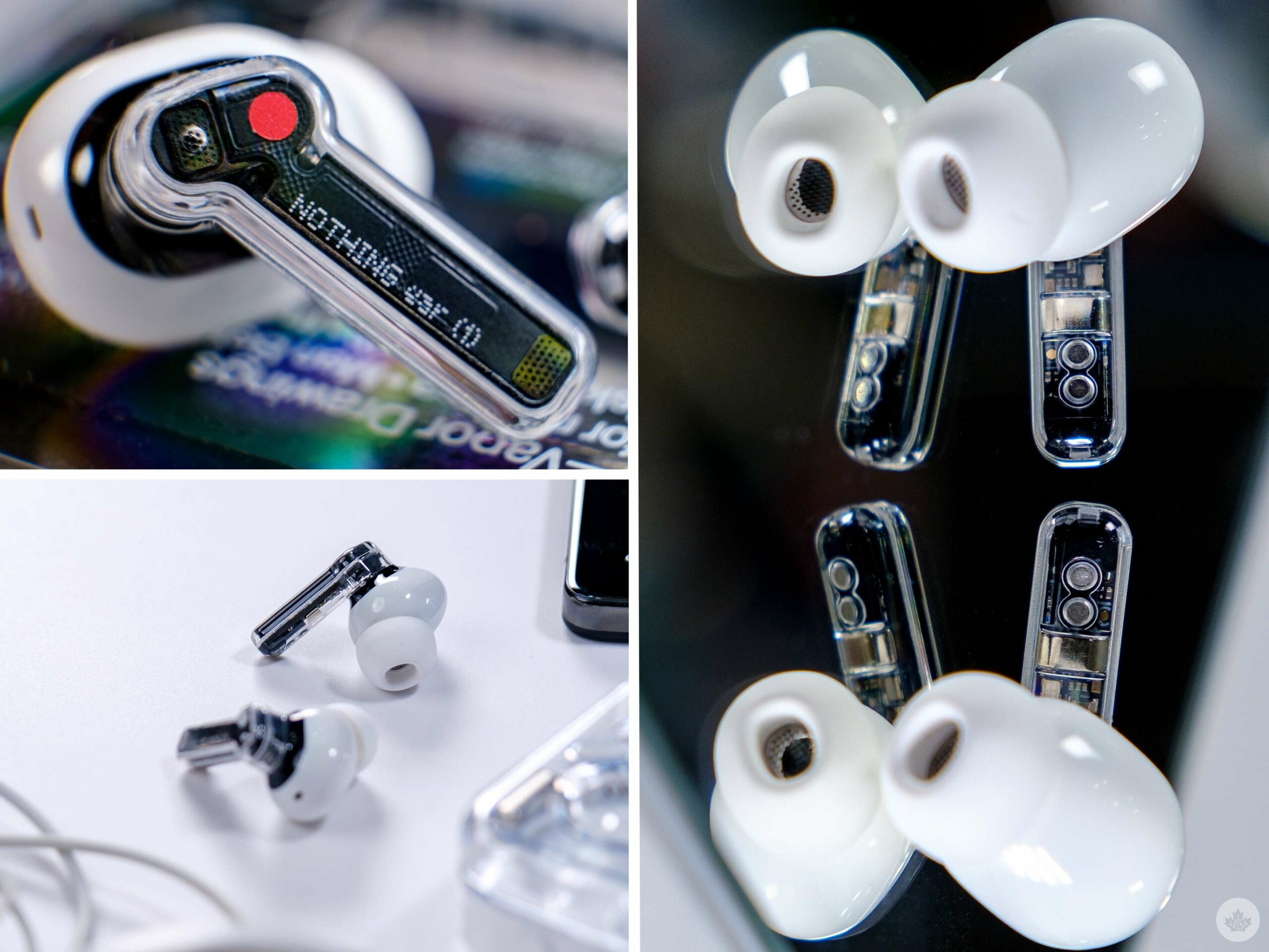
On the inside of each stem, you can see the magnets and the two connectors for the charger to push power through. It all looks very cool and adds to the retro-futuristic aesthetic that Nothing is now known for. I hate to say it, but there’s not a smartphone capable of matching these incredibly trendy buds.
Other Perks
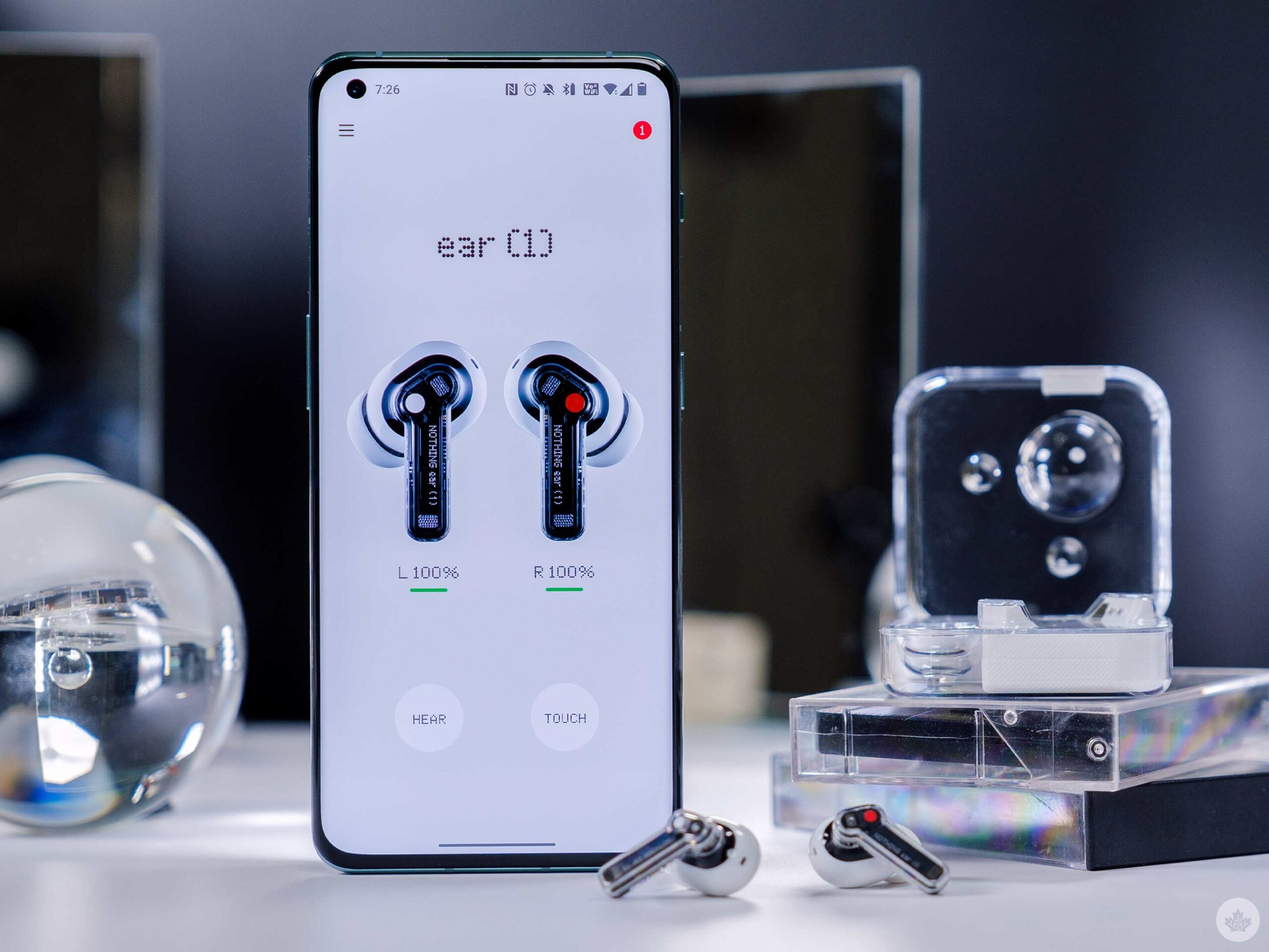
One thing that shouldn’t go unnoted is how well Nothing’s software works with the Ear (1)s. Generally, if you’re not getting earbuds from a big-name company, the app that controls them sucks. Luckily, that’s not the case with the Ear (1)s.
Like several other modern buds, the buds feature in-ear detection, and it works pretty well. I’d say about 80 percent of the time, it’s perfect at pausing the music when I take a bud, or both, out. However, putting them back in doesn’t always work as well. The touch controls work alright, but I am a little annoyed that Nothing decided to make the double-tap gesture play pause when it’s a single tap on like 80 percent of other buds. The touch and hold to toggle active noise-cancelling, transparency, and no effects worked well enough.
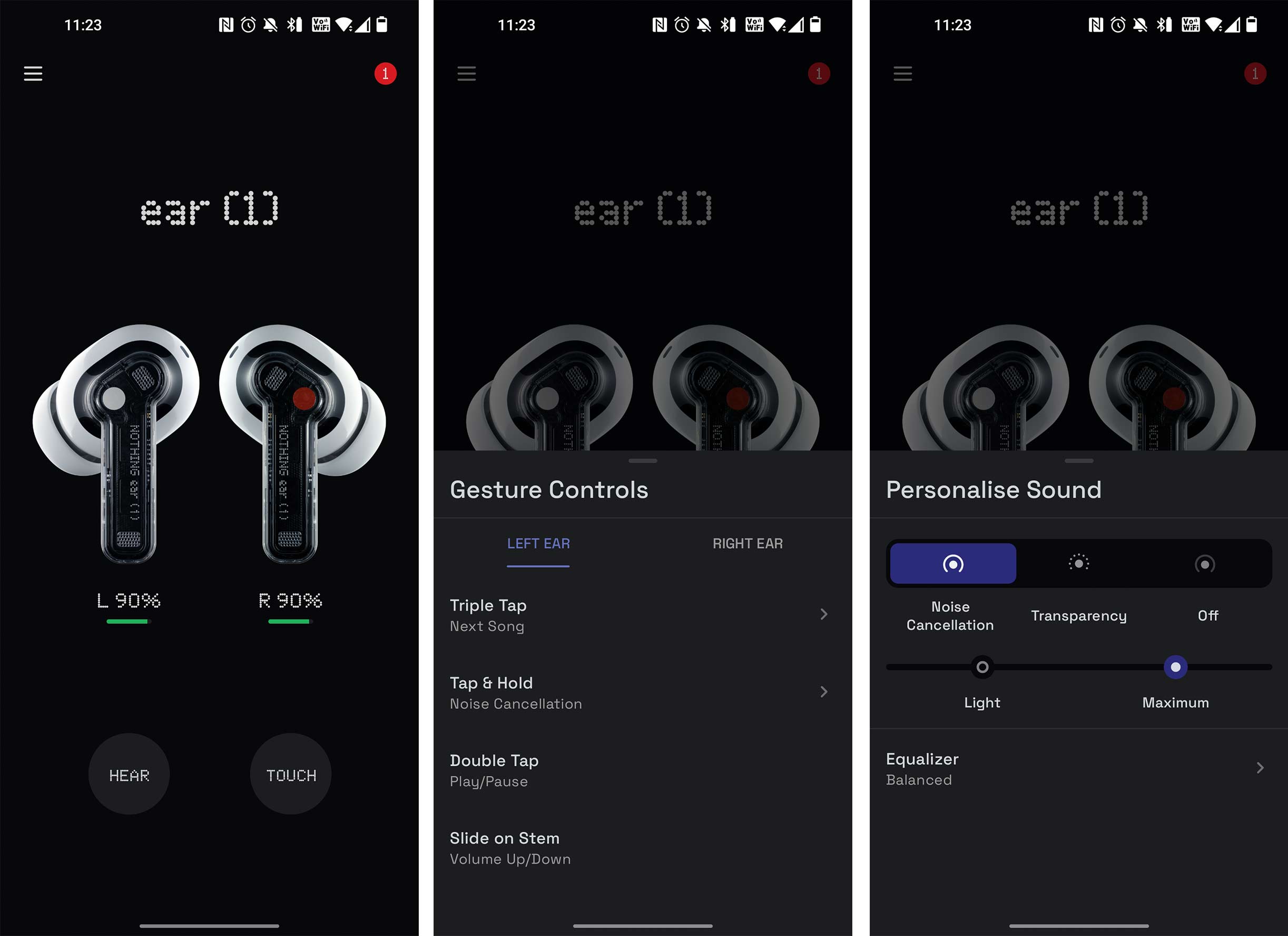
Battery life was fine on these earbuds, and they easily got me through a day of use at work and, with the charging case, almost a whole week of intermittent use. As for sound quality, a lot of wireless earbuds last long enough now, so the Nothing buds haven’t let me down yet. They’re only rated for around five hours and that seemed accurate in my tests. The case adds an extra 24 hours of charge if you use active noise-cancelling and 36 hours without. The case supports wireless charging, which is nice to see.
These buds also support Android Fast Pair tech, so if you use them on Android, your initial pairing setup should be streamlined and straightforward. However, during my review, I did need to re-pair them to my Mac since they wouldn’t connect seamlessly sometimes.
A standard microphone
You can watch the full video above to hear how the Nothing earbuds sound, but my overall impressions are that they were fine in a quiet room, but my friends did complain about some background noise when I tried to use them in louder rooms and even areas with ambient AC noise.
Earbuds for people that crave good industrial design over all else
As a reviewer, I often need to remind myself that not everything needs to aim for the perfect price/performance sweet spot. Sometimes if the product makes you happy and it’s passable in some other regards that's enough. In 2022 when there are good products around every corner, the beautiful craftsmanship of the Nothing Ear (1)s is a refreshing reprieve.
That’s not to say that there aren’t companies with strong industrial designs out there now. Google has come a long way in the last few years since Ivy Ross joined the board and ushed in a beautiful era of human-led design that feels welcoming and fun. Samsung has also democratized its own modern high-class business aesthetic in recent years. OnePlus and Essential have both fought for the youth market in tech in the past by being the “cool-kid” of phones, but to me, if anyone really has a chance to capture that market it might actually be Nothing.
There has been some dread forecasted about chasing this market in North America since Apple and the iPhone has seemingly dominated the youth, but this might actually play into Nothing’s strategy better than expected. Usually, when some form of culture takes over a counter-culture is born to resist it and in my mind, Nothing is setting itself up perfectly to capture on this moment, if it ever happens.
I hate to compare Nothing to Apple since the startup seems all too comfortable doing that itself but after years of Apple indoctrinating the tech world with brilliant industrial design, it's incredibly nice to see another company taking design as seriously as the house that Steve Jobs built.
I have no idea if Nothing will be able to carry this intention-led design language forward, but if it can give Android fans products with incredible designs, that’s a mission I won’t be able to stop myself from getting behind.
Nothing has impressed me with the Ear (1)s, but if these earbuds are the first step for a company learning to walk it was less shaky than I expected, and I really hope that the next step it takes lands with even more stability so the company can continue to grow.
You can buy the Nothing Ear (1) for $130 in ‘Black’ and ‘White.’
"Sometimes if the product makes you happy and it’s passable in some other regards that's enough."
MobileSyrup may earn a commission from purchases made via our links, which helps fund the journalism we provide free on our website. These links do not influence our editorial content. Support us here.


