The internet is a place of controversy where even the seemingly inane leads to divisive bickering.
So it was this week when Google rolled out a new look to its search results on desktop that mirrored what was available through its mobile site and app. The search giant added favicons — the little images you see in your browser tabs — to its results. The internet was furious.
Last week we updated the look of Search on desktop to mirror what’s been on mobile for months. We’ve heard your feedback about the update. We always want to make Search better, so we’re going to experiment with new placements for favicons….
— Google SearchLiaison (@searchliaison) January 24, 2020
Google announced Friday that is has “heard your feedback” and will walk back the change — in fact, Google search will closely resemble the old style for most users now, with no favicons and green URLs positioned below the page title. The company says it’s experimenting with further design changes, which seems like code for going back to the way things were before everyone got mad.
Here’s the thing, though: the favicons made everything better.
Here’s our full statement on why we’re going to experiment further. Our early tests of the design for desktop were positive. But we appreciate the feedback, the trust people place in Google, and we’re dedicating to improving the experience. pic.twitter.com/gy9PwcLqHj
— Google SearchLiaison (@searchliaison) January 24, 2020
When Google first made the change, it said it added the favicons to put “a site’s brand front and center, helping searchers better understand where information is coming from, more easily scan results and decide what to explore.”
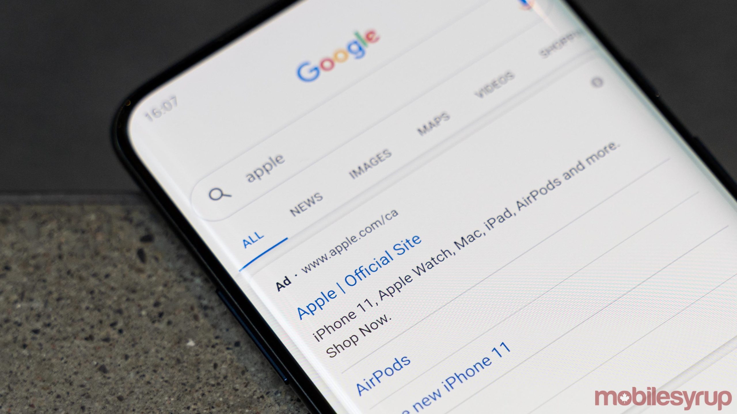
That’s undeniably true. At a glance, it was easy to see which website was which through visuals. A picture is worth a thousand words, even if it’s tiny. For example, a Google search for ‘Apple’ shows a typical list of results. It’s easy to spot Apple’s page because there’s a small Apple symbol beside the result. It’s significantly easier to parse and quickly spot what you need — the whole point for making the change.
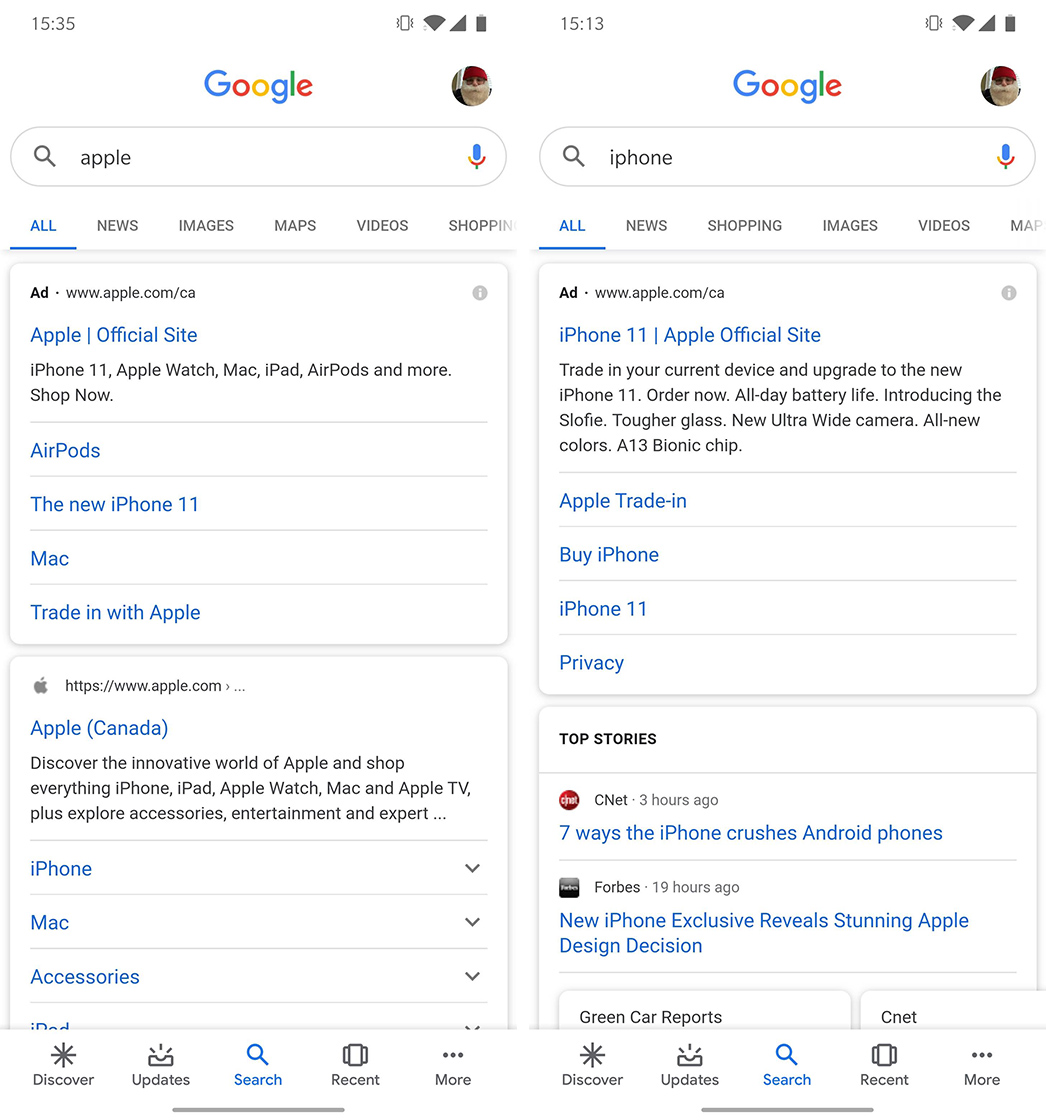
Favicons also make it much easier to spot an advertisement in Google’s search results. Every Google search comes with ads; usually, the first couple links on the page are advertisements. Companies pay money to get to the top of the page. With the favicons, these paid links are clearly marked with an ‘Ad’ symbol.
Despite that, the internet turned its rage upon Google, claiming the favicon implementation helped hide ads so users would click them more. Yes, boldly declaring something as an ad clearly helps hide the fact that it is an ad. The old design, unfortunately, only displays a small green ‘Ad’ logo below the page title. It blends in with the URL and is much harder to spot when quickly scanning a page of results.
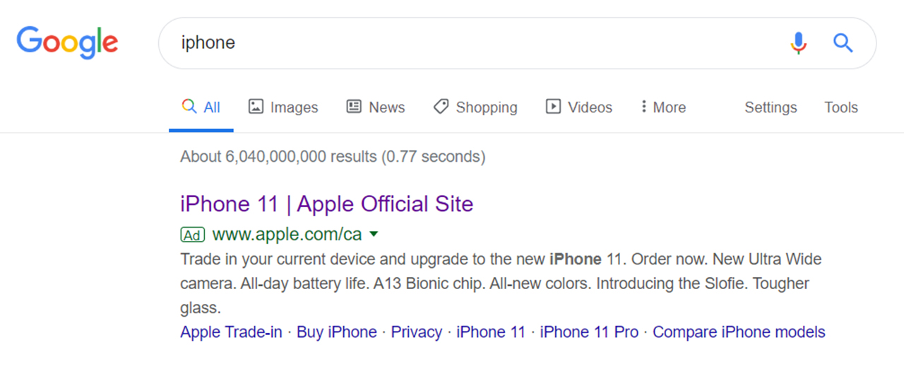
For what it’s worth, the controversy isn’t entirely without merit. The new results page wasn’t perfect — designers pointed out that changing the URLs from green to black text was confusing since the URLs blended in with everything else.
Further, moving URLs above the page title could also be confusing. I’d argue that it lends more prominence to the URL, which could help users land on the right page and not get tricked by a deceptive link.
But to call the results unusable? That’s a stretch.
For the first time in 21 years, @Google is practically unusable.
Favicons are distracting in list format and black URLs conflate with black meta descriptions—nothing draws the eye. Also, why is the URL above the page title?
I can't believe this shipped to 100%. pic.twitter.com/bdEJQwpGx6
— Jeff Seibert (@jeffseibert) January 17, 2020
Regardless, Google acquiesced and will experiment with new results pages. The internet has successfully bullied a large company into doing what it wants yet again and we’re probably all the worse for it. Thankfully Google won’t change the mobile search results page, and favicons will live on there, boldly declaring which links are advertisements and which are not.
Of course, if Google’s search results page is really that offputting, you could always switch to Bing. You’ll never be able to find anything again, but at least your search results won’t have any damn favicons.
MobileSyrup may earn a commission from purchases made via our links, which helps fund the journalism we provide free on our website. These links do not influence our editorial content. Support us here.
