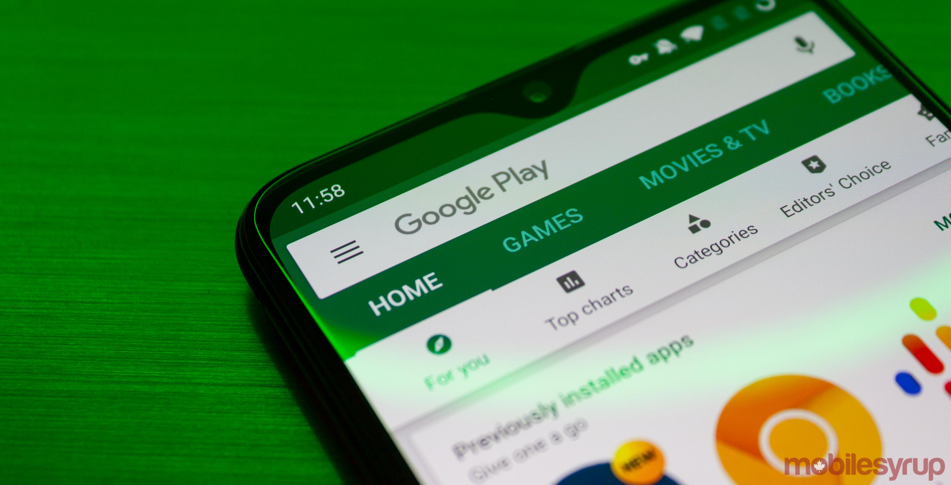
Google has put its Play Store through several tests in an effort to find a layout that works best for users.
The most recent attempt has landed some users with a weird top bar containing only two options: ‘Apps’ and ‘Games.’ The other tabs, like ‘Movies & TV,’ ‘Books’ and ‘Music’ no longer inhabit the space beneath the search bar.
It’s an odd choice of layout. To me, it doesn’t make sense to relegate all the media tabs to the side menu. It seems like that would drive less traffic to those stores as they’re not as visible.
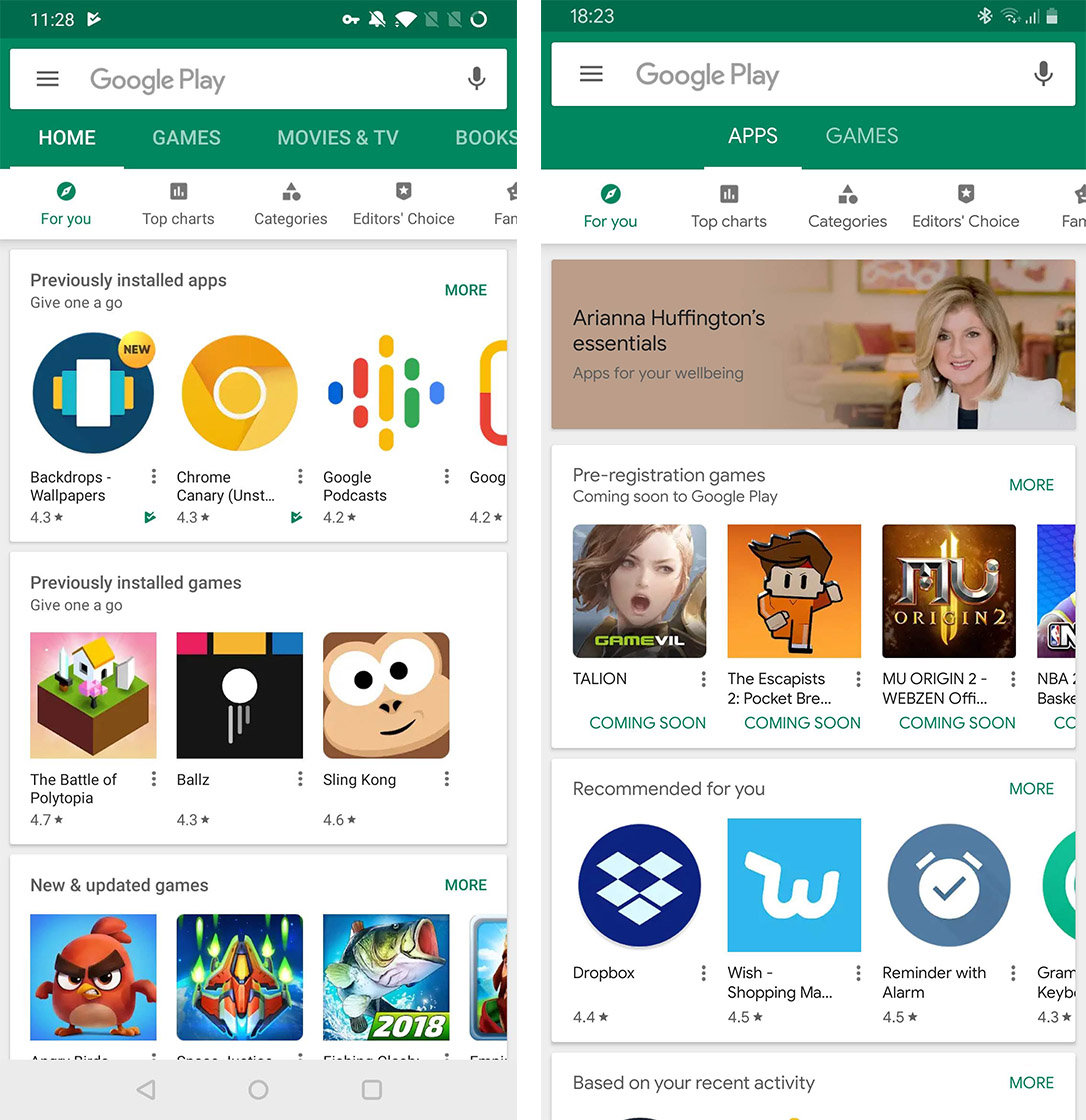
Left: Google Play Store’s old tab layout. Right: Play’s new layout.
Further, while have a separate Apps and Games section is nice, they aren’t actually separated. The Apps tab still shows games, but the Games tab at least appears only to have games.
Thankfully, this layout appears to be part of a server-side test. It’s not clear whether Google will implement this Play Store layout, but hopefully it chooses not to.
I think there are significantly better ways to layout the Play Store that this.
Source: Android Police
MobileSyrup may earn a commission from purchases made via our links, which helps fund the journalism we provide free on our website. These links do not influence our editorial content. Support us here.
