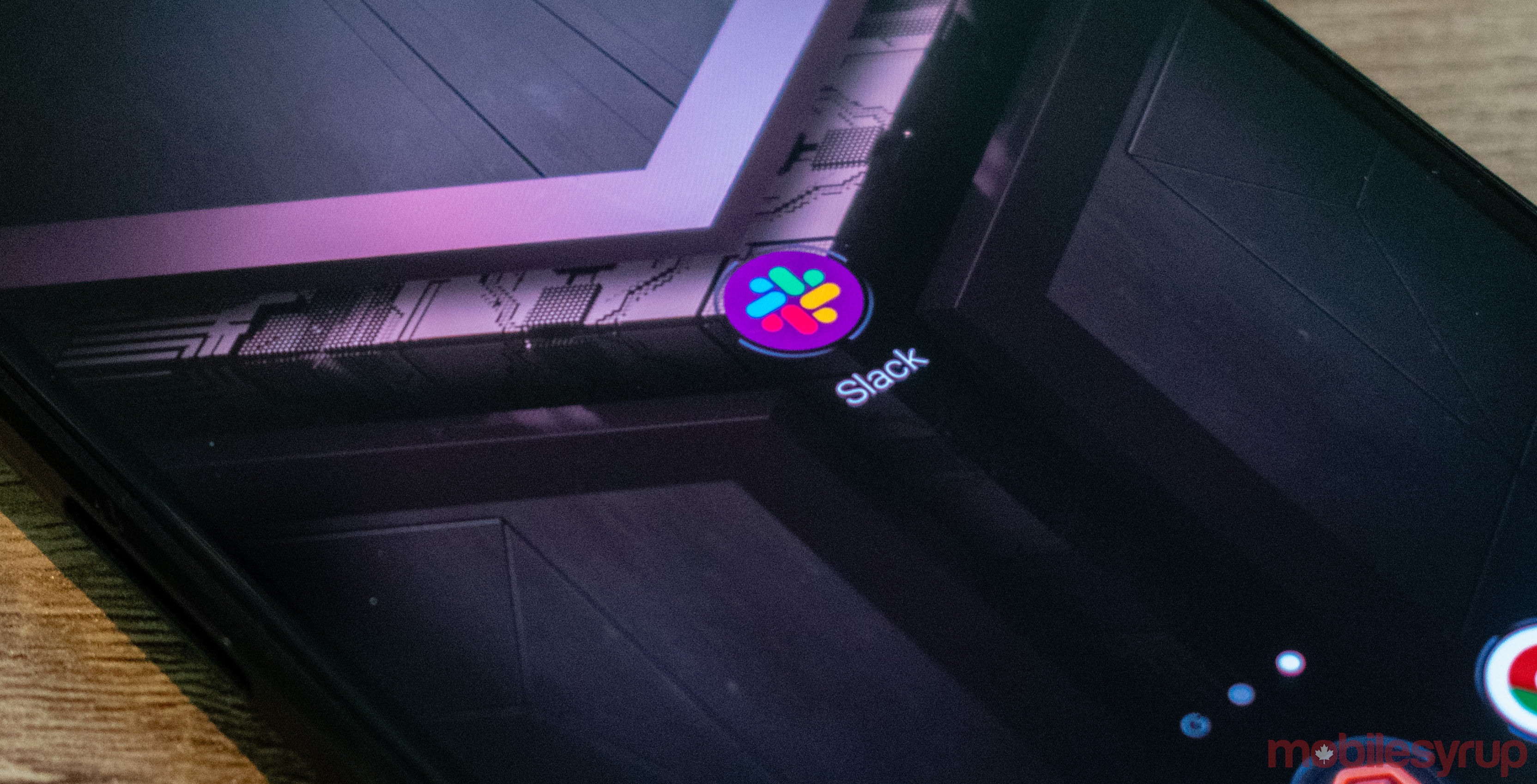
Team collaboration software Slack has updated its logo, as well as introduced a new colour scheme for its desktop and mobile interfaces.
Simply dubbed ‘Aubergine,’ the new colour scheme is a more vivid eggplant colour compared to the previous scheme’s more muted purple appearance.
Ta-da! From today, Slack has a new logo, the start of a general refresh of our look. A little simpler, a little clearer, and (we think) a little better. Read more about this change in the handy blog post we’ve written about it: https://t.co/LT1ju7kGxw pic.twitter.com/aceZMCb5St
— Slack (@SlackHQ) January 16, 2019
The new logo does away with the company’s intersecting, mutlicoloured octothorpe design, replacing it with a four-colour disconnected design instead.
“It uses a simpler color palette and, we believe, is more refined, but still contains the spirit of the original,” reads an excerpt from a January 16th, 2019 Slack blog post.
“It’s an evolution, and one that can scale easily, and work better, in many more places.”
Slack is currently in the process of rolling out updates for its Android and iOS apps that changes the app logo design, while also introducing the new Aubergine colour scheme.
Users who want to revert back to ‘Aubergine Classic’ can do so by navigating to ‘Preferences’ in the app’s drop down menu and selecting the ‘Sidebar’ setting.
Source: Slack
MobileSyrup may earn a commission from purchases made via our links, which helps fund the journalism we provide free on our website. These links do not influence our editorial content. Support us here.


