Microsoft is starting to take design more seriously with a handful of tweaks to the iOS version of Outlook ranging from a slightly refreshed look to some skillful quality of life improvements.
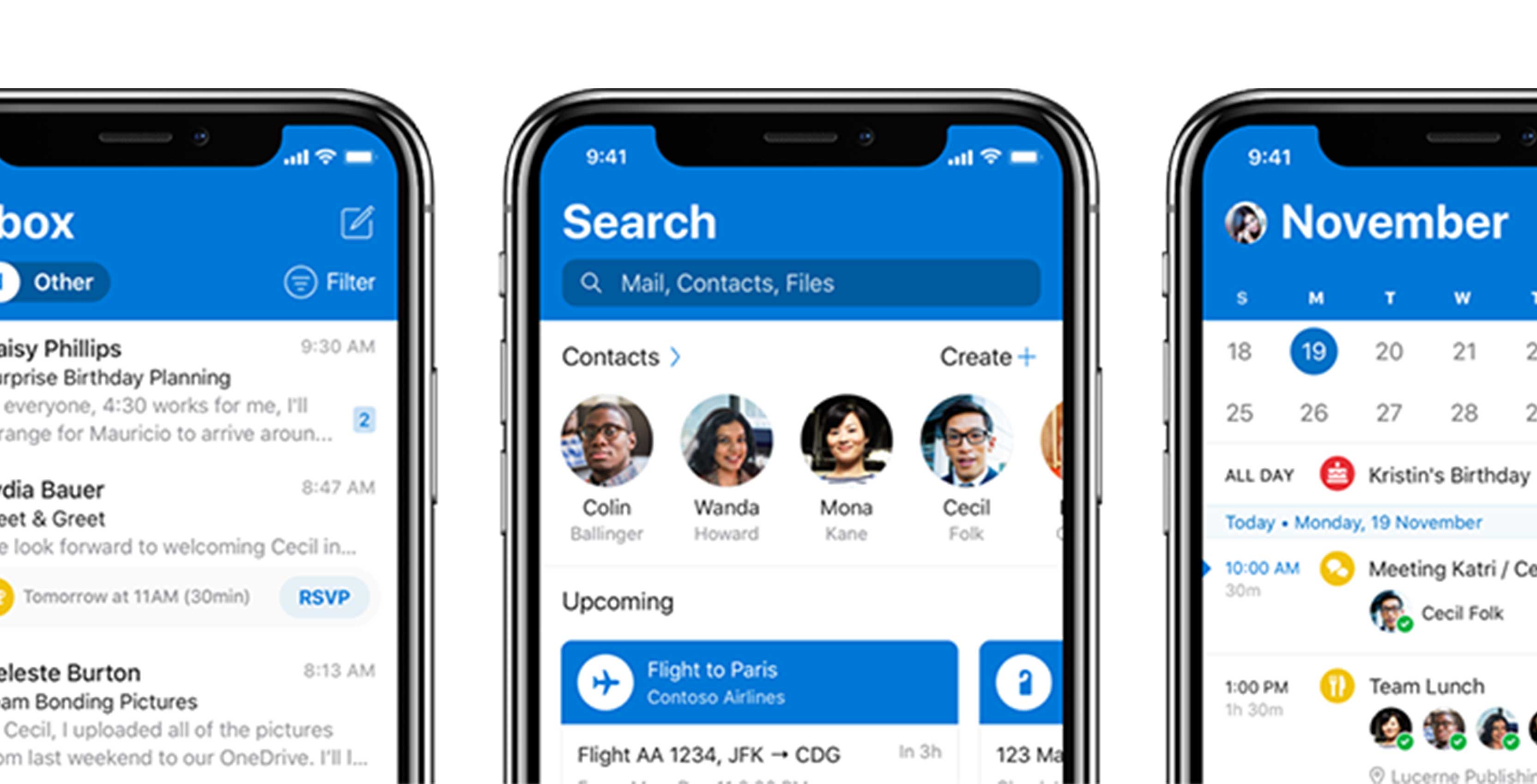
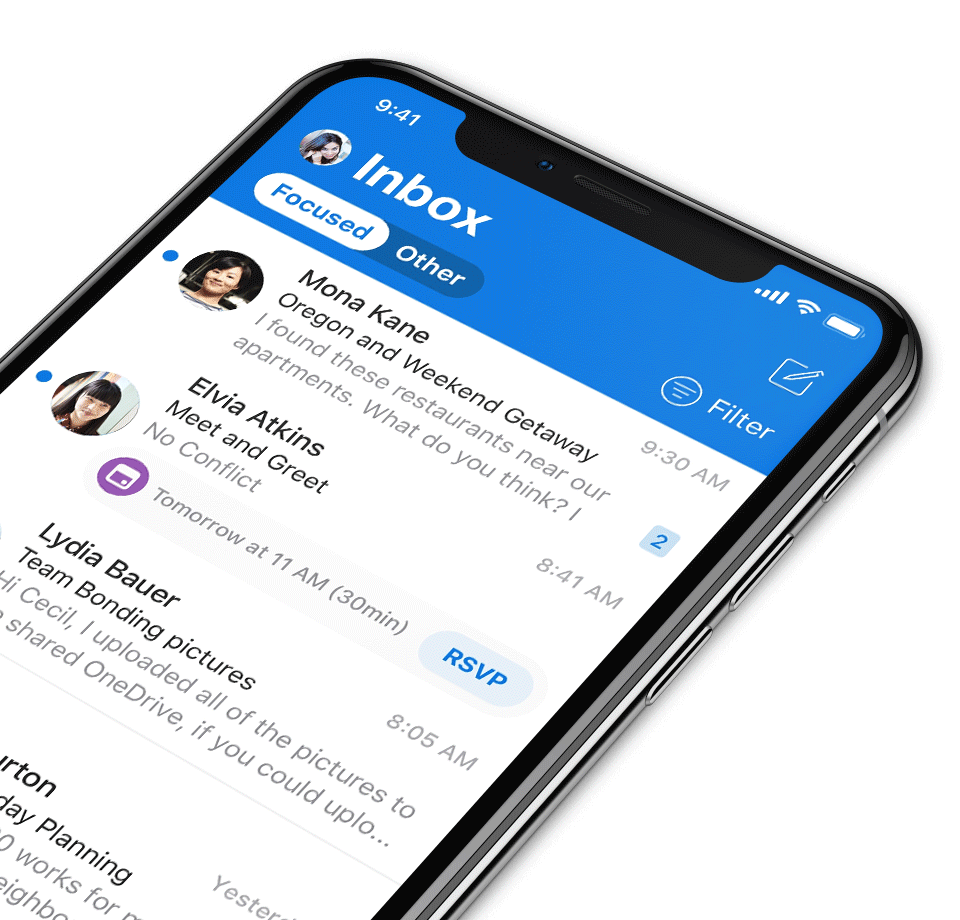
The company is now working to unify the design of Outlook across platforms by bringing the blue header from the Android version of the app to iOS.
Concerning other new visual updates, the app has gotten bolder text that that better matches Apple default app font. Overall, there is more attention to tiny details in this version of Outlook, such as the use of specific typography, animated icons and more information is now available at a glace, according to Microsoft’s Blog post. 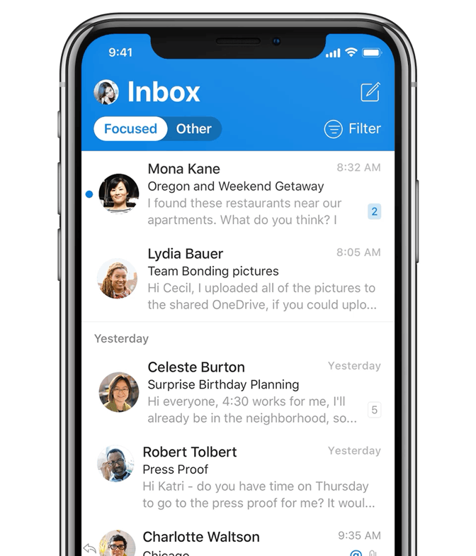
Microsoft is also adding avatars to inboxes to make it easier to find specific emails using visual queues as well as reading the subject line. Avatar icons are added to personal accounts too, so if you have multiple calendars and email accounts signed into the app, it’s now easier to see which one you’re in since the avatars help signify the distinct accounts.
There are also a few smaller changes that make the experience overall more polished. There is haptic feedback throughout the app for actions like moving email, according to Microsoft’s blog post.
The whole experience of using the mobile email and calendar app is supposed to be faster and more fluid than before.
Outlook for iOS is also getting a dark mode that will bring it in line with the web version of the app.
Overall, this is an exciting update for the iOS version of the email platform, and it will be one of the first apps to get Microsoft’s updated iconography.
There are reports that the updated app is rolling out now, but its app page in the iOS App store still features the old version at the time of publication of this story.
Source: Microsoft
MobileSyrup may earn a commission from purchases made via our links, which helps fund the journalism we provide free on our website. These links do not influence our editorial content. Support us here.
