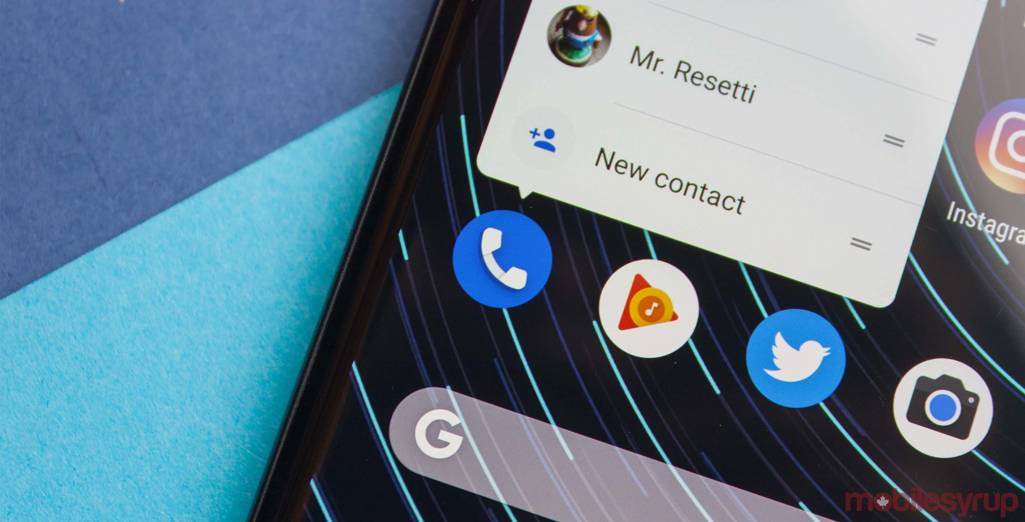
Google is keeping its promise and bringing dark mode to the Phone app.
The company teased an upcoming dark mode after updating the Phone app with the new Material Design look. However, a recent teardown of Google Phone version 24 reveals that it’s almost ready for prime time.
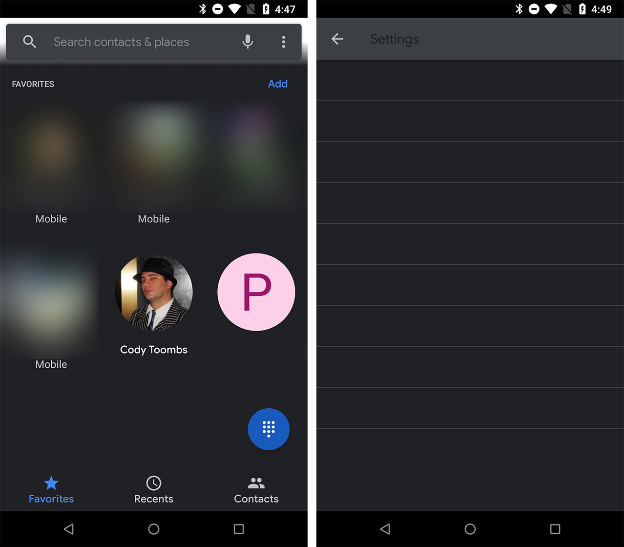
Android Police writer Cody Toombs enabled the work-in-progress dark mode using a custom Xposed module.
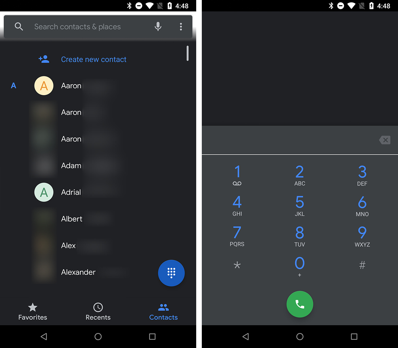
Phone’s dark theme looks very similar to the dark theme available in Android Messages. It uses dark greys instead of pure blacks and subtly changes the blue highlight colour.
While some may prefer the pure black look, I think the grey looks nicer.
Despite everything featuring the grey background, it’s clear that the development team hasn’t finished yet. For one, there’s a weird gradient under the search bar that they need to fix. Furthermore, the pastel contact icons look too bright — in Android Messages, those icons are darker.
The settings menu is also incomplete. In its current state, the top bar is a lighter grey than everything else. Furthermore, the font is too dark. The Settings title blends in with the background and you can’t see the actual menu items at all.
Additionally, Toombs discovered an inactive code string that indicates dark mode users will be able to activate dark mode through a new option under the ‘Display Options’ Settings menu.
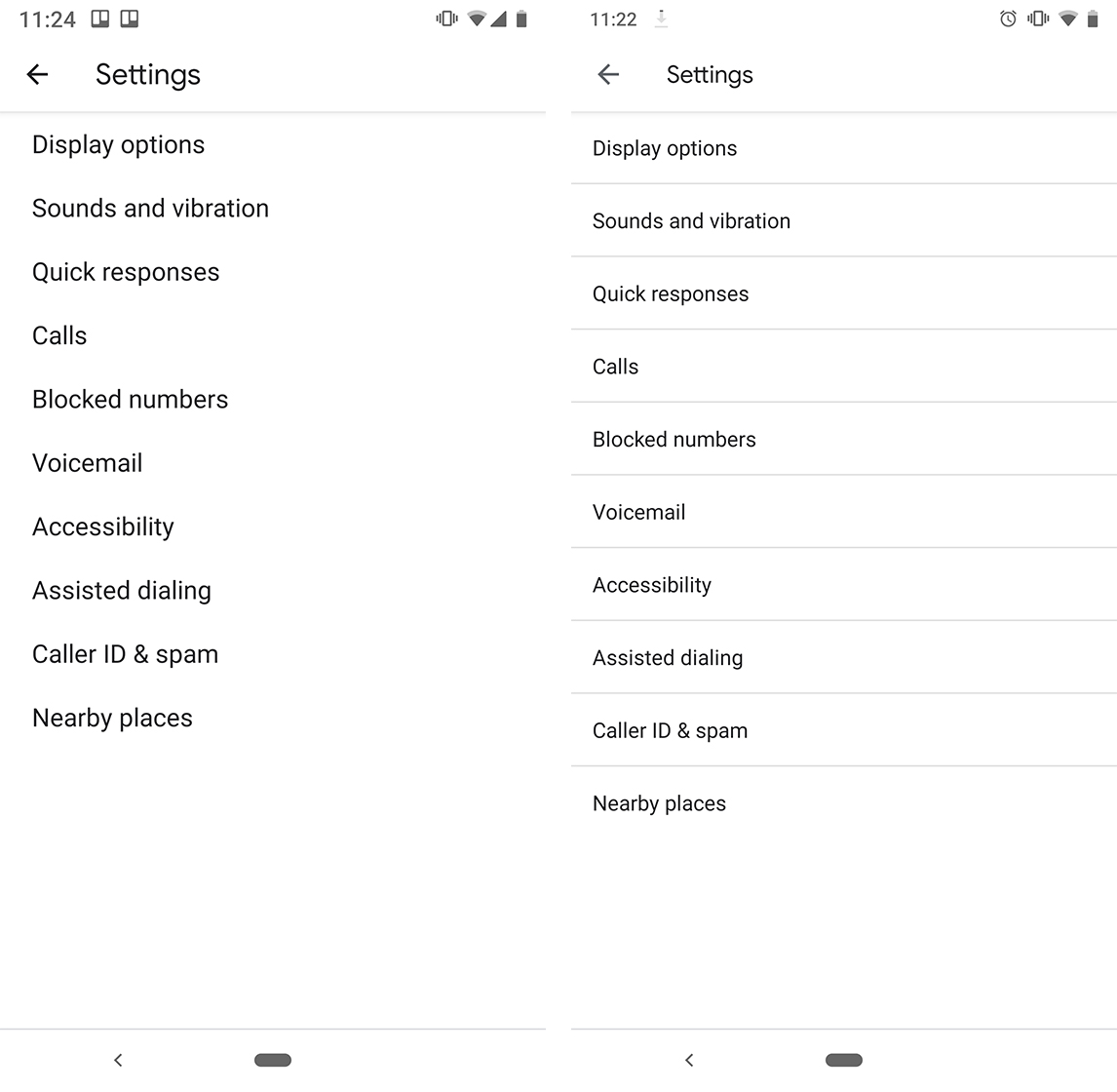
Speaking of Settings menus, Google Phone version 24 brings a small visual tweak to the app’s Settings menu. The tweak adds grey divider lines between each item in the list. You can see the dividers in the photo above (left). The old version had no dividers (right).
I don’t like this change at all. One of the core strengths of the new Google look is the use of white space to separate UI elements effectively. The grey divider lines completely defeat the purpose of white space — and it looks ugly to boot.
Source: Android Police
MobileSyrup may earn a commission from purchases made via our links, which helps fund the journalism we provide free on our website. These links do not influence our editorial content. Support us here.
