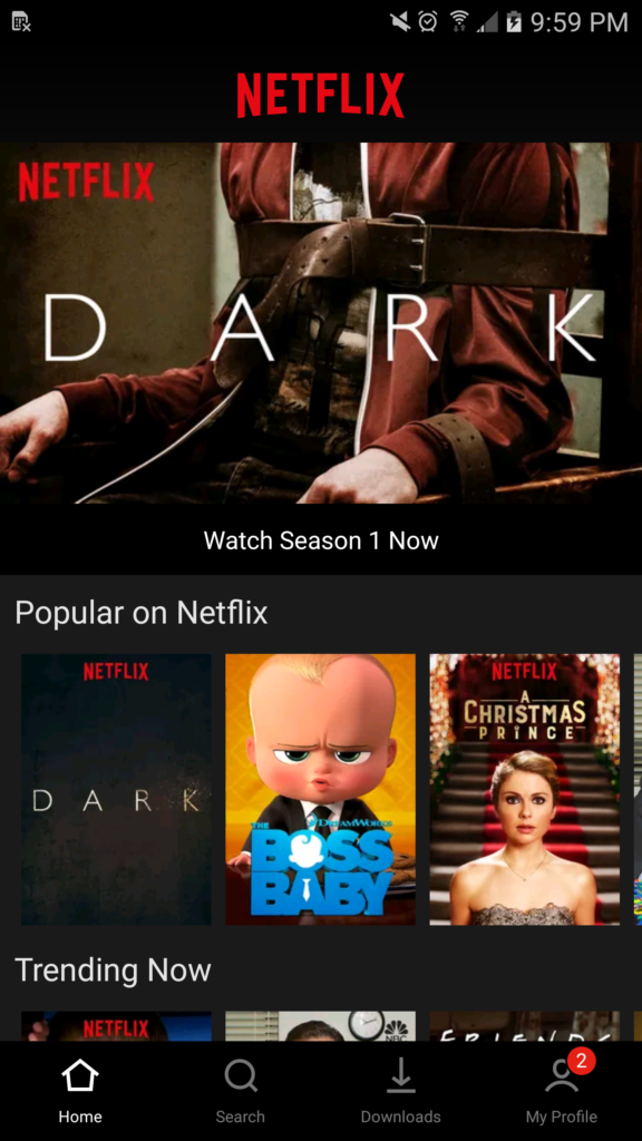
Netflix is reportedly testing a new bottom bar in its Android app‘s user interface. According to a Reddit user, the new Android Netflix app features a bottom navigation bar that replaces the current slide-out menu.
In the images provided by the Reddit user, the bar at the bottom of the screen includes links to Home, Search, Downloads and My Profile.
As well, the categories from the old navigation menu are now merged with the search page, while notifications have been integrated with the profile interface.
The Reddit user said he discovered the redesign in the regular Android Netflix app on his Samsung Galaxy S6, so it’s not a beta-specific feature.
It’s worth noting that tested features don’t always make their way to a full public release, however, so it remains to be seen what Netflix will do with its Android app’s UI.
Via: Android Police
MobileSyrup may earn a commission from purchases made via our links, which helps fund the journalism we provide free on our website. These links do not influence our editorial content. Support us here.


