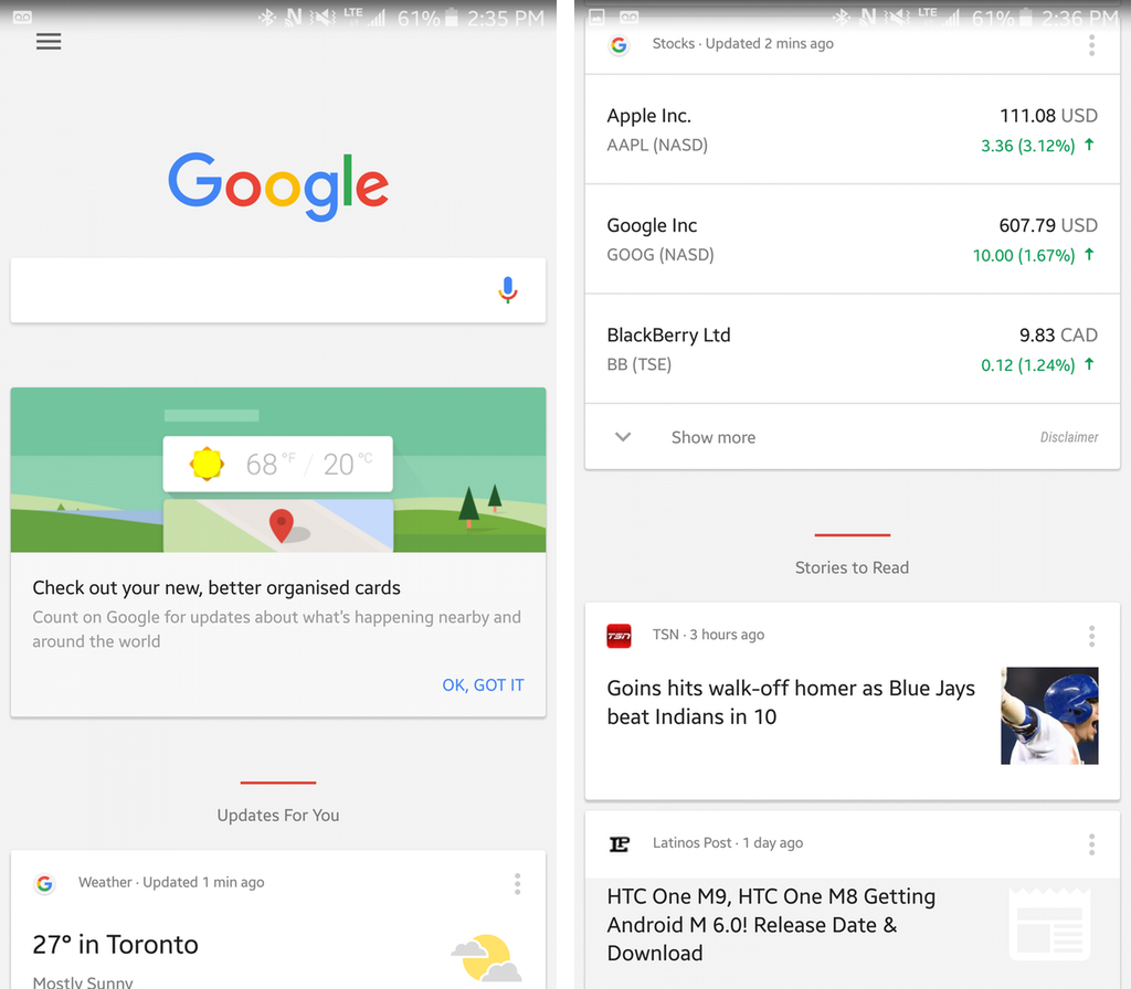
With most people still getting used to its new logo, Google has updated its Now app to reflect the company’s new identity.
The most notable change here is that Now’s Cards have a more subtle look to them. Gone are the bright colours that characterized cards in previous iterations of the app; instead, they’re completely white now, and their background is more subtle.
Swiping away a card reveals a more pronounced animation, as well as a useful menu that helps users device what to do with future cards. Organization between Now’s various cards is also likewise improved. Some of the categories include weather, upcoming events and news stories.
When performing a voice search, the underlying interface is the same, but the new loading variation of Google’s revamped logo makes an appearance while the app processes queries.
It’s likely this update to Google Now is a sign of things to come when it comes to the company’s own suite of apps; we’ll likely see Google redesign its other apps in the coming days and weeks.
Update Google Now by visiting the Play Store.
[source]Google Play[/source]
MobileSyrup may earn a commission from purchases made via our links, which helps fund the journalism we provide free on our website. These links do not influence our editorial content. Support us here.


