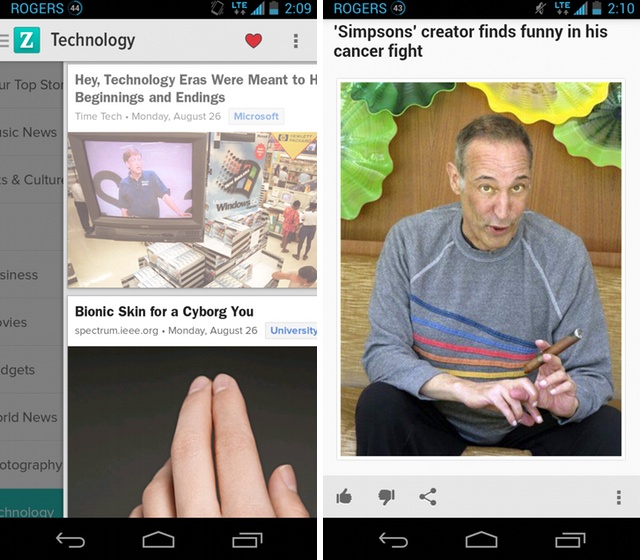
After 18 months of languishing in the dustheap of Android design, Zite has relaunched on Google’s platform with a redesigned native app that looks great and works even better.
Zite was one of the earliest “magazine-style” news readers for mobile, competing with Flipboard for eyeballs when both were Apple exclusives. Now that times are different, developers are being forced to take Android seriously, and the team, after relaunching their iOS version in December, turned their attentions to building a Holo app for Android.
Utilizing the now-recognizable (and increasingly ubiquitous) “hamburger” icon on the top left, users have a full screen view that can be interrupted by swiping from the edge of the left side at any time. Users can then draw down on a specific category, such as TV or Technology, or search through a list of favourite topics in the Quicklist.
The app takes advantage of some Android-specific features, too, adding a scrolling widget and new sharing menu, along with S Pen support for Galaxy Note users.
Zite’s claim to fame, and partly the reason it was purchased by CNN in 2011, is its recommendation engine, which hones in on content the user will enjoy consuming. After reading certain topics, or from specific outlets, it grows more intelligent, pushing better content to your home screen.
The team has also launched a first-generation Google Glass app, which lets users scroll through 10 stories quickly and easily.
[source]Google Play[/source]
MobileSyrup may earn a commission from purchases made via our links, which helps fund the journalism we provide free on our website. These links do not influence our editorial content. Support us here.


