Samsung’s “S1” also known as the Galaxy S, should have been more like the iPhone, according to an internal document that Apple managed to submit into evidence at the trial currently happening in California.
The trial, in which Apple is attempting to prove that Samsung copied its designs not only for the original Galaxy S i9000 but subsequent smartphones and tablets, has been revelatory not only for its evidence submitted but for its look behind the perfect sheen of both companies’ internal processes.
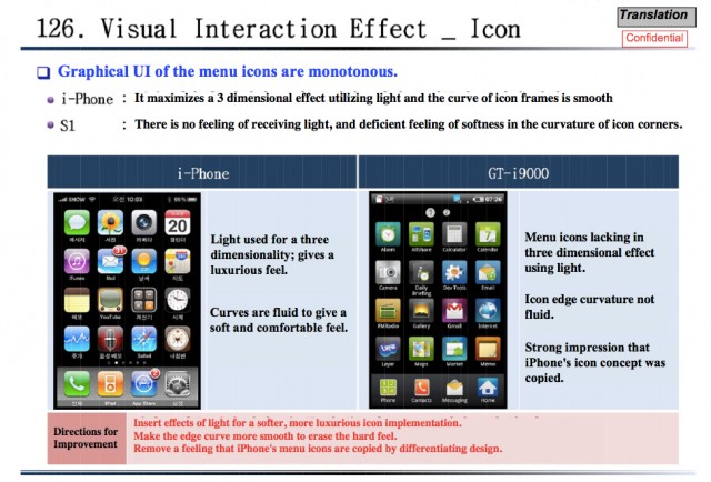
In this 132-page internal document submitted by Apple, Samsung is found comparing the home screens of the the iPhone 3GS to the Galaxy S and finds its product wanting. “Menu icons lacking in three dimensional effect using light,” and “Icon edge curvature not fluid,” are two admissions on Samsung’s part, but also that they acknowledge even without that added luxury the two home screens could be mistaken for one another.
This certainly adds credence to Apple’s accusation that before the iPhone, Samsung did not know exactly what it wanted to do with this emerging capacitive touchscreen technology that was spreading so quickly through the industry. Samsung argues that a number of its devices before the iPhone was even announced utilized the very magic — multitouch, icon-grids — that the iPhone seems to have defined in the industry. Apple argues that just isn’t true, and that once the iPhone was released Samsung’s designs changed drastically.
Check the full doc here at AllThingsD
MobileSyrup may earn a commission from purchases made via our links, which helps fund the journalism we provide free on our website. These links do not influence our editorial content. Support us here.
