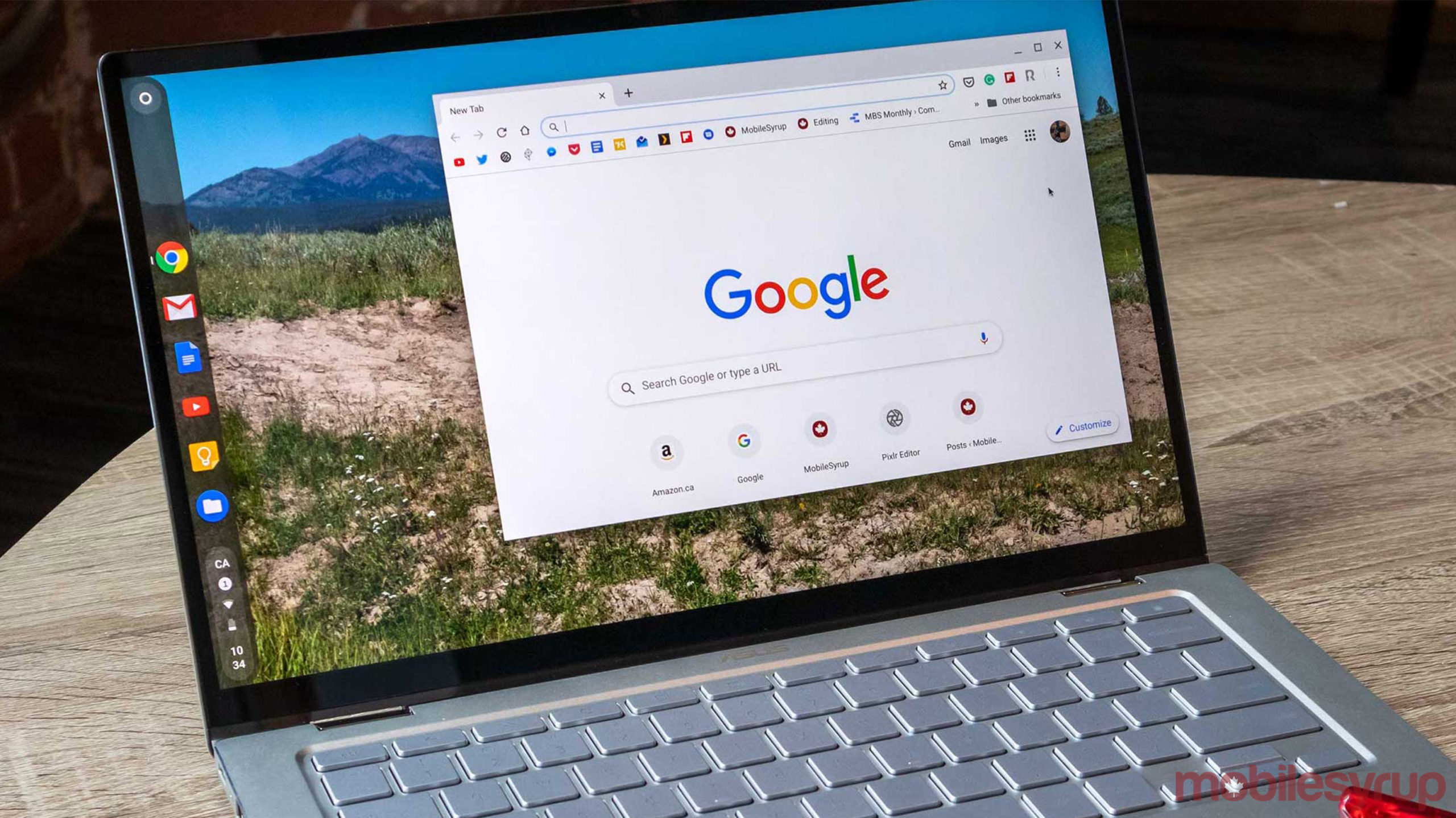
Google announced a redesign of its mobile Search experience a few days ago, and now it seems some of those changes are coming to the desktop layout.
9to5Google reports that the search field is now always raised above the rest of the page. Prior to the change, this only happened when you hovered over it.
Another small tweak shrinks the blue underline that appears under the current category you are in, such as ‘News’ or ‘Images.’ This minor tweak matches Google’s mobile redesign.
The biggest change appears to be the use of Google’s exclusive font ‘Google Sans.’ The font is now used for page names and Search controls. Google previously only used the font for section headers. It’s worth noting that site descriptions and other text are still visible in Roboto.
These changes haven’t rolled out widely but are visible to some users. It’s unknown when or if Google plans to roll this out to all users.
Google’s recently announced mobile Search redesign adds pops of colour to make it easier for users to find what they’re looking for. The search giant has made text bolder and titles larger. There are also other minimal changes aimed at improving the user experience.
Source: 9to5Google
MobileSyrup may earn a commission from purchases made via our links, which helps fund the journalism we provide free on our website. These links do not influence our editorial content. Support us here.


