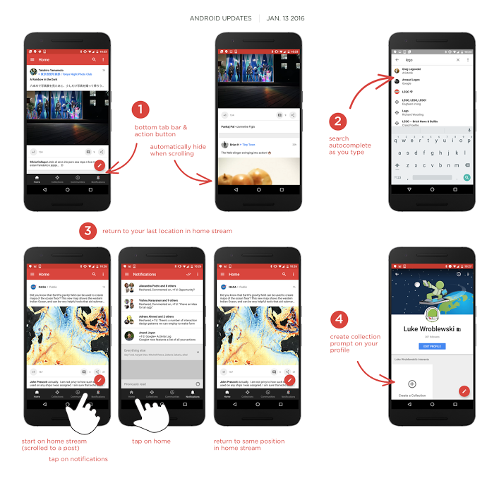
It was only in November that Google comprehensively redesigned the Google+ Android app, and two weeks into 2016 the company is busy adding a couple of refinements to the design of its social network.
The main change here is found at the app’s bottom navigation bar — this is the one that makes it easy to jump between collections and communities, the two main features the Google+ team decided to highlight with its most recent redesign. The bar will now automatically hide when the user scrolls far enough down their feed. Moreover, the home screen will now remember you left it, even when switching to a different part of the app like the notification screen.
There are also a variety of bug fixes (69 to be exact, according to the company), as well as usability fixes.
According to Google, the update will roll out to users over the next couple of days.
[source]Google+[/source]
MobileSyrup may earn a commission from purchases made via our links, which helps fund the journalism we provide free on our website. These links do not influence our editorial content. Support us here.


