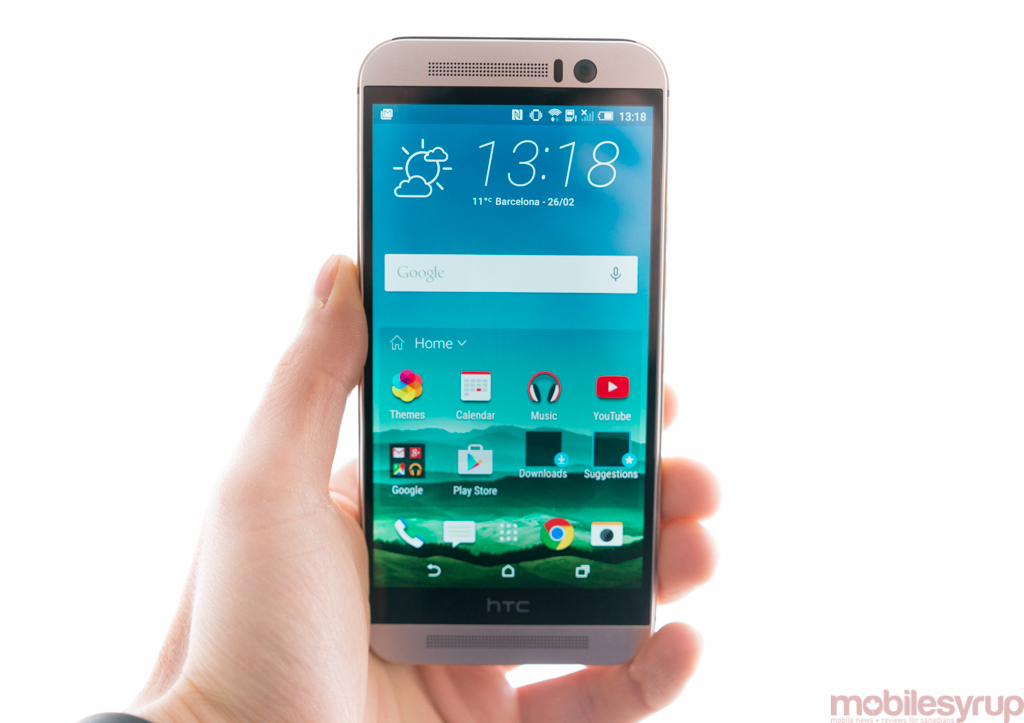
Once again, HTC has unveiled what is sure to be one of the year’s best smartphones. That shouldn’t be a surprise, though; they’ve done it annually for the past several years. But what sets the HTC One M9 apart from the rest of the industry’s top contenders is the deliberate and somewhat conservative nature of its upgrade process.
The One M9 embodies a series of small visual changes meant to address some of its predecessors’ shortcomings.
Yes, the One M9 has an all-new 20MP camera and a fast-as-hell Snapdragon 810 chip, but it’s the places that HTC held back that impress the most.
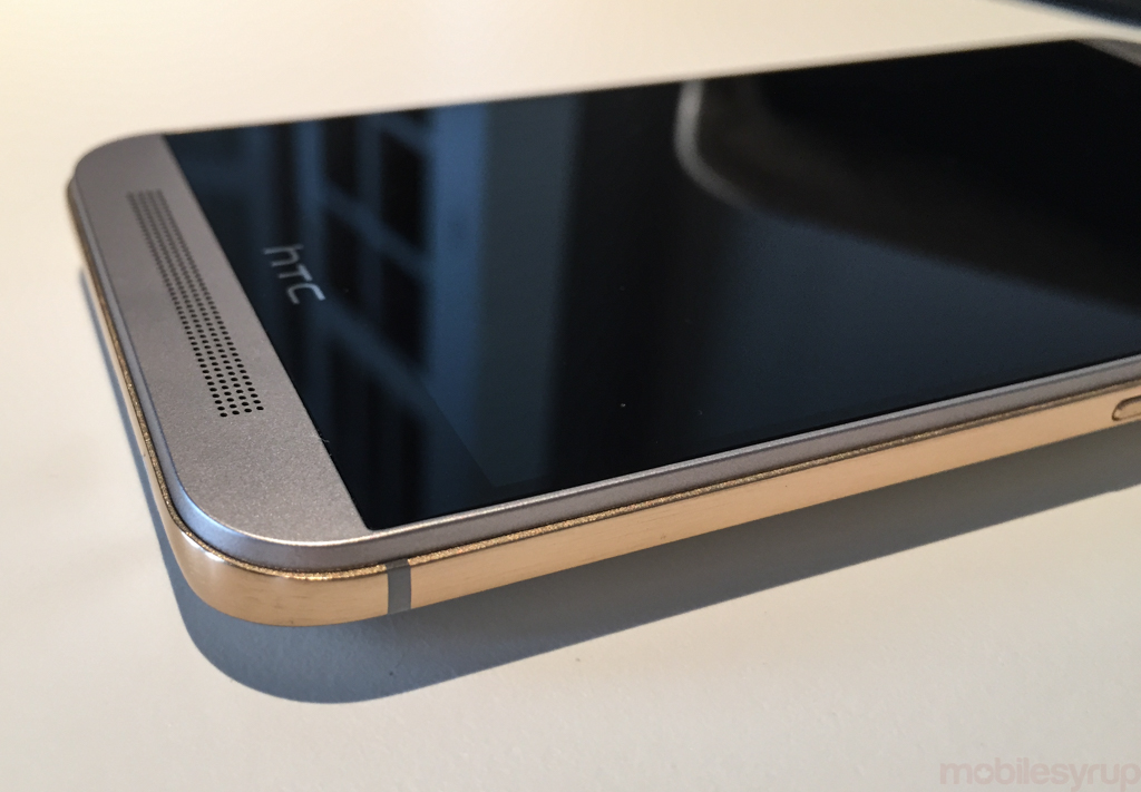
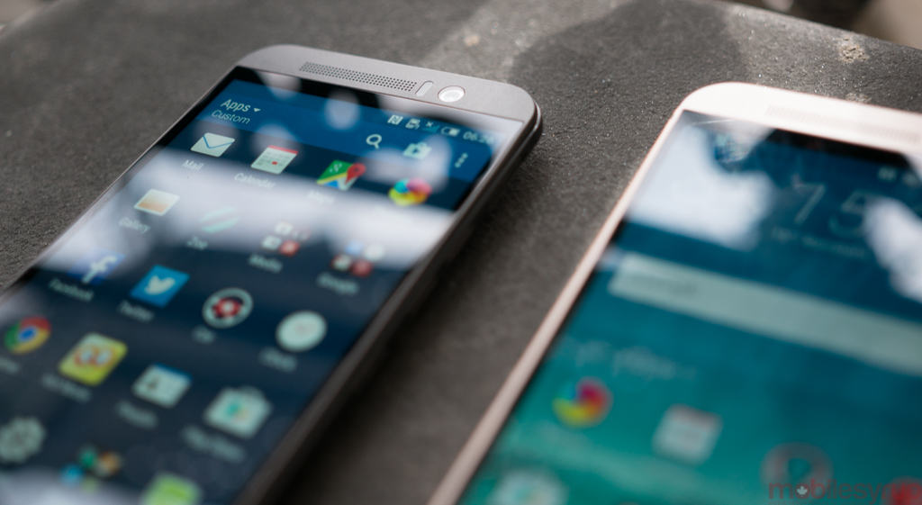
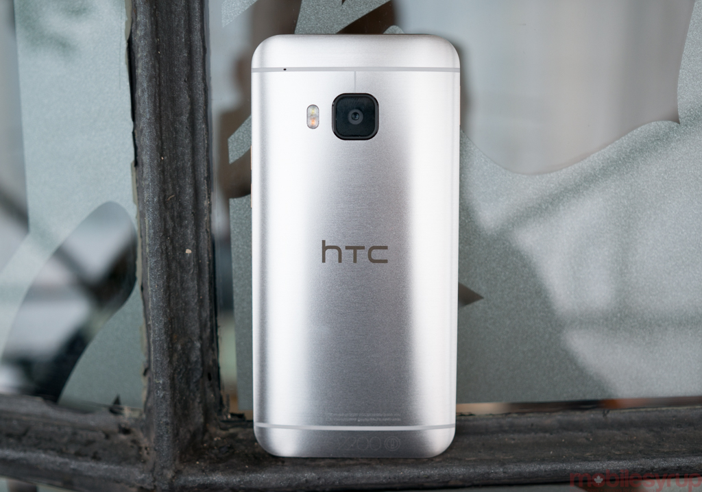
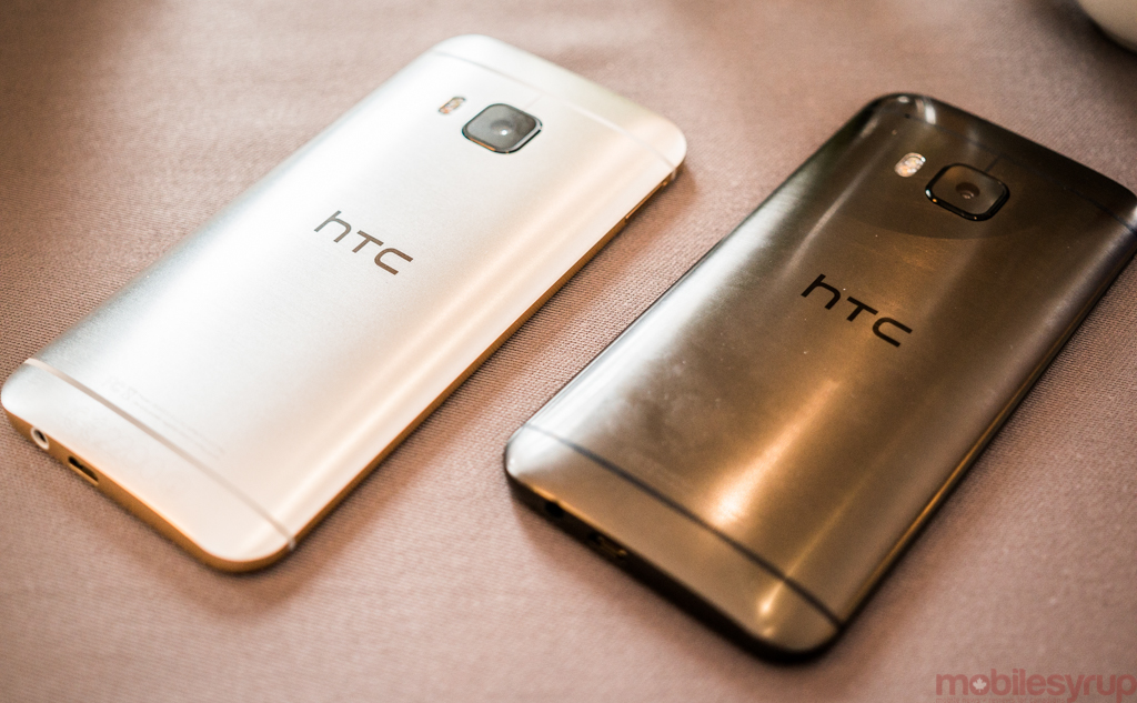
There’s a new manufacturing process — dual annodization — that places two aluminim pieces of the chassis in contrast. On this model, you see a silver body onset with a gold perimeter, but there’s also a two-toned gunmetal variant and a champagne gold model similar to last year.
Indeed, one has to look closely to find the major changes to over the M8; it’s marginally lighter and shorter than its predecessor (though around 1% thicker), which amounts to a phone somewhat easier to hold and use with one hand. It is still slightly too tall, and a bit slippery, but the Taiwanese OEM has clearly taken pains to optimize the chassis for what it believes is the ideal hand-to-screen ratio.
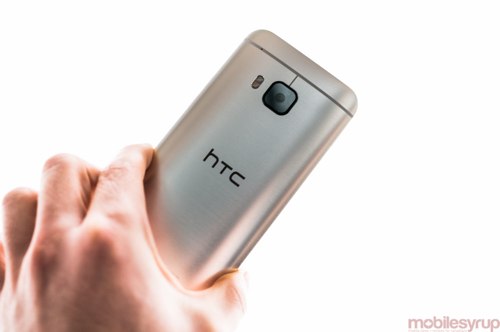
During our briefing, HTC was adamant that it feels flagships have grown too unwieldy, more suitable to content consumption than performing basic functions. The One M9 is still slightly too big for our liking, but so is nearly every other flagship released in the past two years. That HTC even attempted to make the new One more compact speaks to its admirable design philosophy.
The 1920×1080 pixel screen, too, is upgraded from its predecessor — richer colours, better outdoor visibility and some notional viewing angle improvements — but more impressive is the confidence on HTC’s part to know that a 5-inch 1080p display is the best compromise between size and performance for its loyal customer base.
The screen is somewhat colder than the M8’s, and that leads to a more AMOLED-like colour palette, though not as saturated. Blues are bluer, obviously, but whites are more accurate — less grey — while greens and reds are more pleasant to look at, especially at lower brightness levels.
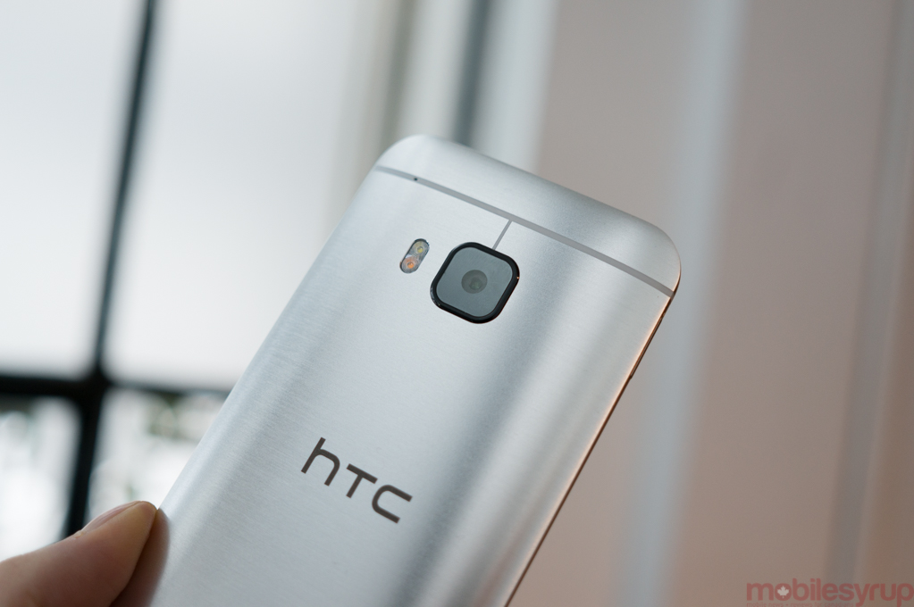
Where HTC has changed things, and not entirely for the better, at least according to the results from this pre-production model, is in the camera. The company opted out of another low-resolution, high-pixel-size UltraPixel sensor, and swung wildly the other way. Not only does the 20MP sensor sport a strange 10:7 native aspect ratio, but despite the outstanding amount of detail, the unit I used had plenty of trouble with autofocus — contrast-based, not phase detection like in the Galaxy S5/Note 4 — and couldn’t be trusted with white balance. We were told that our test software is unfinished, and white balance improvements will be made before devices ship to consumers in March, so we’ll hold off our criticism until then and let the samples speak for themselves.
On the plus side, the sensor, as stated, does capture an amazing amount of detail — it ought to, since it’s five times the resolution of the One M8 — and outdoors it captured some remarkable images. Some of that can be chalked to HTC’s superlative camera software, which looks the same, but has received numerous speed and feature improvements. It is still one of the only OEM apps to support manual controls like shutter speed, ISO, focus and white balance, but HTC intends to release an update shortly after the phone’s release to add RAW capture support.
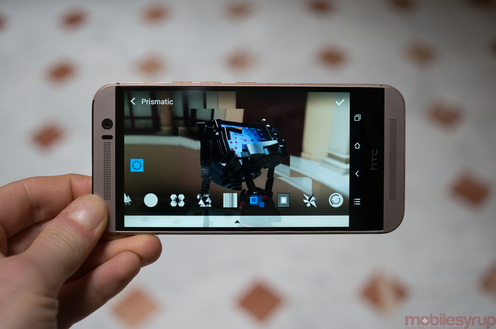
The company has also thoroughly improved its editing suite, featuring a number of effects that HTC’s head of design, Drew Bamford, calls “significantly less cheesy,” and “mature.”
Features like Double Exposure and Prismatic, which overlay two photos on top of one another, or add tasteful shape effects, respectively, are, like many of HTC’s projects, inspired by third-party apps, but are so carefully implemented into the OS that they feel natural in ways that no app could.
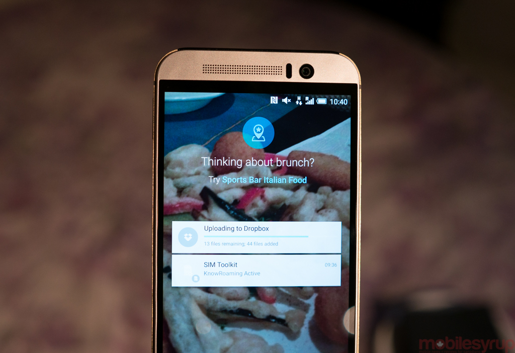
The same can be said for BlinkFeed, which has also been overhauled in this version. Now that Lollipop supports lock screen notifications, BlinkFeed will detect a user’s location and push restaurant recommendations depending on the time of day. HTC has partnered with Yelp to deliver these targeted suggestions, and they’ll only show up when a restaurant comes highly recommended — no sponsored ads on your lock screen, HTC promises.
The renewed BlinkFeed is just one aspect of Sense 7.0, which doesn’t look all that different from previous versions, but extends the idea of context to more areas. Now, a home screen widget orders most frequently-used apps based on automatically-generated Home, Work and Out profiles, the locations of which can be custom-set, and another folder recommends apps based on ones currently installed. While HTC says that the recommendations are for now organic, they’re open to monetization and sponsorships down the road. Luckily, like many of Sense’s other less desirable aspects, this one is removable.
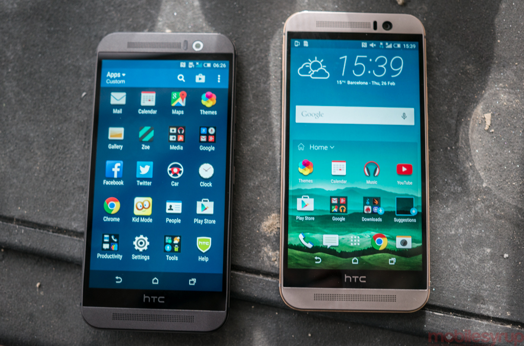
Curiously, while the native apps have received moderate design updates, this version of Sense looks and feels more like the previous version than any one before it.
Sure, HTC conforms to certain aspects of Android 5.0’s framework, most notably in the way it conveys notifications, but the company has gone so far as to retain the volume behaviour from KitKat which, while not as versatile, is much less confusing (and doesn’t mute alarms when the notifications are silenced).
The company has also added a few interesting tweaks to its UI. Users can now add a fourth button to the virtual navigation area, such as quickly pulling down the notification shade, locking rotation, or turning off the screen. There’s also an extensive Themes manager, which extends to the web through a WYSIWYG editor that will be launching later this quarter.
Users can modify everything from the wallpaper to the sounds, icons and fonts, but the most interesting part is that the Editor can automatically generate a theme based on an image in the gallery. Say you take an image of a crisp fall day, with lots of reds, oranges and greens; the theme will incorporate those three main colours, and warp the icon shape to best suit an “autumn” mood. Like the improved image editing suite, the additions of themes alters the device in subtle but meaningful ways.
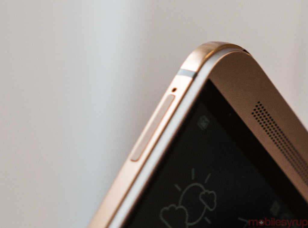
On the hardware side, the One M9 runs a 64-bit octa-core Qualcomm Snapdragon 810 chipset at 4 x 2.0Ghz / 4 x 1.5Ghz, along with 3GB of DDR3 RAM and 32GB of internal storage. The microSD slot remains, but HTC has (finally) moved the power button from the phone’s top to the right side, and along with the new anodization process has textured it to make it more easily distinguishable with the volume buttons, also (unfortunately) on the right.
After hearing about thermal issues with the Snapdragon 810, I performed a few runs of AnTuTu to see if the high scores scaled back after several completions, and the drop was within the scale of most devices; while the M9 gets hot after intense use, it’s no more so than the One M8, and users shouldn’t notice a problem. Performance seemed spritely, and certainly a noticeable jump over the M8 running Lollipop.
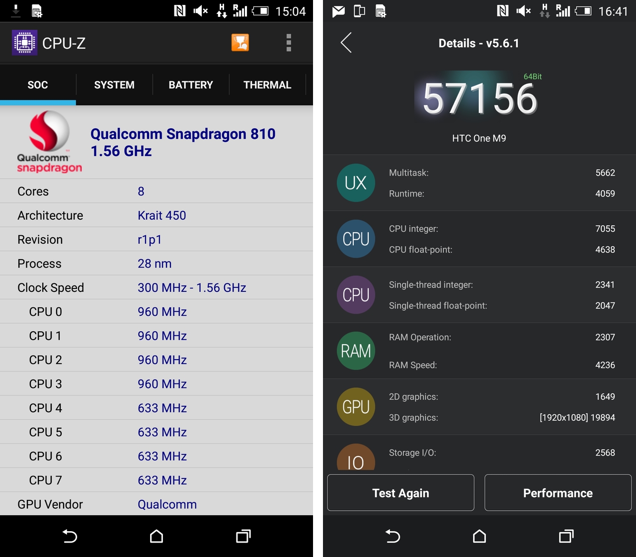
While I don’t encourage taking much away from the results, due to unfinished software, etc., I performed our standard benchmark suite on the M9 and recorded a 5-20% jump in performane in nearly every one. Some, like AnTuTu, were optimized for 64-bit chips and scored higher as a result, while others merely benefited from the eight cores in multi-core tests. Single threaded performance stayed about the same, owing to a more efficient AArch64 design but a slightly slower core clock speed.
The camera is really the story here, which is why we’re going to end there, until we get a review unit. HTC hasn’t quite given up on the UltraPixel, but by moving it to the front, where people are less discerning, and more likely to take the kind of indoor shots that require larger, light-friendly pixels, the company is acknowledging a passive kind of defeat.
And while we’ll wait until the shipping hardware to pass final judgement, it seems that the camera saviour we were looking for from HTC — higher resolution while retaining the same intelligent pixel sensing that made the One M7 and M8 so much fun — has vanished. Indoor shots were inconsistent and often unusable, garbled messes of warped colour and grain. HTC touts its intelligent processing as the differentiator between it and other Android OEMs, but now that it has the hardware chops to match them, it will need to show us something better than this to get ahead.
In many ways, the One M9 is exactly what I, and many others, are looking for in an Android device. Beautiful, careful design married to deliberate materials that feel natural, and an extension of the software which it powers. The M9 is more comfortable, less slippery, and more premium-feeling than the already-superlative M8, and while we didn’t test it for long enough, the 2,840mAh battery should last longer, too.
If HTC can iron out the last remaining kinks in what promises to be a wonderful Android phone, I’ll look forward to recommending this device over most other Android flagships on the market.
That’s a big “if.”
MobileSyrup may earn a commission from purchases made via our links, which helps fund the journalism we provide free on our website. These links do not influence our editorial content. Support us here.


