Now that I’ve spent a little time using the first Android 12 beta, I’ve found a ton of new design elements that we’ll compare below.
If you have a Pixel 3 or newer, you can learn how to install the beta for yourself, here. It’s also available for devices from other manufacturers, but early reports indicate the beta is less stable on non-Pixel phones.
If you missed out on all the news from Google’s big I/O keynote yesterday, you can check out our recap here.
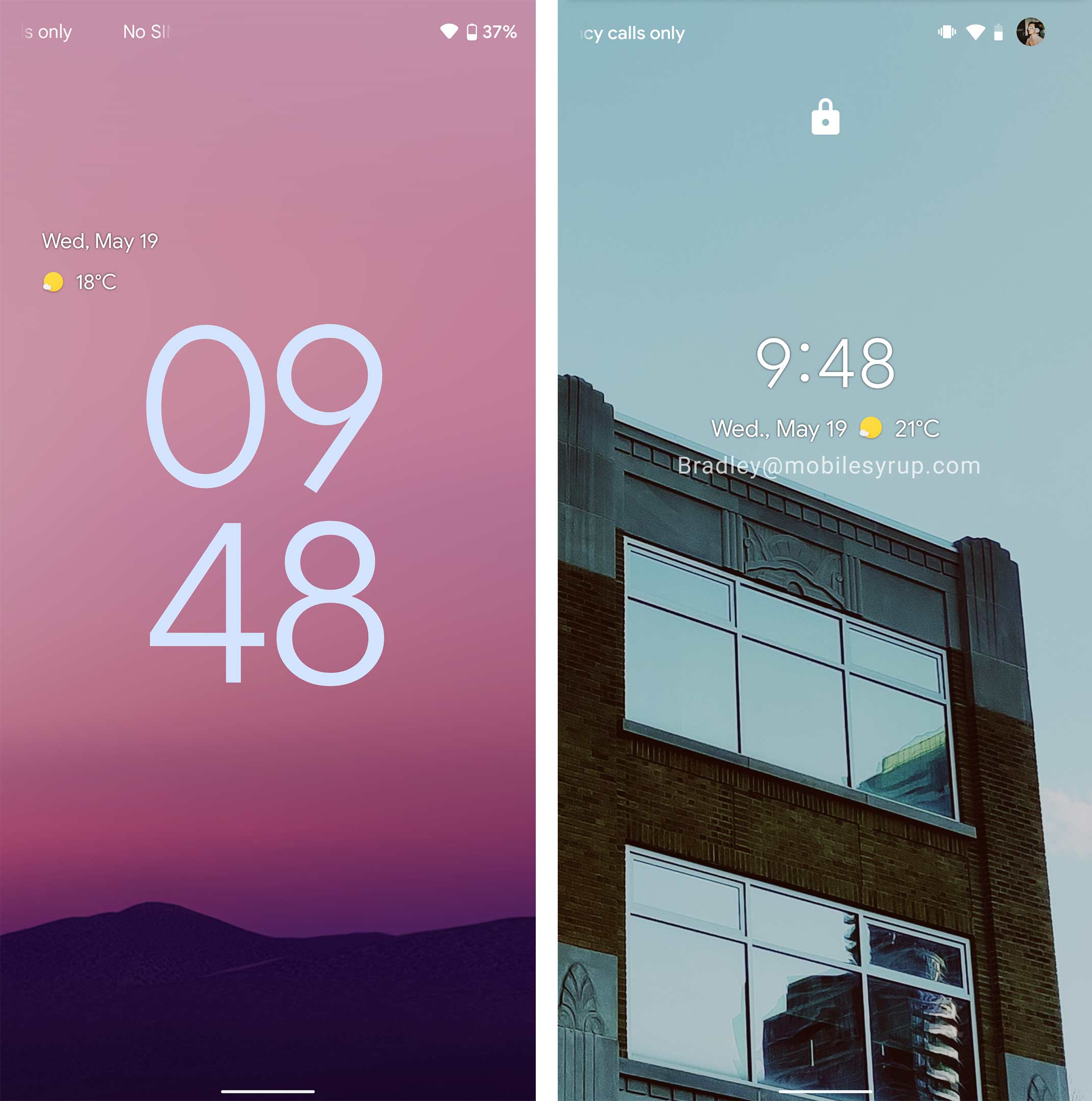
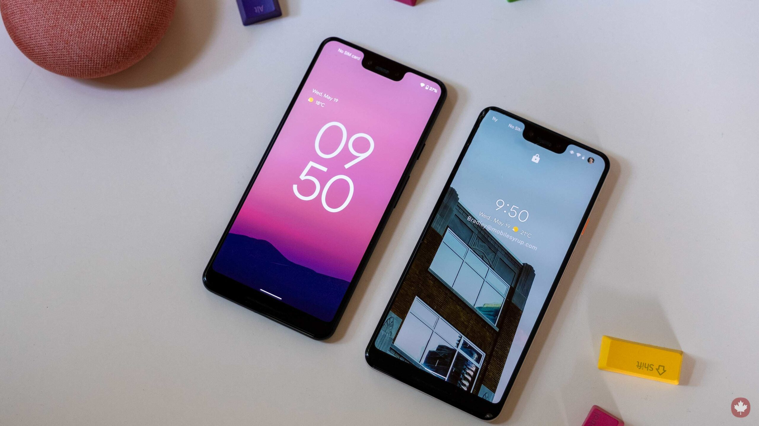
The left image is the new Android 12 lock screen. It features a giant clock when you don’t have any notifications.
![]()
The Always-on-display also reflects this new system.
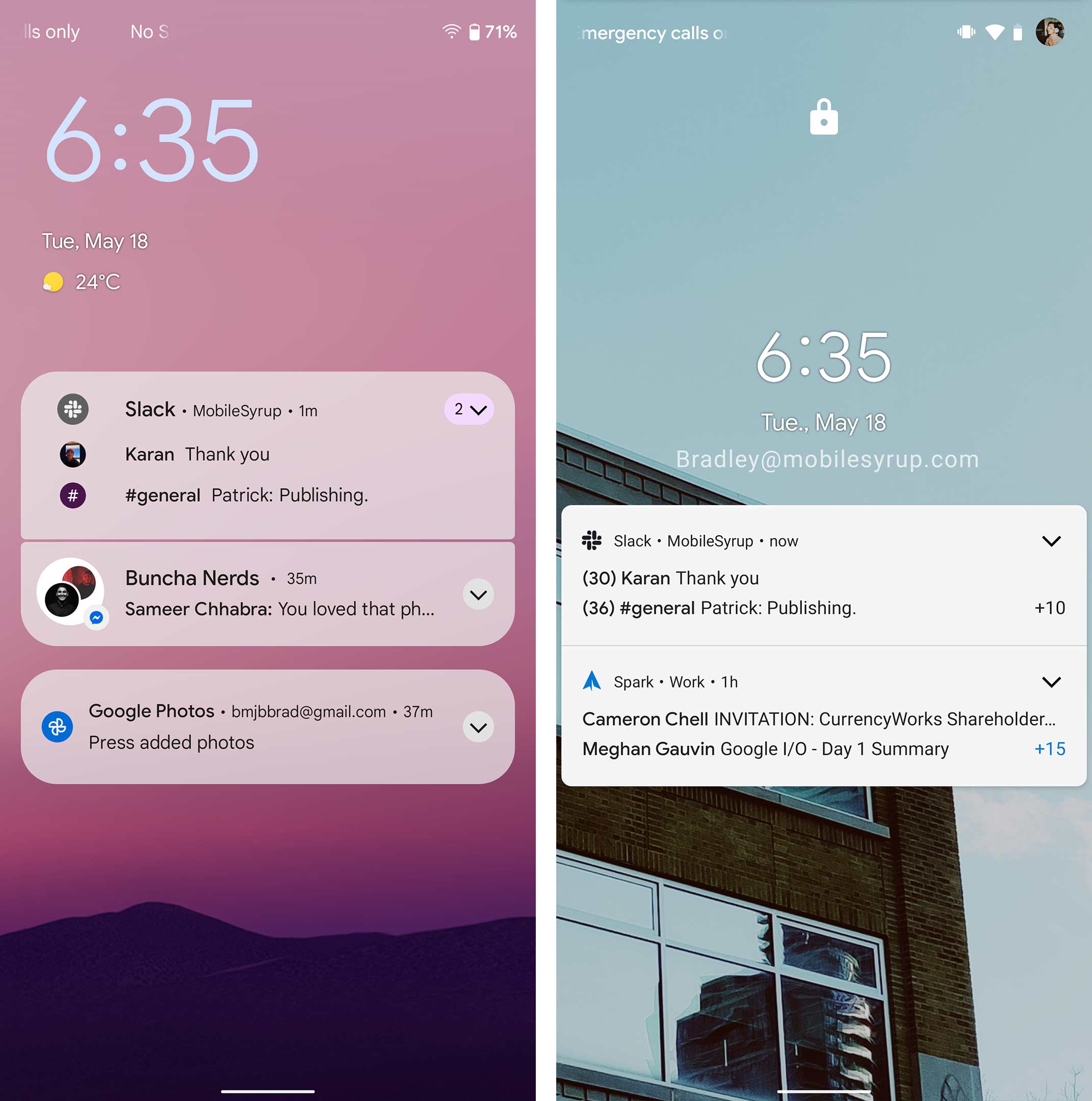
If you do have notifications, the lock screen looks like this instead.
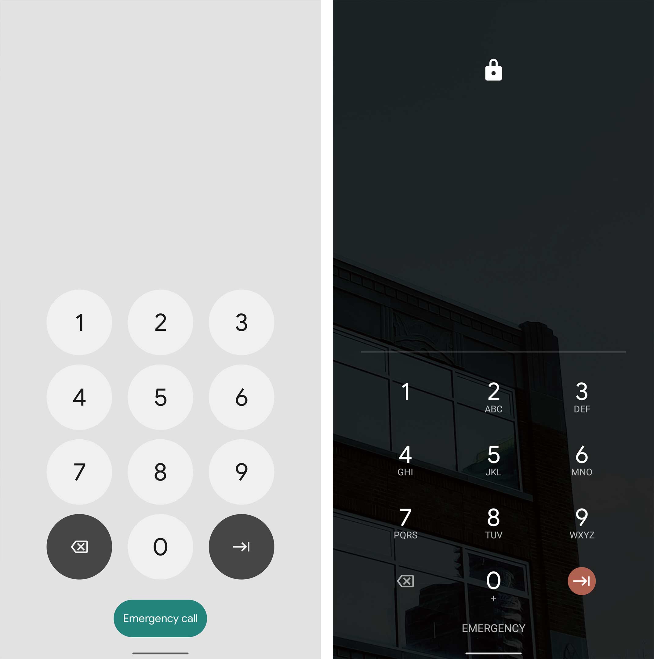
As you enter the phone, the keypad for inputting your pin has been updated. Whenever you tap on a new circle number button it quickly becomes a square to visually show that you’ve touched it.
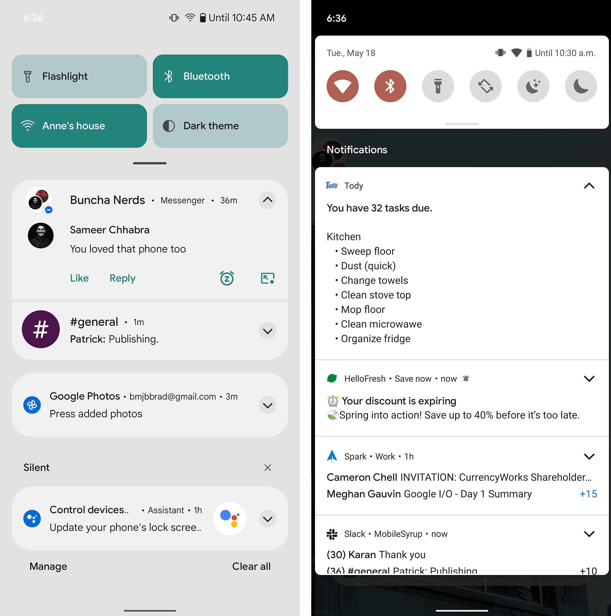
The new notification shade has a lot more space and looks cleaner. The quick toggles at the top are also representative of whatever accent colour you’ve chosen in the Styles section of Android. In the above image, my accent colour is teal and below it’s orange. It’s also worth noting that Wi-Fi, Bluetooth and other icons haven’t changed in Android 12 — you can still customize them by selecting from various styles in the ‘Styles & wallpapers’ app.
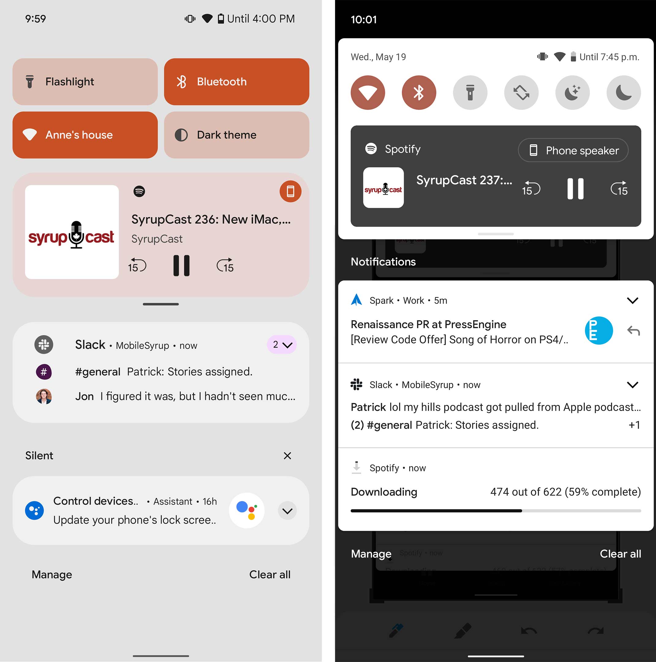
This is what it looks like if you’re playing media. The media player no longer adopts colour elements from the app it’s playing from or the cover art and now just utilizes your selected accent colour.
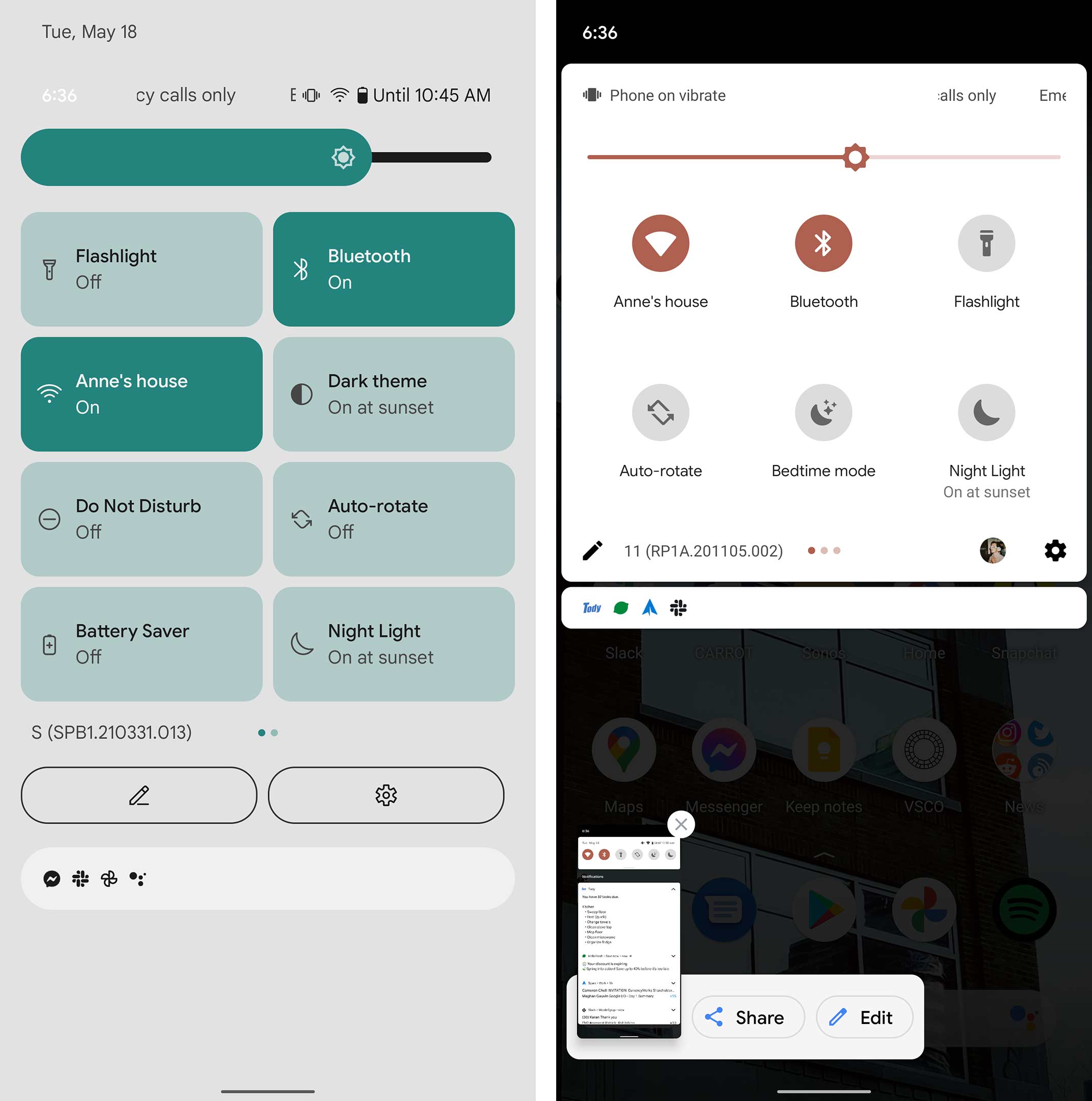
This is what the new quick toggles look like. In the Android 12 design trailer, it also shows a power button beside the new edit and settings icons.
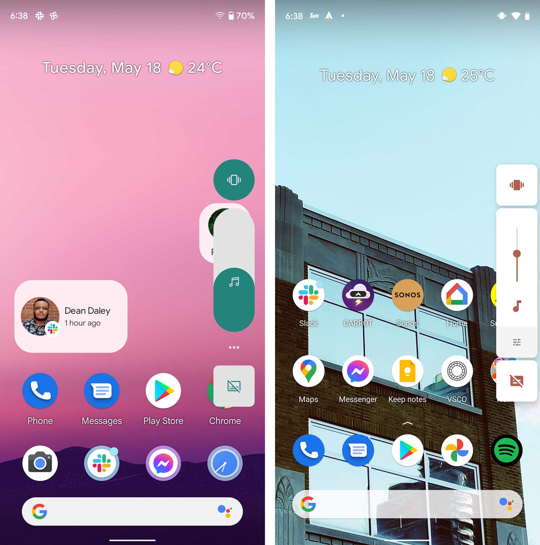
The home screen hasn’t changed too much, but you can choose a new 4×4 app grid if you want and the volume slider has a much more in-your-face design.
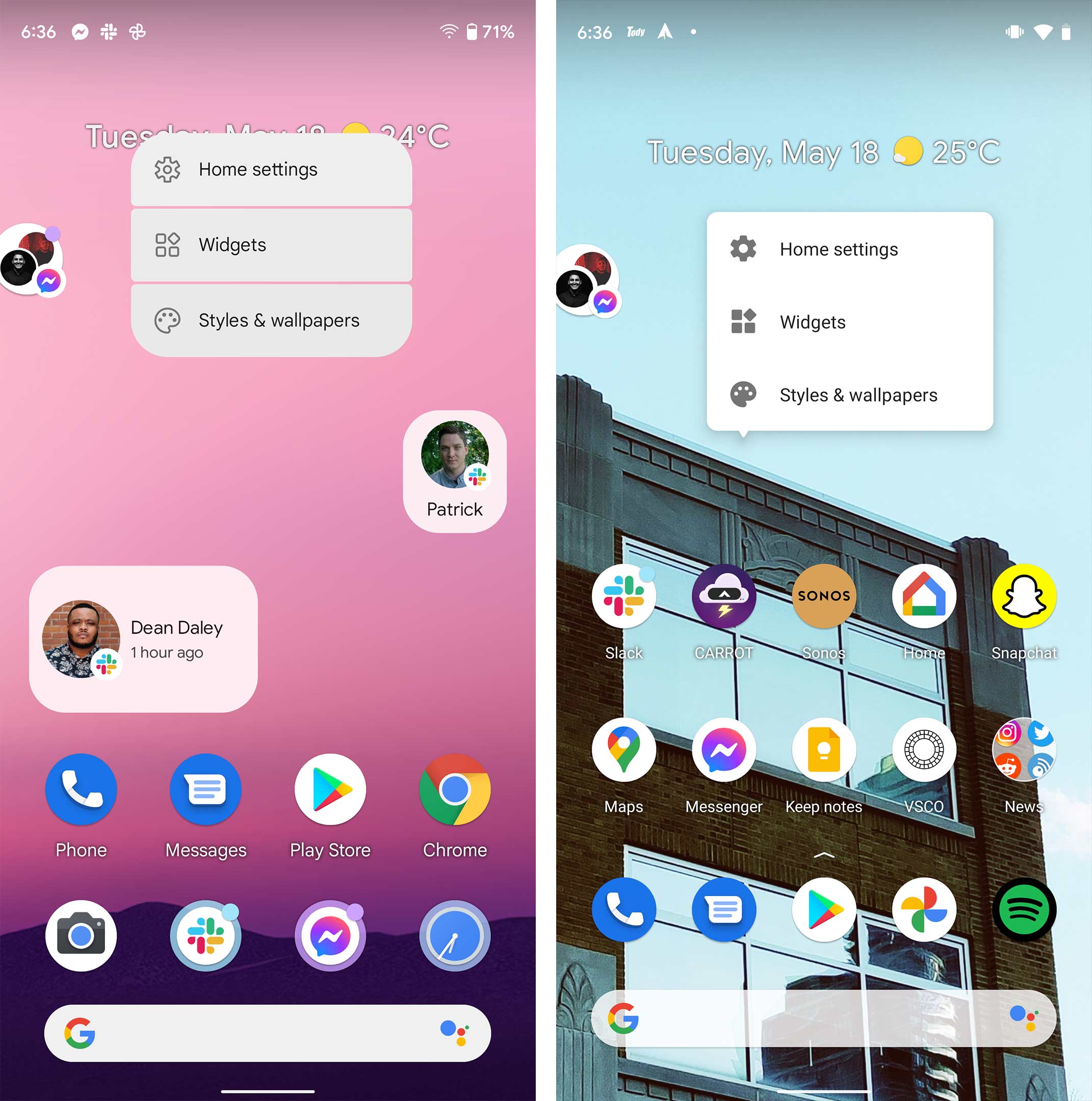
The little tool that appears when you tap and hold on the home screen now has rounder edges.
The app drawer is also a little more rounded at the top when you open and close it. It also feels a bit more bouncy as you move it.

The Settings app is the only app to get a redesign in the Android 12 beta so far.
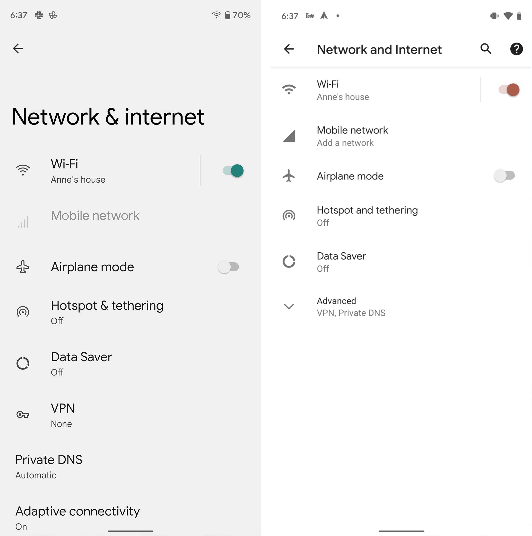
This is more or less what it looks like once you dive a little deeper into the settings app.

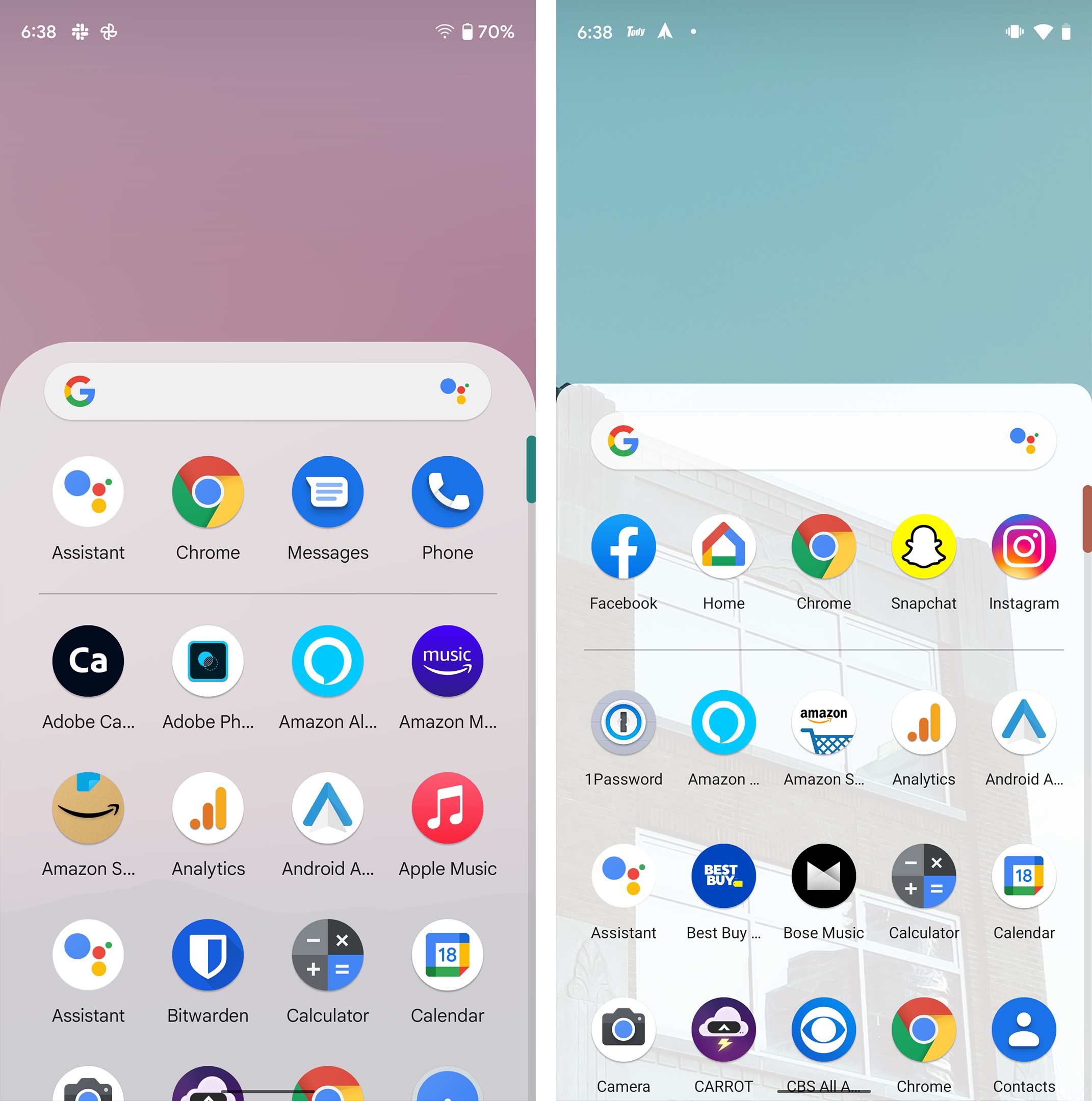
These are so other screenshots showing off some other aspects of Android 12. Notably, the chat bubble changed a bit compared to Android 11.
Finally, it’s worth noting that some aspects of this design could change before Android 12 releases later this year. There are already differences in the current build and what Google showed off at I/O, so expect changes to come before the final release.
MobileSyrup may earn a commission from purchases made via our links, which helps fund the journalism we provide free on our website. These links do not influence our editorial content. Support us here.
