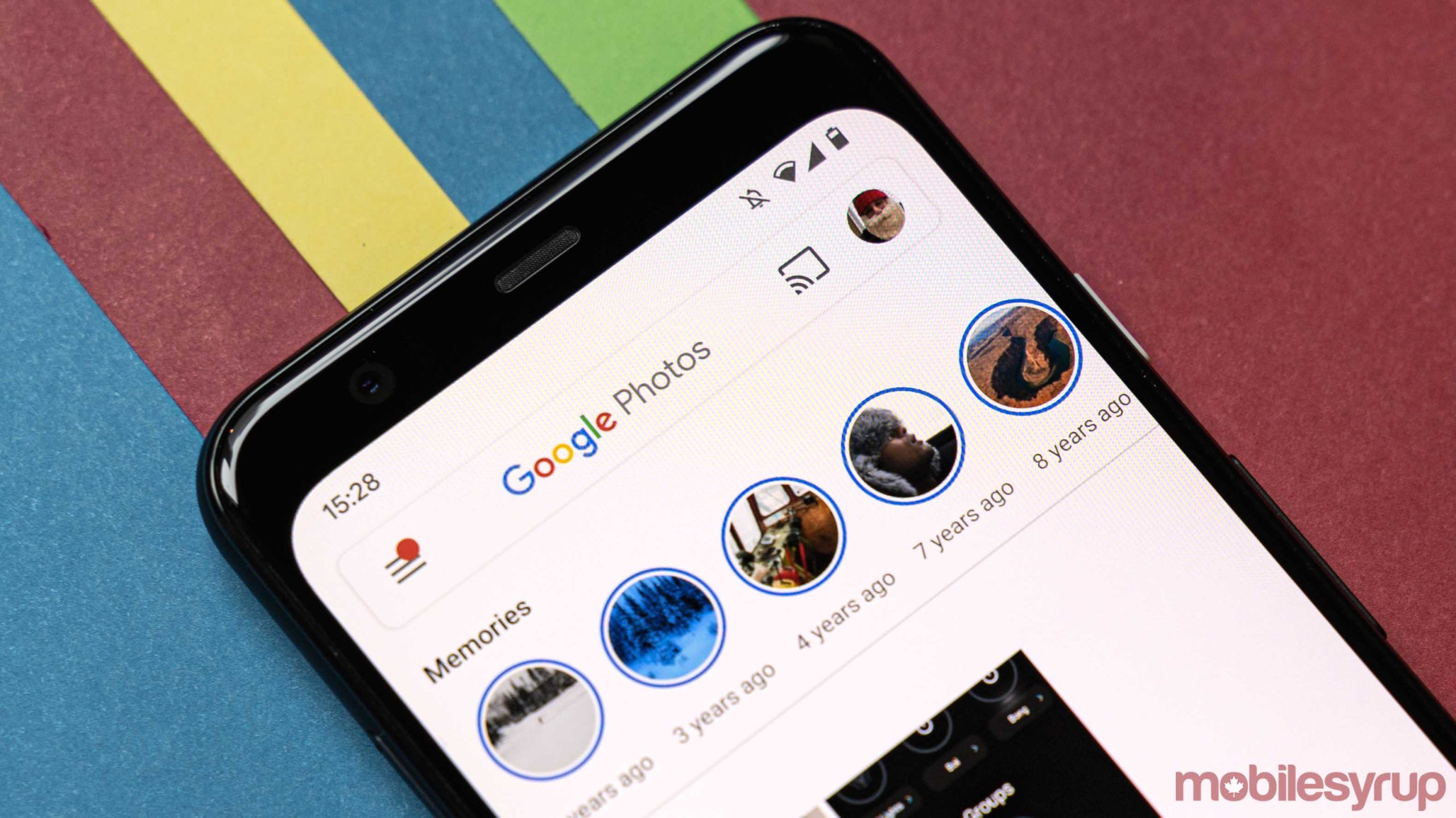
Google Photos is getting another significant redesign, this time putting the focus on memories and reminiscing on old pictures.
The app’s overall look isn’t significantly different. It’s still very ‘Google’ with a primarily white background, and the colourful Google Photos logo at the top of the screen and a grid of your pictures to scroll through. One of the first big differences you’ll notice is the new bottom tab, which drops some options for new ones.
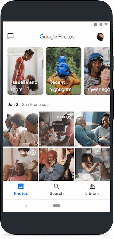
The app still opens to the default ‘Photos’ tab, which features the Memories feature at the top followed by your pictures in reverse chronological order. Memories, for those unfamiliar with the feature, is a rip on Snapchat and Instagram’s popular ‘Stories’ feature that showcases photos you took around this time a few years ago.
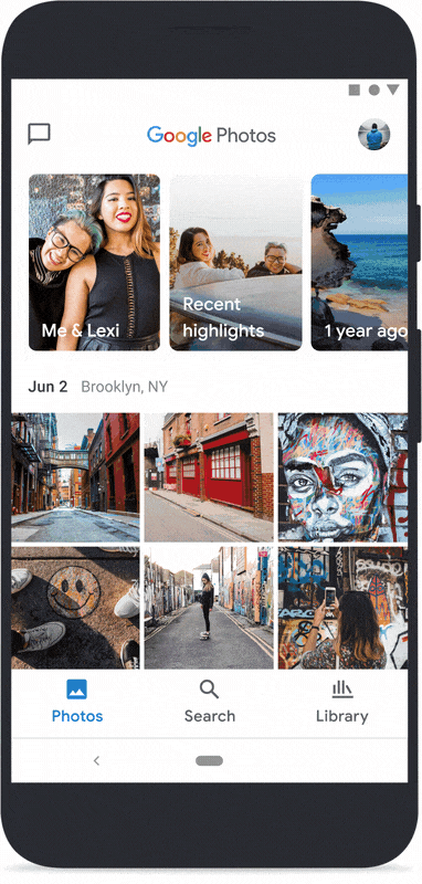
However, there’s a new ‘Recent Highlights’ section that showcases your best recent pictures along with automated creations like collages and animations that Google Photos creates on your behalf. Previously, those resided in the ‘For You’ tab.
As for your actual photos, Google has shrunk the space between pictures slightly and now Photos will guess which images users find most interesting and automatically makes them bigger in the feed.
New Search tab makes it easy to find images of specific people or locations
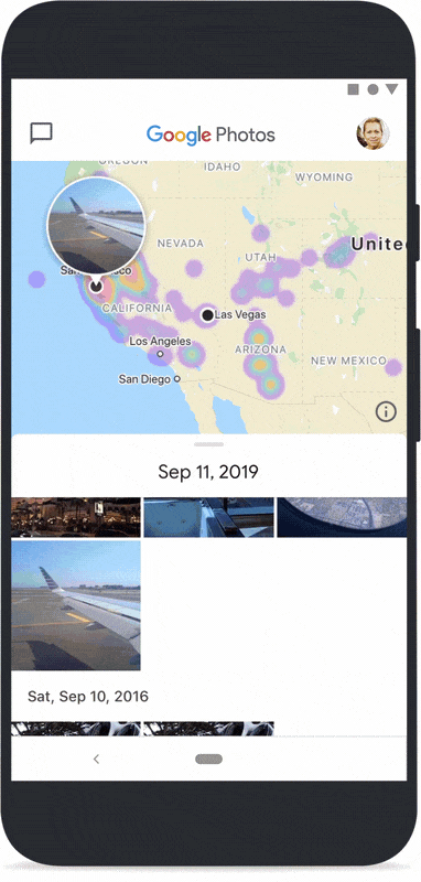
Next up, the redesign features a new ‘Search’ tab instead of the helpful search bar previously featured prominently at the top of the screen. Search puts Google’s machine learning capabilities on full display, although frankly, there isn’t much that’s significantly different from what Photos could do before.
At the top of the Search tab, Photos shows the people and pets that appear most often in your photos and videos. It’s a great way to browse your photo library, especially if you’re looking for pictures of a specific person.
Below that is the new ‘Places’ section, which lets you browse images and videos you’ve taken on a map. Users can tap ‘View all’ to see a grid of locations where they’ve taken a lot of images. Tapping into a location shows a two-paned view with a map and a list of pictures. The map shows hotspots of areas where you’ve taken a lot of photos. Further, scrolling the list will show different images where you’ve taken them on the map.
Additionally, there’s a new ‘Things’ view that tries to capture photos related to users’ interests. For example, someone who bakes a lot may find a helpful baking tab in this section that lets you browse through pictures of things you’ve made.
Library contains just about everything else
Finally, there’s a new ‘Library’ tab, which rounds out the three tabs in the Photos redesign. Gone are the ‘Albums,’ ‘For You,’ and ‘Sharing’ tabs, which have all been moved to different parts of the app.
For the most part, Library picks up all the other features and tosses them in one place. You’ll find the print store for orders prints and books of your photos, a link to a photo scanner utility and tolls for making animations. On top of that, the Library includes access to deleted pictures and a list of your albums.
The share menu is now accessible through a speech bubble icon in the top left corner. The interface is primarily an awkward messaging system that shows a list of pictures you’ve shared and the conversations related to them.
![]()
Finally, Photos is getting a new, more straightforward icon. It’s still the old pinwheel style, but now it features four coloured half-circles instead of the angular polygons it had before. While it’s not significantly different, hopefully, the change adds enough visual distinction that I’ll stop confusing it with Slack and Google Podcasts.
![]()
Google says the new redesign will roll out to Android and iOS users over the next week. As with all Google redesigns, expect it to arrive slowly and to different groups at different times.
MobileSyrup may earn a commission from purchases made via our links, which helps fund the journalism we provide free on our website. These links do not influence our editorial content. Support us here.
