Google could be working on a new desktop layout for YouTube that resembles how the app works on mobile.
Leaker Jane Manchun Wong (@wongmjane), who is behind several recent Facebook, Instagram and Twitter leaks, posted a video showcasing the new layout.
The main difference with the new layout is that the comments section is on the right side of the screen, under the ‘Up next’ videos. Simila to mobile, users will have to scroll past the suggested videos to view comments.
Further, there’s a new ‘Show more’ button under the video to expand the description. Clicking the button also shrinks the video player.
YouTube is testing mobile-like layout on desktop pic.twitter.com/4psGd76Bpm
— Jane Manchun Wong (@wongmjane) February 26, 2019
Beyond those changes, there isn’t much that’s visibly different from the current desktop layout. That said, some users have already responded to Wong’s tweet to express their dislike for the layout.
While the layout may not be ideal, it does have some benefits. For one, there’s less scrolling for those who don’t want to get into the comments.
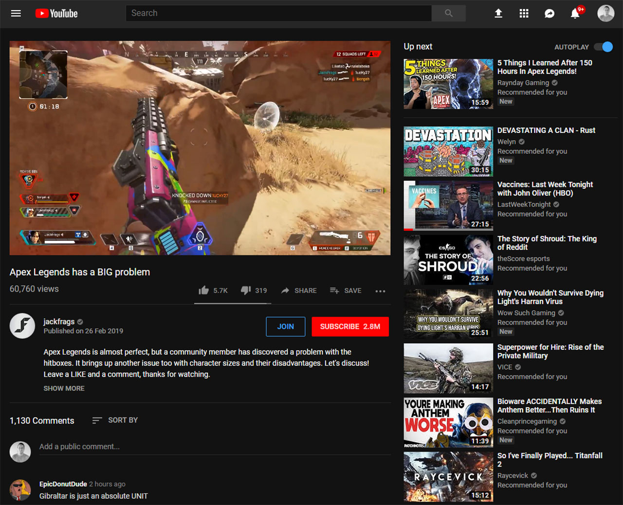
Current YouTube layout on web
Another plus is that the comments section is partially hidden, which could reduce spammy comments by forcing users to scroll further to post a comment on a video.
Regardless, the layout is a test, and it may never come to desktop, so there’s nothing to worry about yet.
Source: Twitter (@wongmjane)
MobileSyrup may earn a commission from purchases made via our links, which helps fund the journalism we provide free on our website. These links do not influence our editorial content. Support us here.
