Facebook gave us a look at its upcoming Messenger redesign back at its F8 conference in May.
Now, some users reported that the redesign has arrived.
The redesign reportedly arrived without an update to the Messenger app. The server-side change brings with it a new bottom bar with three buttons instead of five. The camera and a new chat button now reside at the top of the screen.
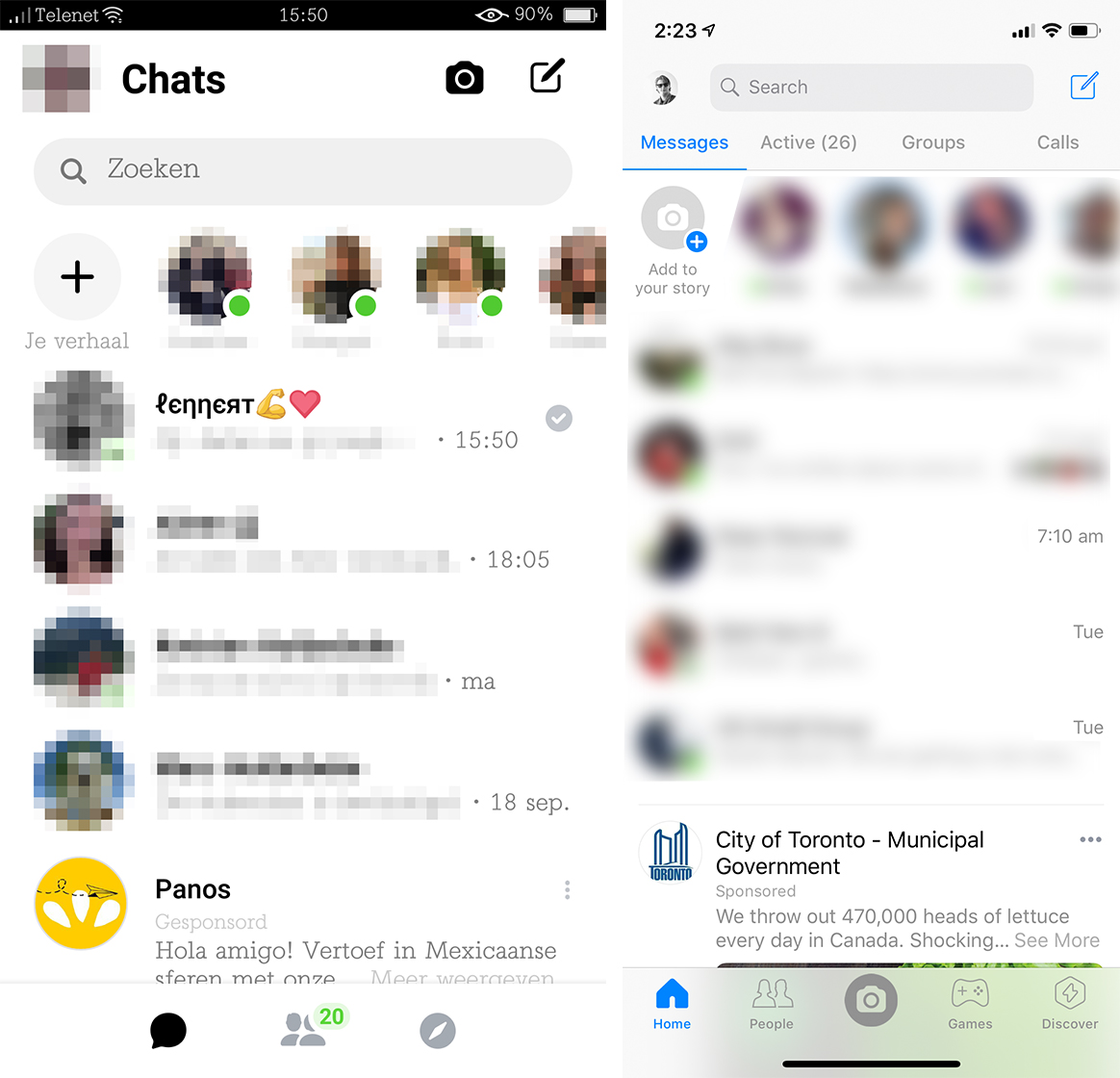
You can see the difference in the above photo. The left side shows the new design with screenshots sent to Android Police from reader Lennert. On the right is the current Messenger design on iOS.
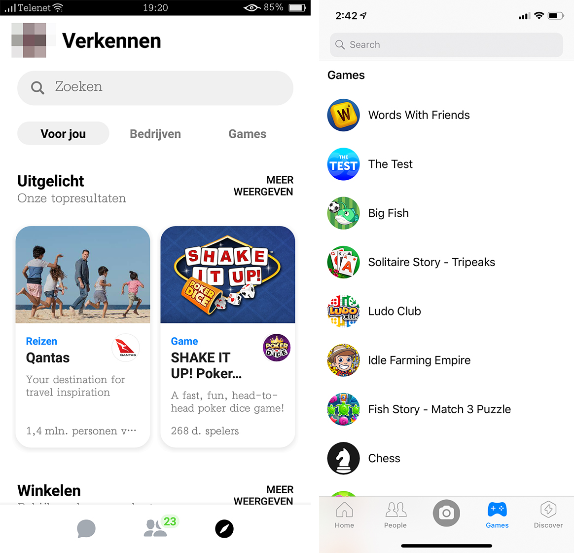
Several of the more redundant features — or bloat, if you’re so inclined — have moved to a new ‘Explore’ tab. This includes features like games and businesses.
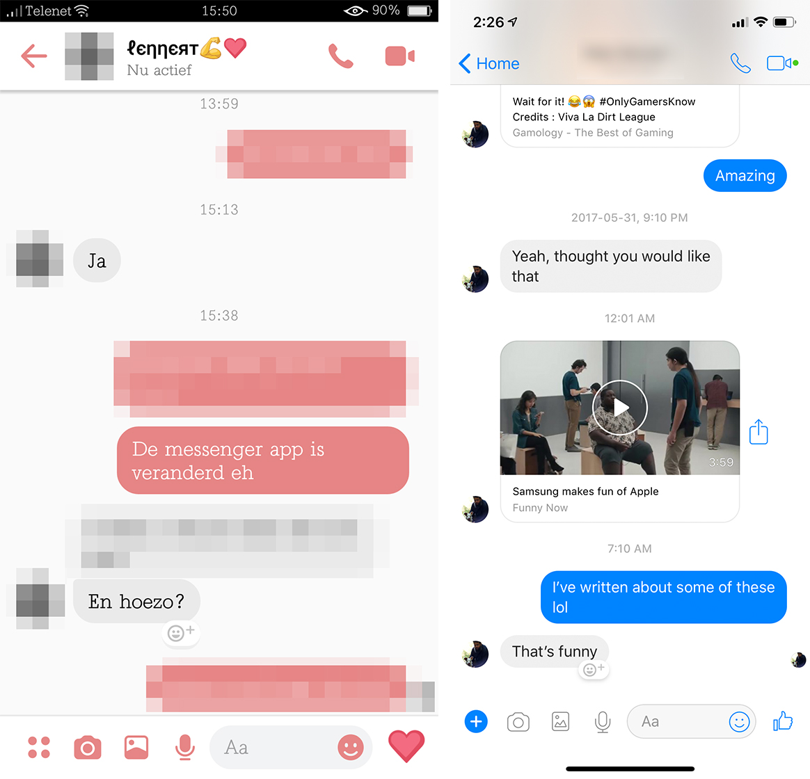
The chat screen has changed slightly as well, although not significantly. The main difference is the icon in the bottom left. Previously it was a ‘+’ symbol, but now it’s four coloured dots.
Overall, the new design looks a bit cleaner, but it doesn’t seem all that much better. The look is reminiscent of Google’s Material Design, but overall I think Facebook did it worse. Messenger tries to do the all-white look. However, it seems like the company didn’t put as much consideration into it as Google.
On the upside, the all-white look also has a dark mode that looks very sharp. Unfortunately, it isn’t shown in the screenshots.
Regardless, Messenger needed a refresh, and this is a step in the right direction. The app looked cluttered on both iOS and Android. The Android version specifically looked dated.
Hopefully we’ll see this roll out to more people soon.
Source: Android Police
MobileSyrup may earn a commission from purchases made via our links, which helps fund the journalism we provide free on our website. These links do not influence our editorial content. Support us here.
