Airbnb unveiled a major rebranding effort this week, complete with new colour scheme and company logo (check out this great Fast Company profile for more information on the rebranding process). As part of the rebranding, Airbnb has also dropped new versions of its iOS and Android apps. The new versions are more than a simple palette swap, featuring a total UX (user experience) overhaul designed to make listings more appealing and help travellers quickly find the information they need.
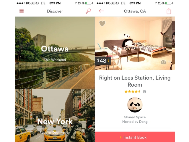
The updated apps follow the current mobile trend towards flat design, and place great emphasis on large beautiful photos broken only by small blocks of text. Airbnb’s Discover feed now takes into account more information about a user’s immediate location, prioritizing nearby listings and destination locations. It’s beautiful and easy to navigate, but I took minor offence at being presented Ottawa as a destination getaway (sorry, O-Town. You know I love you).
The curated neighbourhood information that was a primary focus of older versions of the Discover feed has not disappeared, but is now integrated into the listing pages, which have also been overhauled in prioritized hierarchy based upon Airbnb travellers’ most important decision points for booking. Unsurprisingly, large location photos are right at the top, followed by reviews and photos of the host, with more detailed information (number of guest, amenities, exact location, etc. ) trailing behind.
The revised experience works well, and should make it easy for those craving a weekend getaway this summer to find the perfect spot. Both Android and iOS versions of the app are available now, and can be found at the respective source links below.
[source]Play Store / App Store[/source]
MobileSyrup may earn a commission from purchases made via our links, which helps fund the journalism we provide free on our website. These links do not influence our editorial content. Support us here.
