Samsung is a big company. Last quarter, it earned nearly $10 billion in profit on revenue of $55 billion. There are over 100,000 employees working in the research and development department, and with smartphones one of the company’s most profitable areas, it speaks to reason that there is constant experimentation on the software design front.
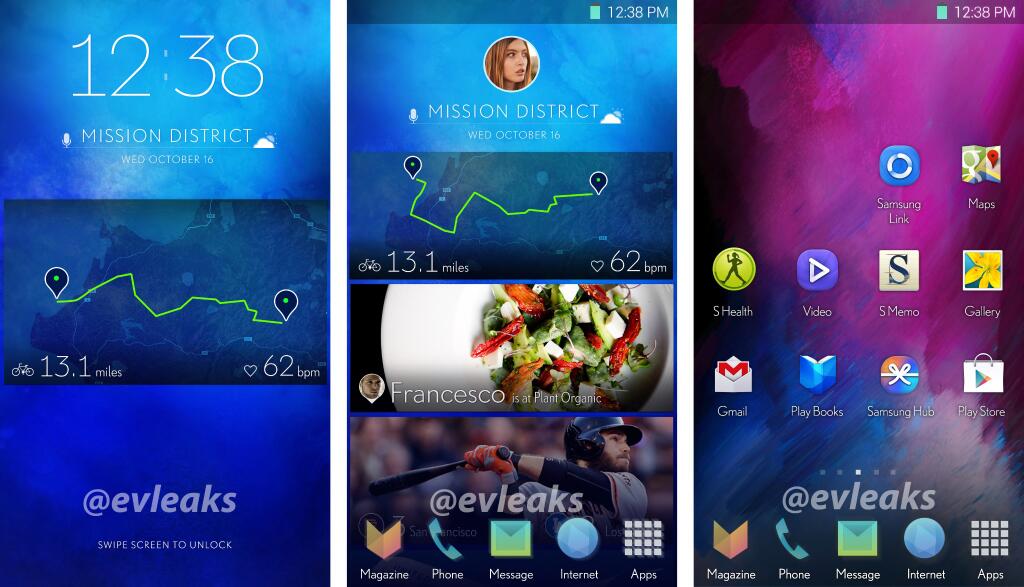
A new set of screenshots delivered by @evleaks shows off a smartphone version of the Magazine UX we saw yesterday on the new Galaxy NotePRO and TabPRO slates, shrunk down and thinned out.
While the leak could be a fake — many custom ROMs and icon packs exist to change the way Android devices look and feel — there is good reason to believe that Samsung is working on improving the user experience of its smartphones. TouchWIZ has long been derided as one of the least intuitive Android overlays, replete with questionable design choices and a too-deep menu system.
At first glance, the new UI, with its KitKat-inspired icons and thin, Roboto-derived font, feels like a natural evolution of TouchWIZ. But looking closer, it appears that Samsung is using widgets like Google uses Cards within Google Now; the second panel looks to be a page separate from the main launcher, perhaps a derivation of the Flipboard magazine found on the Note 3. The icon to the far left titled Magazine could be a separate app or merely part of the launcher (or both), aspiring to turn your Samsung smartphone into a more accessible content device (think HTC’s BlinkFeed, but better).
It’s unclear whether the UI will be utilized in existing devices as they’re updated to Android 4.4, but that makes the most sense; Samsung has overhauled parts of TouchWIZ as it upgrades older devices and introduces new ones. Considering existing devices, like the Note 3 and Galaxy S4, are expected to receive Android 4.4 in the next couple months, the wait shouldn’t be too long.
[source]@evleaks[/source]
MobileSyrup may earn a commission from purchases made via our links, which helps fund the journalism we provide free on our website. These links do not influence our editorial content. Support us here.
