A translucent menu smoothly animates over the flat white app window, revealing glimpses of the content behind it. A quick horizontal gesture reveals the previous screen, text transitioning from one word to another. Apps update in the background, at intervals optimized not to deplete the battery. Folders expand as apps are added, paging indefinitely to the right.
While iOS 7 may appear to be an enormous change from its former six versions — and aesthetically it is — the biggest improvements to the experience are in the subtle, mundane maneuvers people repeat hundreds of times per day. Since the update is becoming available to hundreds of millions people on the same day, requiring a modicum of re-education for basic actions alongside the new features, its effect is likely going to be more immediately pronounced than any software update, ever.
We’ve been using iOS 7 since it was announced at WWDC in June, and through its six betas changes have gradually hardened into fully-formed ideas, and as we’ve grown used to them our opinions have hardened, too. There are elements of the UI we don’t love, but for the most part this is a huge improvement, and it will take the average user only a few hours (or at most a few days) to acclimatize.
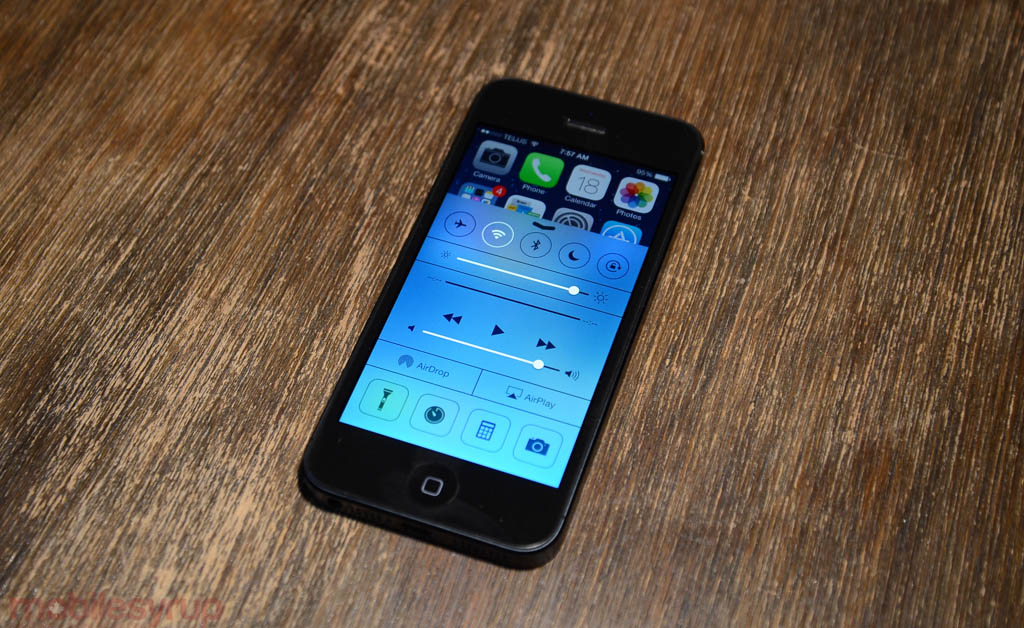
A robust multitasking menu, with easy app termination, feels more natural. An expanded notification bar, while still frustrating, is further improved over iOS 6. Features like Control Center, the equivalent of Android’s Quick Settings, lets users turn on and off WiFi, Bluetooth and even quickly open the camera from any application.
But perhaps the most important aspects of the upgrade are what users can’t see on day one, or at least only a little: the apps. iOS 7 is a huge improvement to the app toolkit developers use to create software on the platform, and further extend Apple’s lead in this respect. Things like opportunistic background updates, which were previously extremely limited to extend battery life, finally put iOS on par with Android. App design has been transformed overnight, and developers are taking this as a cue to clean up the cruft and deliver an all-new experience, from animation to navigation to, above all, features. iOS is still the best place to find the best apps, period.
Combined with the hardware improvements in the iPhone 5S, iOS is becoming a compelling stand-in (read: replacement) for the traditional computing interface.
We’re going to take a look at four places where iOS 7 succeeds, and two where it doesn’t.
What Works
Design
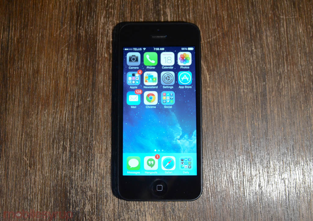
The way iOS 7 looks is drastically different to what came before it. Gone are the textures and glyphs of the past, replaced by a flat, layered set of windows arrayed on top of one another like thin panes of glass. It takes some getting used to, but the flatter design is not only prettier on the eyes — and perfect for Retina displays, which are the future of iOS-based devices — but it’s easier for developers to workshop complex hierarchies without worrying about the user getting lost.
For example, the emphasis on gestures means that, like on a traditional multi-pane tablet interface, apps can be easily designed to always get back to that original screen. Similarly, because apps are now relatively modular, they should be easier to adapt to larger screen sizes in the future.
While some icons may not have made the transition successfully — Safari comes to mind — there are some drastically improved colour schemes in iOS 7, owing to the sunsetting of skeumorphism, that much-maligned holdover from low-resolution displays, leaving the interface feeling more fluid. An improvement in animation quality contributes to this sense of speed and movement, though the way in which users interact with the operating system — tap on an app from the static home screen; tap tap tap within the app; press the home button to return — is unchanged.
iOS 7 will feel at once familiar and alienating, and that’s because this is the first time in six years that Apple has reworked the interface. Because many system windows overlay on top of one another, there is a real sense of depth, as you can see content underneath a translucent veil, as if it were a piece of frosted plexiglass. I have been using iOS 7 since its inception and am still amazed at the effect every time.
Much ink has also been spilled about Apple’s use of parallax in its backgrounds, and this integration extends to developers as well. Moving your phone around adjusts slightly the contours of the image, lending it, yet again, a sense of movement and depth.
A lot of people will call iOS 7 flat, but it’s not; it contains a real human element to it, an entrenched practice of layers and films. The real world is very rarely entirely opaque, but a series of boundaries that must be crossed. The difference is with iOS 7 you can’t see the holes, the doors or the seams; you’re just expected to know how to enter and exit.
The Subtle Things
Behold background updates. Yes, Android has been doing this for years, but Apple’s implementation is primarily battery-conscious, keeping with the notion that just because you can do something doesn’t mean you should. To wit, your iPhone can now update apps periodically in the background, but the OS doesn’t let developers run wild with the idea; something called opportunistic updates bundles these packets together when your phone is already making use of the network. In other words, if you’ve set your email to refresh every hour, iOS 7 will take that opportunity to let certain apps — ones you’ve explicitly allowed to do so — download new content.
At the same time some apps, like podcast or news apps, can use push notifications to trigger background updates. So, if you receive a breaking news alert from the New York Times, instead of having to wait for the article to load when you enter the app, it’s already there waiting for you. It’s a subtle feature, but one that will completely change the way you use the phone. It also removes the biggest limitation of iOS compared to Android (in my opinion).
Background updating also extends to apps themselves: as Google recently did with its new Play Store version, Apple has implemented behind-the-scenes app updates in iOS 7. While the small chance exists that the system may automatically update to a buggy or, less likely, a damaging app, Apple’s update oversight largely negates that fear.
Another subtle feature worth noting is Control Center, the new shortcut menu that you pull up from the bottom of the screen at any time. Whereas previously one would have to head into the Settings to disable WiFi or turn on Bluetooth, Control Center is simultaneously omnipresent and unobtrusive. While some may see it as a waste not to combine CC into the Notification Center, it makes sense from an aesthetic perspective: the former is task-oriented and largely a single tap experience. Turn off WiFi, slide down to exit. Notification Center, on the other hand — especially now, with an expanded iOS 7 design — requires all that room at the top. As I’ve said before, Apple’s Notification Center is still problematic, but Control Center is great.
More greatness abounds when it comes to text rendering. Dynamic Type is a new feature that allows app developers to intelligently resize text based on your preference. Less an accessibility option than just another way of more granularly adjusting the OS to your liking, the reading experience in iOS 7 is hugely improved. While it may not feel productive to read large swaths of text on a 4-inch display, Apple has made doing so as comfortable and easy as possible.
Developer Improvements
This cannot be overstated. Though we mentioned some of the ways developers can take advantage of the new iOS 7 design guidelines to create more beautiful and fluid apps, the real benefits will come over the next little while.
We’ve already seen dramatic feature improvements from companies like Evernote, Pocket, Digg, Camera+ and others, but what we’re most excited to see are how developers adjust to the wealth of new APIs afforded to them. Things like iBeacon, which uses Bluetooth LE to make mobile payments easier, and better access to camera APIs let developers more easily pass on features to users.
AirDrop is another interesting addition to iOS 7, though it’s limited only to devices running the A6 and A7 SoC (iPhone 5, iPad 4, iPhone 5c, iPhone 5s). It lets users share files, photos and snippets of information with minimal setup, both from a developer and user perspective.
We’re also going to see a lot of interesting things happen with the M7 chip and Core Motion framework introduced with the iPhone 5s. There is a good chance Apple is gunning to make fitness bands obsolete, or at the very least work more closely with iOS 7 itself. Because the M7 is constantly detecting movement within a 3D environment, at a very low power cost, developers will have access to a wealth of information that can be used to improve peoples’ health.
Ironically, Google appears to be spending more time improving its services on iOS than it is on Android. Sure, there are a couple outliers, and Keep and Play Music are not available on iOS, but for the most part apps like Gmail, Chrome, Google Maps, Google+, Google Drive, Google Search and Earth run faster, perform smoother and do a better job than their Android counterparts.
iOS 7 improves these things by theoretically allowing Google to perform its magic in the background. For example, Google Now has the potential to work on iOS 7 as it does on Android, pushing notifications to the Notification Center while updating in the background.
The advantage to having Google’s services on iOS is that they are just another alternative to Apple’s own offerings, something that can’t be said for Android. Apple’s growing, but largely unreliable, iCloud ecosystem is good for some things, and Google easily fills in the gaps. On Android, the gaps are just that.

What Needs Work
Design
It is immediately apparent that iOS 7 is a first-generation product. From the ways the OS responds and displays content, we wouldn’t be surprised if Apple subtly tweaks things as it progresses to iOS 7.1 and beyond.
For example, there are too many animations. Opening apps feel cumbersome because they expand outwards towards the edges of the screen, and while they look fantastic the first few times you, say, open a folder or activate an app, the glacial perpetual motion of your screen irks after some time.
Some icons, too, feel incomplete. Though Jony Ive assured us that the new iconography is meant to convey a sense of depth while eschewing the more visceral elements of previous versions, some of the results feel cartoony, taking up too much room within the confined space. There is no air, just negative space. The Safari icon is perhaps the biggest culprit, but there are others.
Similarly, because Apple assumes that people know how to use the operating system, there are fewer guides or directions to help users along. People are merely expected to know that to go back is to slide. Icons have been replaced by words in apps like Music, which take up more room and appear less polished.
These are minor annoyances, and will likely be corrected over time, but they still convey a sense of incompleteness.
Still Static
Lastly, iOS still lacks movement when the screen is idle. There are no widgets to scroll through or icons to update, and though the company added moving Dynamic Wallpapers, everything else still feels almost lonely.
There is also a lack of customization options: the four icon dock cannot expand, and it’s still very difficult to load your own ringtones and notification sounds. While pairing a coloured background with an iPhone 5c of the same hue may appeal to some buyers, I’d like to see Apple take things a step further. Some things have even regressed: Newsstand no longer shows small previews of magazines’ content until you enter the window itself.
Per-app indicators are still ugly, with small numbers on the top right corner of an icon or folder. Windows Phone has both iOS and Android beat in this regard; it’s still one of the operating system’s most antiquated ways of displaying information.
Conclusion
iOS 7 is great. It will take some getting used to, but the combination of fantastic apps, important user-facing features like Control Center and a new camera app, and a brand new modern design will likely make millions of iPhone, iPad and iPod touch users happy.
We didn’t even touch on many other improvements, like the new Photos app, which bundles pictures into albums and Moments; a fantastic new Safari browser, which feels much faster than before; improvements to Siri, which now offers both male and female voices; and a far better Mail app than before.
FaceTime Audio is another new feature that should not go unexamined, allowing iOS users to make VoIP phone calls to one another over WiFi. The quality is astoundingly good.
Apple has put out its most important operating system since iOS 2.0, and though it appears to be building the infrastructure for something even more compelling — think the combination of 64-bit CPUs, location-aware Motion Processor chips, Bluetooth 4.0 LE — this is a good start.
iOS 7 is available now for the iPhone 4, iPhone 4s, iPhone 5, iPad 2, iPad 3, iPad 4, iPad mini, and iPod touch 5th gen.
MobileSyrup may earn a commission from purchases made via our links, which helps fund the journalism we provide free on our website. These links do not influence our editorial content. Support us here.
