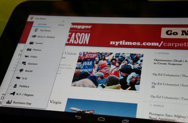
Could it be that with the release of the Nexus 7 and 10 tablets, Android developers are finally being incentivized to update their phone-only apps for larger screen sizes? NYTimes has always had a fairly decent selection of mobile apps, but its first foray into Android tablet design is fast, minimal and beautiful.
Instead of using the now-ubiquitous left sidebar, the app incorporates a drop-down menu, located at the top left, that shows off all the relevant categories. In landscape mode the front page is divided into two columns, though they don’t scroll independently. The app dynamically adjusts to different screen sizes and resolutions, so the 7-inch Nexus 7 is going to laid out a little differently than the Nexus 10.
Articles are arrayed with stunning austerity, with large high-resolution photos and sharp text that can be modified in size to suit each person. The Top News section shows off relevant content from other sections, while diving deeper arrays the content in terms of time and importance.
The app has also been updated to allow more granular breaking news notifications, including whether it just appears in your notification bar or if it pops up to interrupt whatever you’re doing. Unfortunately the 4×1 widget hasn’t been modified for the tablet’s bigger screen, but those notifications are a good alternative.
If you’re rocking an Android tablet — and many of you are — and have a NYTimes subscription — head to Google Play to download NYTimes.
Via: Engadget
MobileSyrup may earn a commission from purchases made via our links, which helps fund the journalism we provide free on our website. These links do not influence our editorial content. Support us here.


