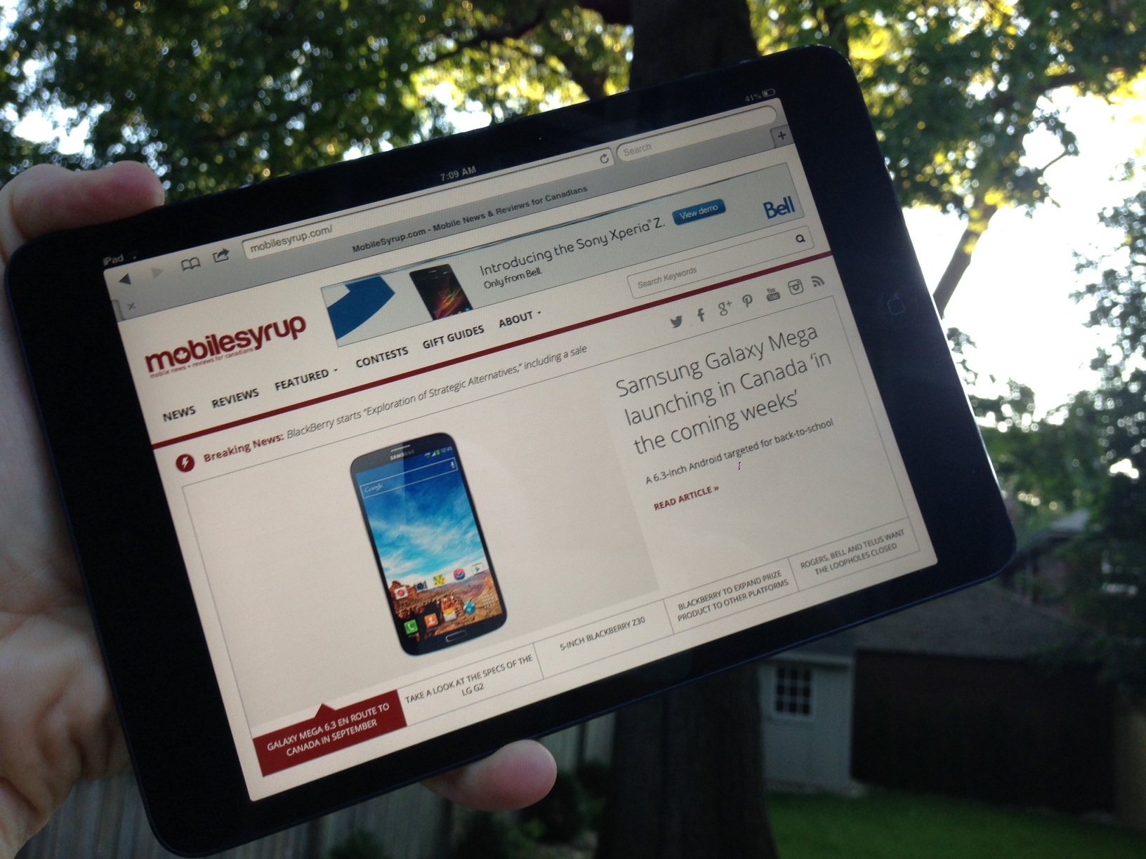
MobileSyrup has seen a few site redesigns since late 2007. Our newest version is fresher, cleaner, and probably most important, it’s responsive! No matter what device you’re using – desktop, laptop, tablet or smartphone – the site will be very friendly to you.
We’ve been taking notes over the past couple years of what you wanted to see. One of the main items was a site that was mobile friendly. This was a given considering the topic we’re writing about, but I was hesitant to produce a mobile app for each platform and didn’t want to be bogged down with continually updating them. We’ve attempted several mobile versions, but most lacked the features that gave a great experience. The new version of MobileSyrup will adapt to your screen size. It’s best viewed on displays that are 1024, 768 and 320.
The font is larger and easier to read. Story titles are also large and in charge. I believe having the titles above the fold make for a better reading experience. There’s also several ways to share articles that you want others to read – the social icons for Twitter, Facebook and Google+ are all embedded within the posts and comments. In addition, within each article you can now easily switch between the previous or next article (this is located above and below the article you’re currently viewing). We’ve also included a “Trending News” section on the right hand side of the site – this gives a good outline of what hot topics people are talking about.
Reviews. Our reviews are one of the main reasons people visit the site. Each review will now big pictures and big picture galleries, plus a glorious looking scorecard. We’ve broken down each review with a strict guideline to include the following topics: Design, Software, Display, Performance, Build Quality, Camera Quality and Battery Life. Each of them will have individual scoring, then we’ll produce an overall score to represent the device (smartphone, tablet, accessory) as a whole. Take a look at the homepage and you’ll see the ‘latest reviews’ section, hover over a review and it’ll reveal the score, then upon clicking you’ll have the full hands-on review.
Search has been improved, finally. The top nav bar makes it easier to find the content you’re looking for. Broken down by News, Reviews, Featured and Contests categories makes for a simple way to get quick access to specific topics. Another route is to simply type in the term you’re looking for within the search icon on the right hand side. However, the highlight of search is that we’ve now included an option to drill down deeper by searching by platform, manufacturer or carrier by clicking on the ‘Filter Articles’ button.
This is just the beginning for this version of MobileSyrup. Over the next couple weeks we’ll introduce a new Forum, polls and a comparison section of devices. Please poke around the site and let us know what you think! Also, please give us feedback on what you’d like to see.
MobileSyrup may earn a commission from purchases made via our links, which helps fund the journalism we provide free on our website. These links do not influence our editorial content. Support us here.


