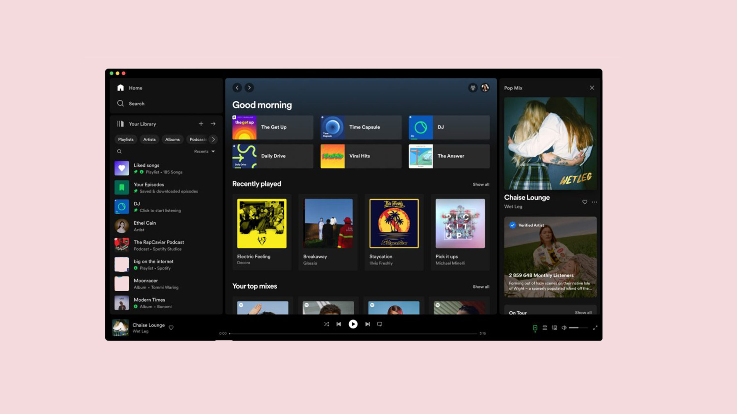
Spotify is rolling out a new design for its desktop interface (as seen above). While the music streaming app’s look isn’t significantly different, the new design utilizes a three-column layout that aims to make it easier to access details about what you’re listening to and organize your playlists.
The company published a blog post detailing the changes, which are rollout out to “all Desktop users worldwide” starting this week. I primarily use Spotify through my web browser, and it appears I already have the new layout, minus the new third column.
It’s worth noting some have reported seeing similar interfaces to the one Spotify just announced for at least a few weeks. Given Spotify detailed an earlier rollout back in April, it’s likely some people had access to an earlier version of the new interface ahead of time.
Aside from the three-column layout, the biggest change Spotify users will notice is the revamped ‘Your Library’ sidebar on the left side of the interface. It now sports a series of colourful icons alongside the names of playlists, albums and artists. Users can now minimize the sidebar to just see the icons or expand it for extra details about each item in the list. Moreover, there’s a ‘compact library layout’ option in settings that will strip out the icons for a text-only look.
The library sidebar also sports new filter options to help you quickly get to albums, artists or playlists, plus there’s a search box for looking up songs, podcasts and more.
The middle section of the layout will show the same stuff you’re used to — recently played teams, recommendations, playlists and more. If you’ve used Spotify on the desktop much, you know what to expect here.
Finally, the third section on the right side of the screen features a ‘Now Playing’ view with the current song or podcast along with extra information, like tour dates, merch, transcripts, episode descriptions and more.
Previously, the right side of the screen was previously reserved for showing what your friends listen to — this feature is still around but now hides behind a friends icon in the top-right corner of the screen. While I’m sure some people won’t like that change, I never used the feature (I don’t particularly care what my friends are listening to and frankly would rather not share my weird tastes in music with them), and I’m happy the space has been recovered for something more useful.
You can learn more about the changes here.
Header image credit: Spotify
MobileSyrup may earn a commission from purchases made via our links, which helps fund the journalism we provide free on our website. These links do not influence our editorial content. Support us here.
