There’s no denying that Microsoft’s new visual design for Windows 11 is striking. It’s a modern look with a centred taskbar, updated icons and more. The design brings a lot to the world’s most popular operating system.
The first change most people will notice is the new centre taskbar. This is a huge update to Windows, and it gives the OS a more macOS and Chrome OS-like look.
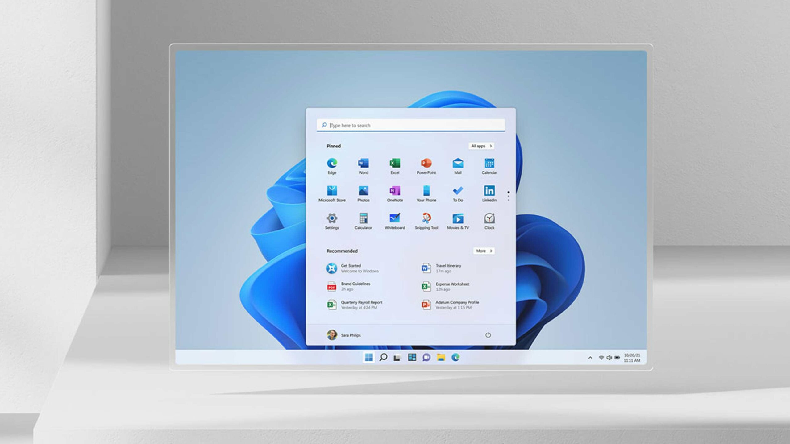
The new Start menu is also simplified now with a few clean rows of apps, and a section to help you find recent files and apps.
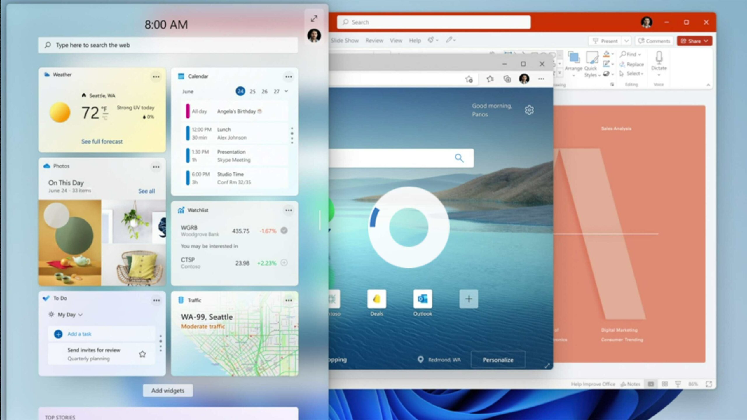
There’s even a new glass-like widget pane you can slide over from the left-hand side of the screen. The design looks great on this, and hopefully, more developers start creating widgets for users to access. If you scroll down, there are also some news stories shoved in the widget pane. This also redesigns the small weather app in the taskbar that the company released a few months ago.
Another thing Microsoft is adding to Windows 11 is heavier use of fogged gradients within its apps. This makes the operating system look a little more cohesive since all the windows on your desktop now retain some of the colours from your wallpaper.
Windows also has revamped the theming in Windows 11 so that applies a little more throughout the OS. You can even customize each virtual desktop with custom wallpapers and pinned apps to create dedicated spaces for work and play.
One thing the company didn’t show off was the new File Explorer interface. However, you can catch a quick glimpse of it in the above video and it looks much cleaner and more modern than its Windows 10 counterpart.
Overall, Windows 11 is a really clean-looking operating system, and I’m really excited to try it when it releases.
Image credit: Microsoft
MobileSyrup may earn a commission from purchases made via our links, which helps fund the journalism we provide free on our website. These links do not influence our editorial content. Support us here.
