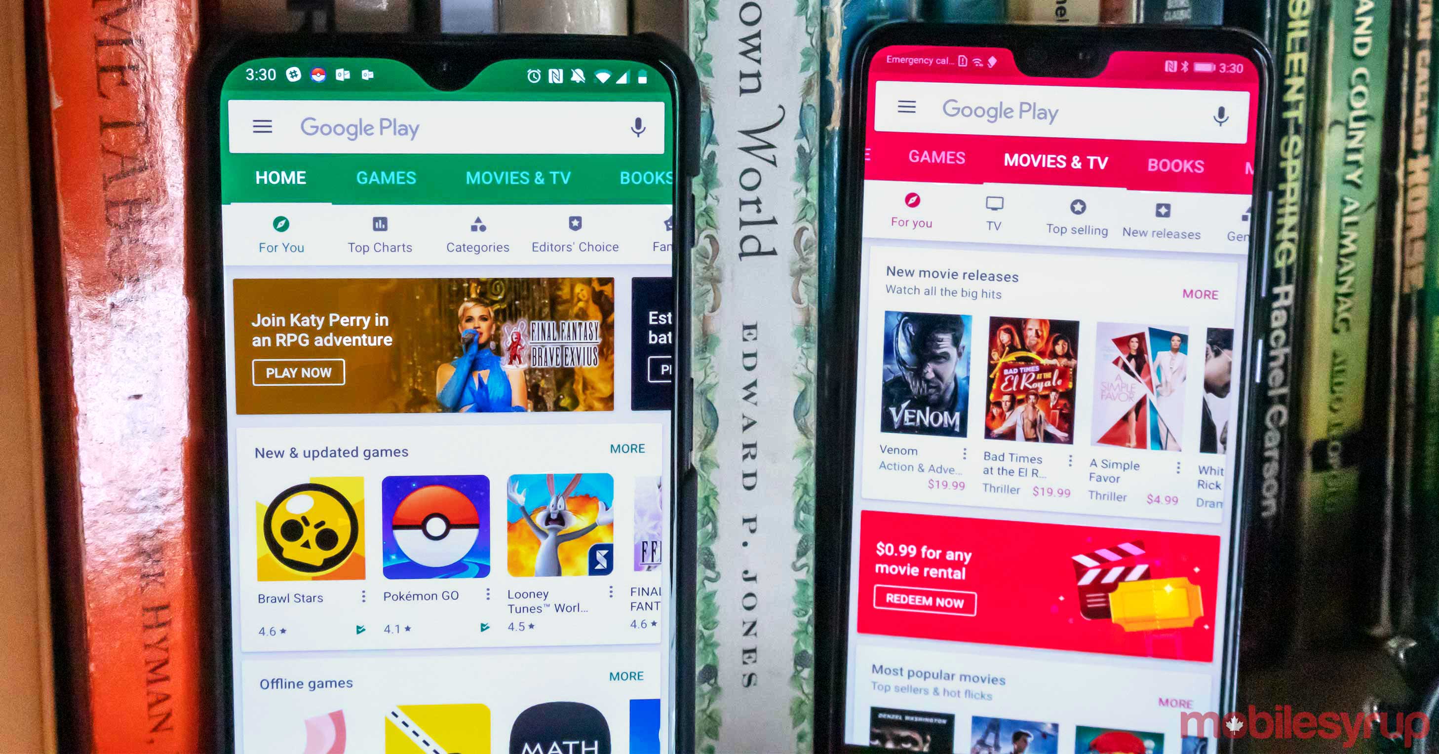
The Google Play Store now features a slightly refreshed colour pallet that modernizes its ageing look.
The Play Store is one of the few apps that has more or less maintained its original design while the rest of Google’s apps have slowly adopted the company’s modern design language.
The new hues are darker than the old ones, but they still maintain the same core colours — orange for music, blue for books, green for apps and games and a pinkish red for movies. Additionally, the old colours are still present in the web version of the store and the Play Music, Play Books and Play Movies and TV apps.
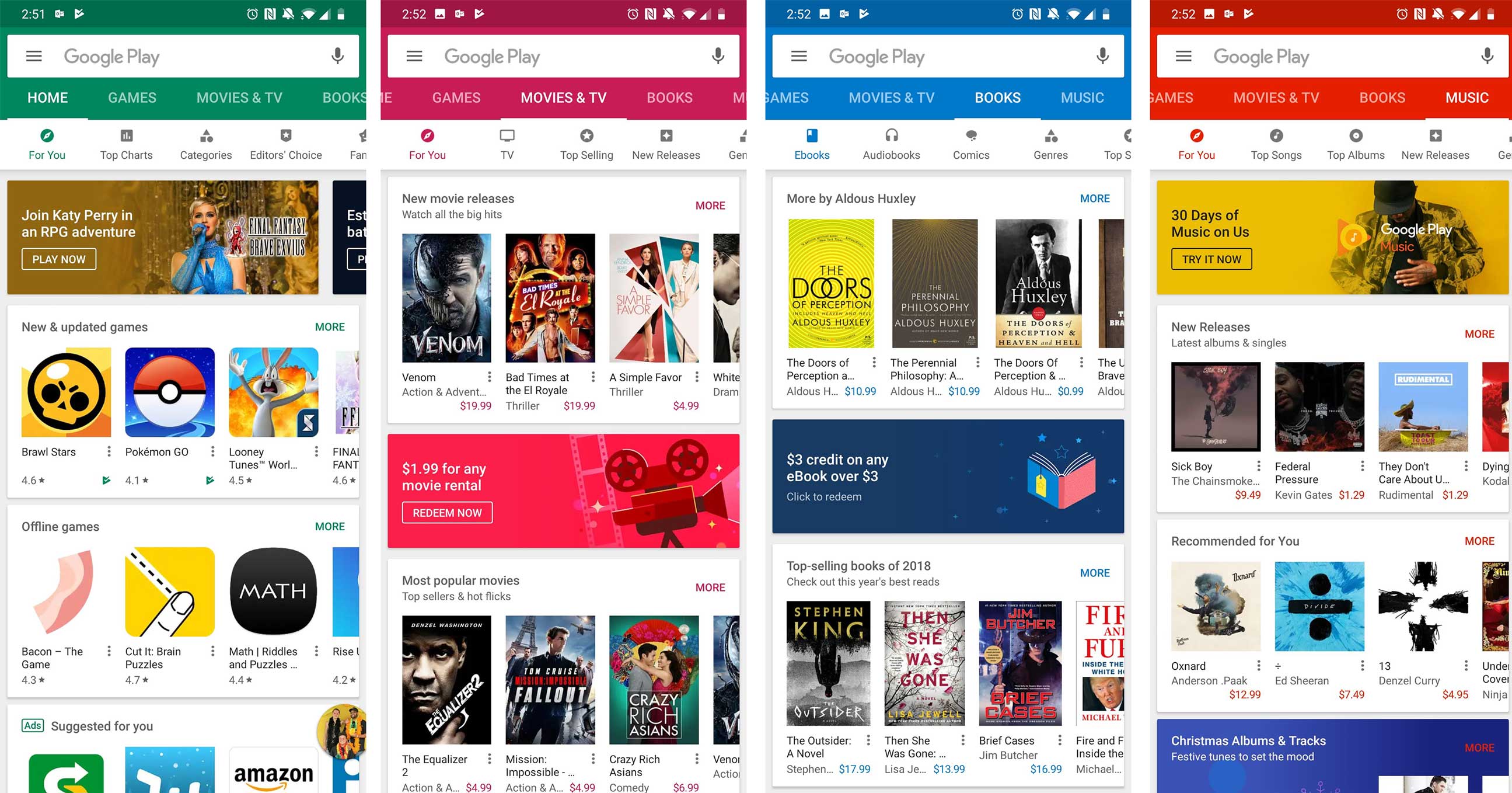
The new colours in the Google Play Store app
Google is altering the reviews interface with more white space, moving it more in line with Google’s modern take on Material Design.
Further, Play Store team has condensed the app info section by removing information like the developer’s address, which makes it a tad easier to read.
The Google Play team has also stripped the colour from the in-app event bar that pops up in the store for games and apps that have special events or sales happening, according to Android Police. The bar is being swapped out for more modern Google cards that look very material design-esque.
So far this update does a decent job of moving the Play Store closer to Google’s modern design, but it’s still missing features like a revamped side menu, new iconography and more rounded corners, to be perfectly in line with Google’s contemporary look.
Via: Android Police
MobileSyrup may earn a commission from purchases made via our links, which helps fund the journalism we provide free on our website. These links do not influence our editorial content. Support us here.
