Uber has announced it is making changes to its logo and Android and iOS app.
Firstly, Uber is doing away with the “bit and atom” -inspired square-inside-a-circle logo that was introduced back in February 2016.
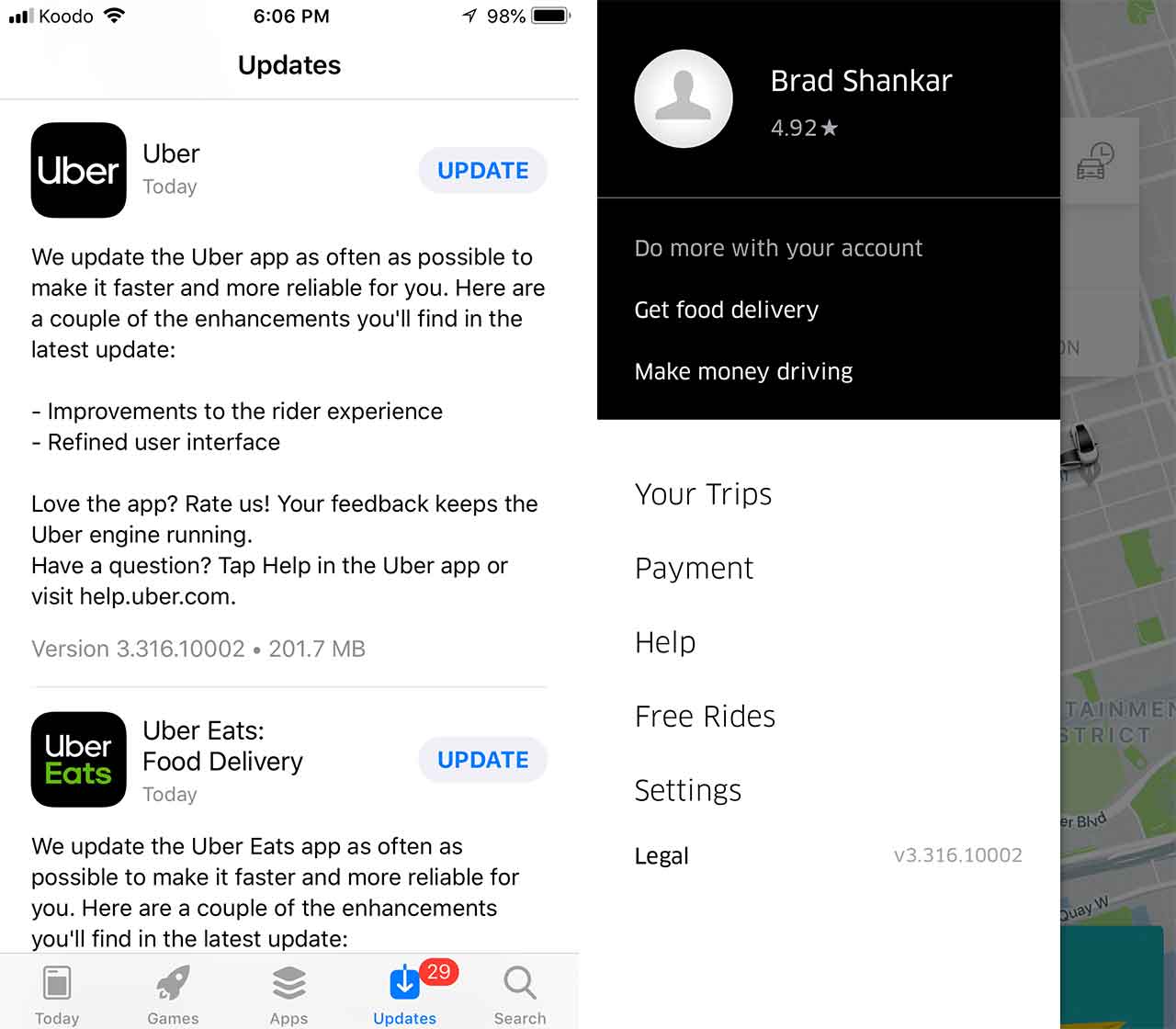
Going forward, Uber will sport a much simpler logo that features the company’s name in white over a black background. Uber Eats branding will also reflect the changes.
In an interview with Adweek, Uber explained that the previous logo was confusing and some users weren’t identifying that it represents the company. Further, Uber said that some drivers were even turning the company-supplied decal inside out because ‘Uber’ was written on the flip side.
“As we expand our reach into our other markets and modalities, it’s super important that it’s very clear that when you’re getting into an Uber car or on an Uber scooter, you know that is an Uber product,” Uber executive brand director Peter Markatos told Adweek. “We weren’t achieving that with our current system.”
Uber also wanted this sleeker look to reflect in its mobile app. As part of the latest update on Android and iOS, users will see a black-and-white bar menu that matches the new logo. The actual map section featuring the moving Uber cars appears to be unchanged.
Source: Adweek
MobileSyrup may earn a commission from purchases made via our links, which helps fund the journalism we provide free on our website. These links do not influence our editorial content. Support us here.
