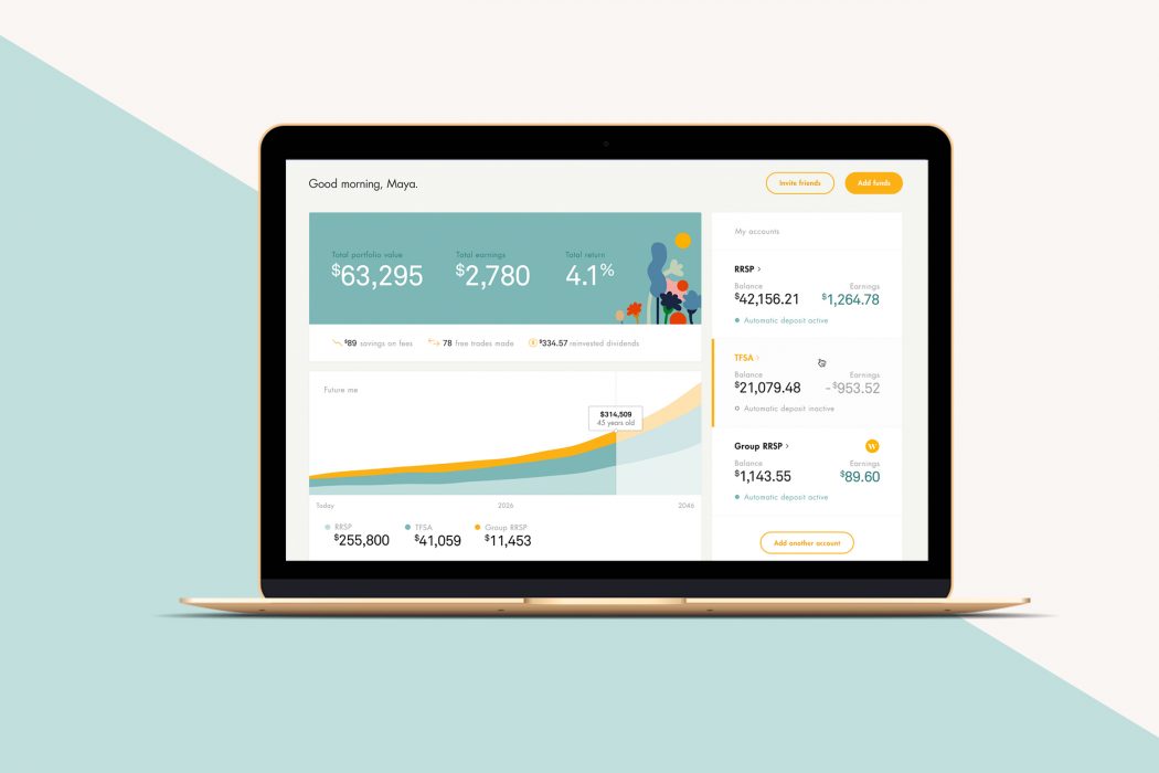
Toronto-based Wealthsimple has won a Webby Award for its “intuitive” website. For the second year in a row, the FinTech company’s website was named the Best Financial Services and Banking website by a group of internet experts.
After winning a Webby Award last year, Wealthsimple redesigned its website, which features an overhauled dashboard for users that manage multiple accounts, and features that help users better quantify how their financial planning can help them reach their goals.
“We’re a technology company first, so a super intuitive, human site is crucial,” said Rudy Adler, chief product officer at Wealthsimple. “It’s like we’re having a seamless conversation with people. And conversations evolve. That’s why we basically tore up the design even after we won a Webby last year — and built it again. It’s a testament to the creativity of our team that we won again this year, with a completely different website.”
Wealthsimple said its website was designed by the company’s in-house creative team in collaboration with Doberman, with design animation by ManVsMachine, and development by Varvet.
This announcement comes two months after Wealthsimple announced that it has expanded its services to the United States. The company is one of Canada’s hottest FinTechs since it raised a $30 million Series A in April 2015. It’s also one of the companies in Power Financial’s justice league of Canadian FinTech, which also includes Borrowell and League.
The Webby Awards will honour Wealthsimple at its ceremony on May 15 in New York City.
This story was originally published by BetaKit.
MobileSyrup may earn a commission from purchases made via our links, which helps fund the journalism we provide free on our website. These links do not influence our editorial content. Support us here.


