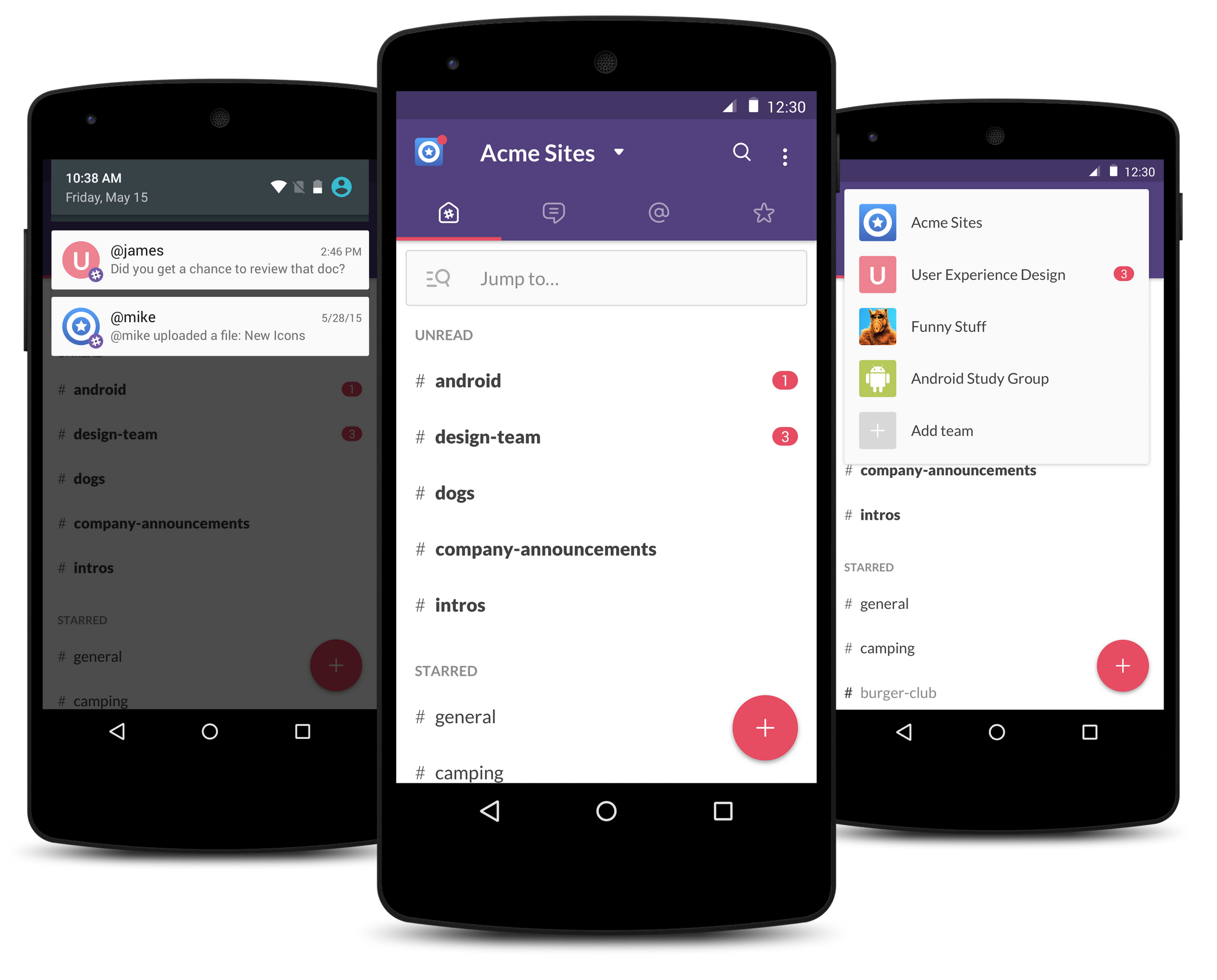
Slack, every work team’s favourite communications tool, has received a design overhaul for Android, with a brand new interaction paradigm that gets rid of the sliding drawer and makes it easier to send messages to individuals and groups.
The app, which has been in beta testing for a couple of months, now supports a wider variety of Slack’s visual idiosyncrasies while adhering to Material Design, a tenet that the company said it spent a lot of time considering. With an improved search feature and better support for Markdown-like formatting features found in the desktop, web and iOS apps, the app has essentially reached feature parity with its iPhone counterpart.
Slack says that the app’s code was rebuilt from scratch, making it load more quickly and perform at a higher frame rate than the previous one, though performance still suffers somewhat on lower-memory devices.
Finally, a Floating Action Button (FAB) has been implemented for quick navigation between channels, group chats and individual ones.
Slack’s new Android app should be available soon.
[source]Slack[/source]
MobileSyrup may earn a commission from purchases made via our links, which helps fund the journalism we provide free on our website. These links do not influence our editorial content. Support us here.


