In the mobile world, there’s always been a tension between design and utility. For a long time, WhatsApp’s minimalism was used as an example of its function over form mantra – it wanted to be the simplest messaging app to use. No flourishes, no animations.
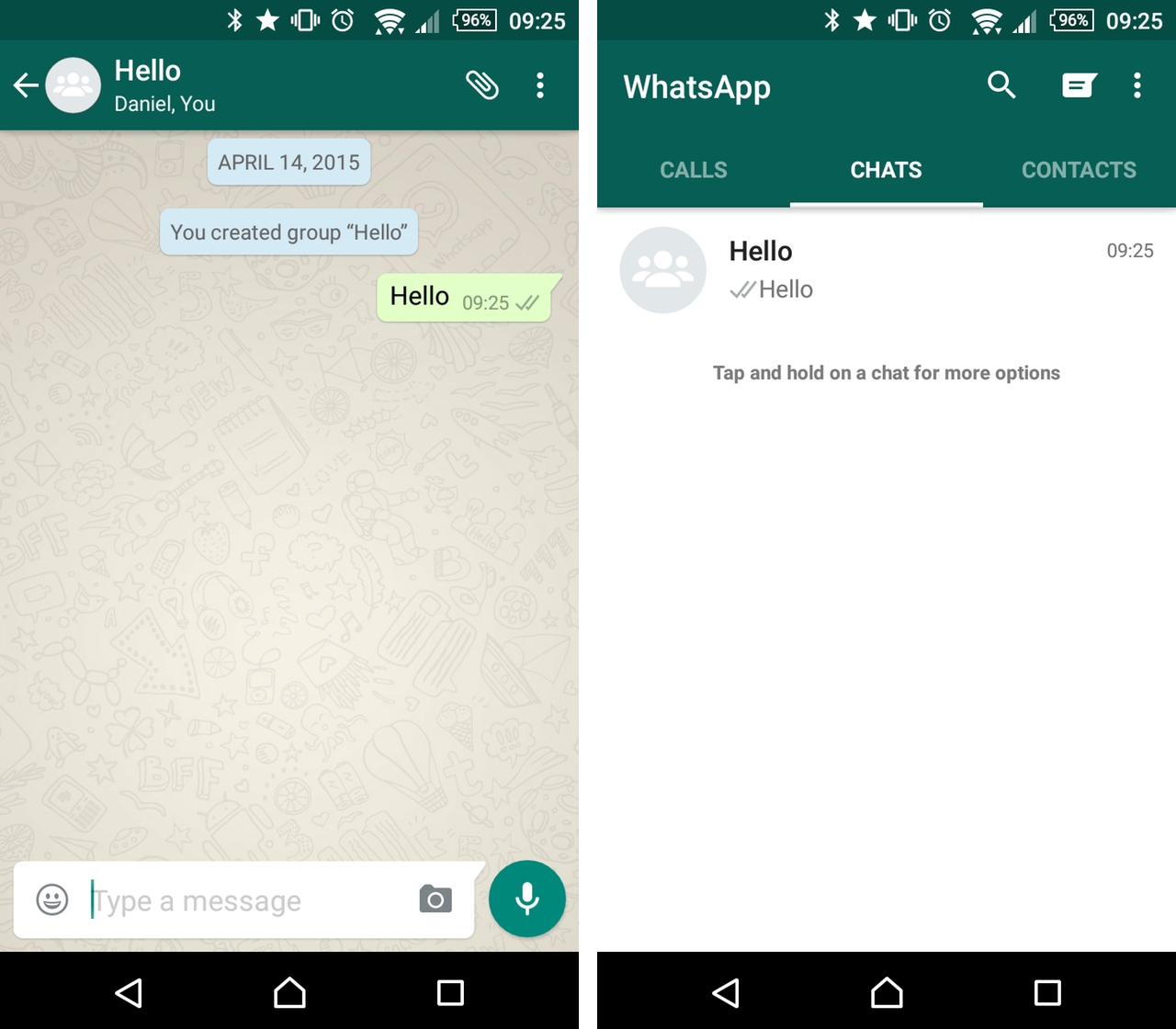
But as has been shown with the rise of material design, the two don’t need to be mutually exclusive. WhatsApp has taken a brush to every pixel of its Android app today, releasing a newly-revamped material redesigned chat experience that feels a lot more at home on newer, higher-density devices.
Indeed, while its functionality has not strayed, WhatsApp for Android now has a coloured notification bar in a darker green shade than before, a new set of flattened icons, also in that darker green, and a bevy of animations for devices that support them.
The update is still rolling out to the Play Store, but you can download it from WhatsApp’s own site, sideloading the APK onto your Android 2.1+ device.
MobileSyrup may earn a commission from purchases made via our links, which helps fund the journalism we provide free on our website. These links do not influence our editorial content. Support us here.


