On the day Twitter announced it is filing for an IPO, the company has released an Android update in the newly-announced beta channel that completely reworks the interface for the better.
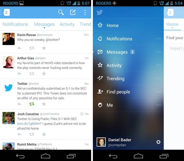
The fundamentals are the same with a blue, grey and white colour scheme and flat design, but Twitter for Android now includes a sliding left navigation panel for easy access to various sections. The new version does away with the standard four-icon look below the action bar in favour of a sliding list of lettered sections. It seems a bit redundant, to be honest, but it works quite well.
Twitter now displays supported images, such as those from its own service as well as a few third-party versions, in-line, negating the need to tap on a link to preview it.
At the top left of the app, where one activates the slide-out menu, an indicator displays the number of unread notifications from both mentions and direct messages. Twitter has also separated the tab formerly known as Discovery into two: Activity and Trending. The former shows what’s going on with those you follow — who they’re retweeting, favoriting, etc. — while the latter displays trending topics and hashtags.
Finally, it looks like the Thin Blue Line, that indicator linking conversations non-chronologically, is here to stay.
If you haven’t yet joined Twitter’s Android beta program, you can do so on Google Groups.
MobileSyrup may earn a commission from purchases made via our links, which helps fund the journalism we provide free on our website. These links do not influence our editorial content. Support us here.
