Google recently updated its Material Design guidelines to include a specification for using condensed sidebars, which the dubbed ‘navigation rails.’
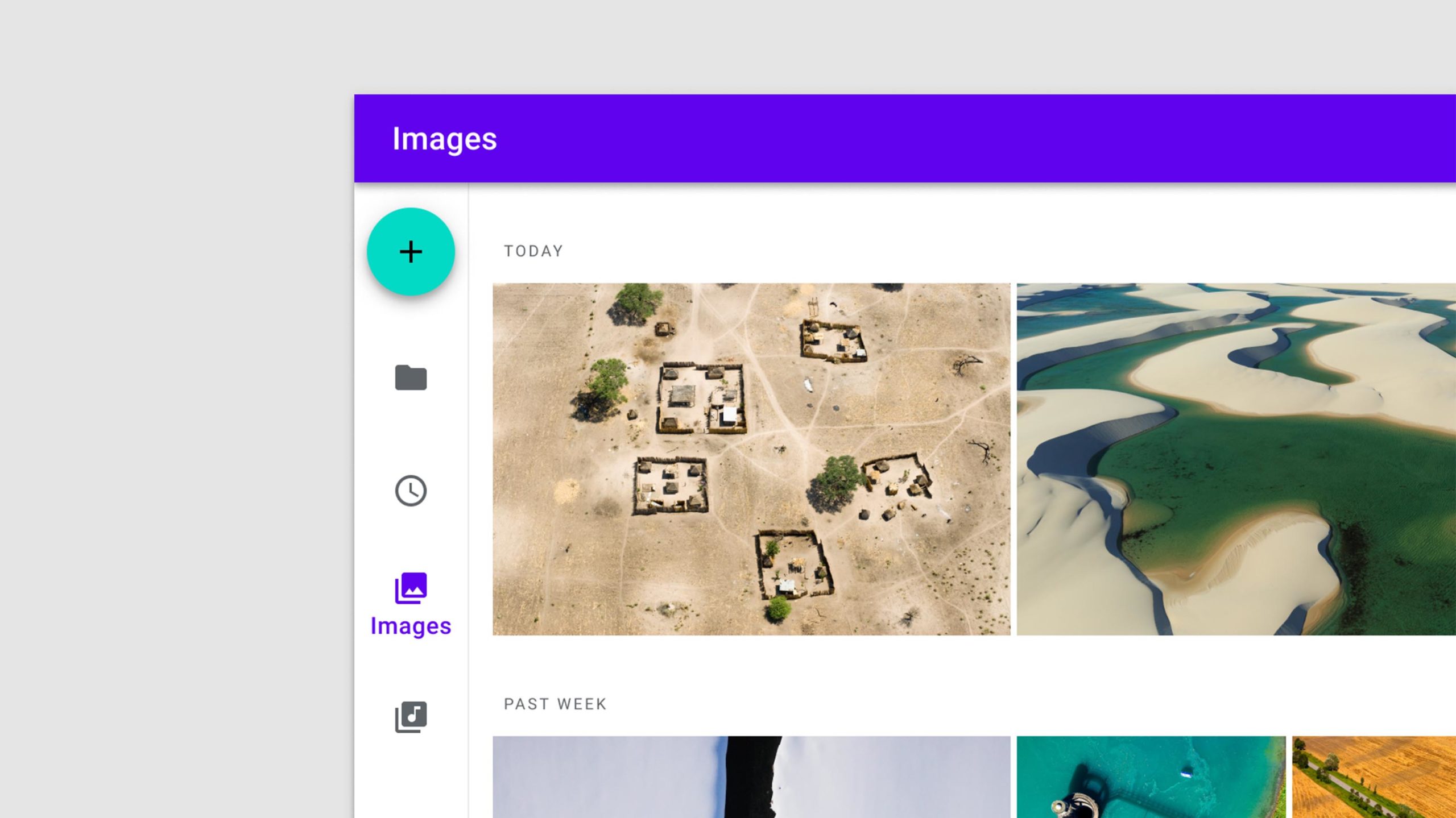
If you use some of Google’s most popular services, such as YouTube, Gmail or Photos, you’ve likely already encountered a navigation rail in some form. YouTube is probably the best example, which includes a sidebar with quick access to things like ‘Home,’ ‘Trending,’ ‘Library’ and a list of subscriptions.
If you click the three-line ‘hamburger’ menu button in the top left corner of the YouTube website, the sidebar collapses and shows just the icons and title of the Home, Trending, Subscriptions and Library sections.
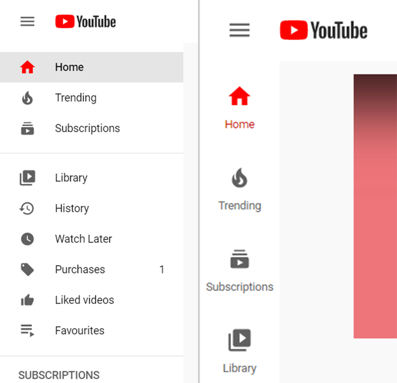
It works similarly to the bottom navigation bar found in several Android and iOS apps, letting users quickly access different sections of the site. However, instead of running along the bottom of the web page, the navigation rail is pinned to the left side of the screen. Photos and YouTube both seem to use navigation rails correctly, based on the spec provided by the new guideline. However, there’s a lot of variation across Google’s services that employ the navigation rail.
Android Police points out that Gmail is one of the most egregious, which doesn’t include descriptions with the icons in its navigation rail. The icons themselves can be quite vague, making the whole difficult to navigate unless users expand it to full size.
Navigation rails serve as a transition point between small- and large-screened devices
The main goal behind navigation rails appears to be filling a gap between small-screen devices like phones and large-screen devices like laptops. Smartphone apps, for example, typically sport a bottom navigation bar with quick access to different areas of an app or site along with a ‘hamburger’ menu with more options. Laptops, on the other hand, have the full menu present and available at all times and no navigation bar.
Navigation rails fit between and could be useful on medium-screened devices like tablets. The guideline includes an animated image showing the transition of an app between screen sizes and how the navigation rail can fill space and provide users with easy access to menu items. Since Google seems to be pushing 2-in-1 Chrome OS devices as its new tablet platform of choice, apps designed to work on both Android and Chrome OS could benefit from the new navigation rail style.
Hopefully, Google begins rolling it out more consistently across its services. The search giant has been inconsistent with design principles in the past, which has lead to some jarring experiences for users moving between services offered by one company.
Source: Material Design guidelines Via: Android Police
MobileSyrup may earn a commission from purchases made via our links, which helps fund the journalism we provide free on our website. These links do not influence our editorial content. Support us here.
