Google Keep Notes for web received a fresh coat of paint following the redesign of the mobile app.
Like the app, there’s not much new outside of the redesign.
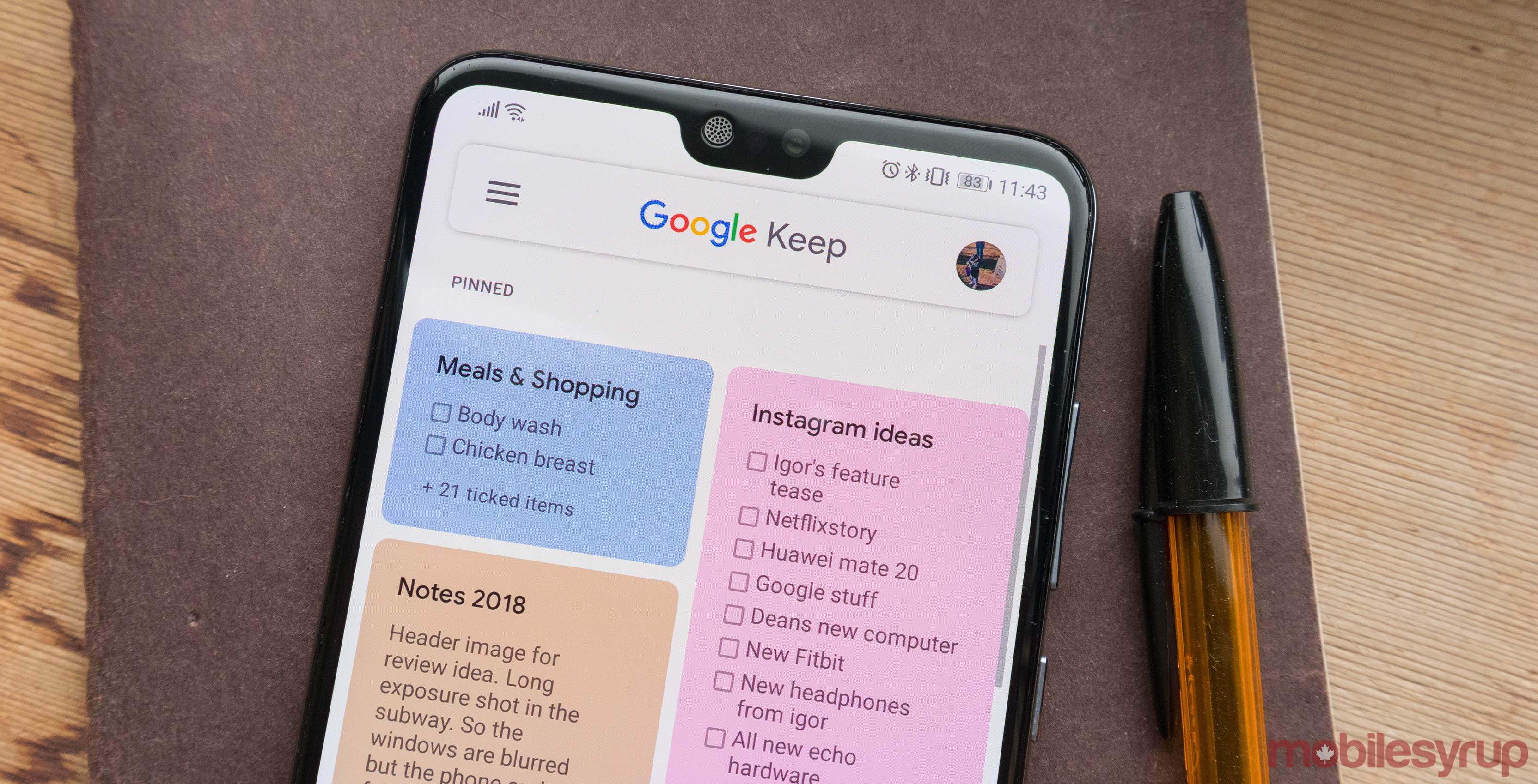
The new look ‘keeps’ with Google’s Material Design trend, eschewing the grey background and yellow header for an all-white look.
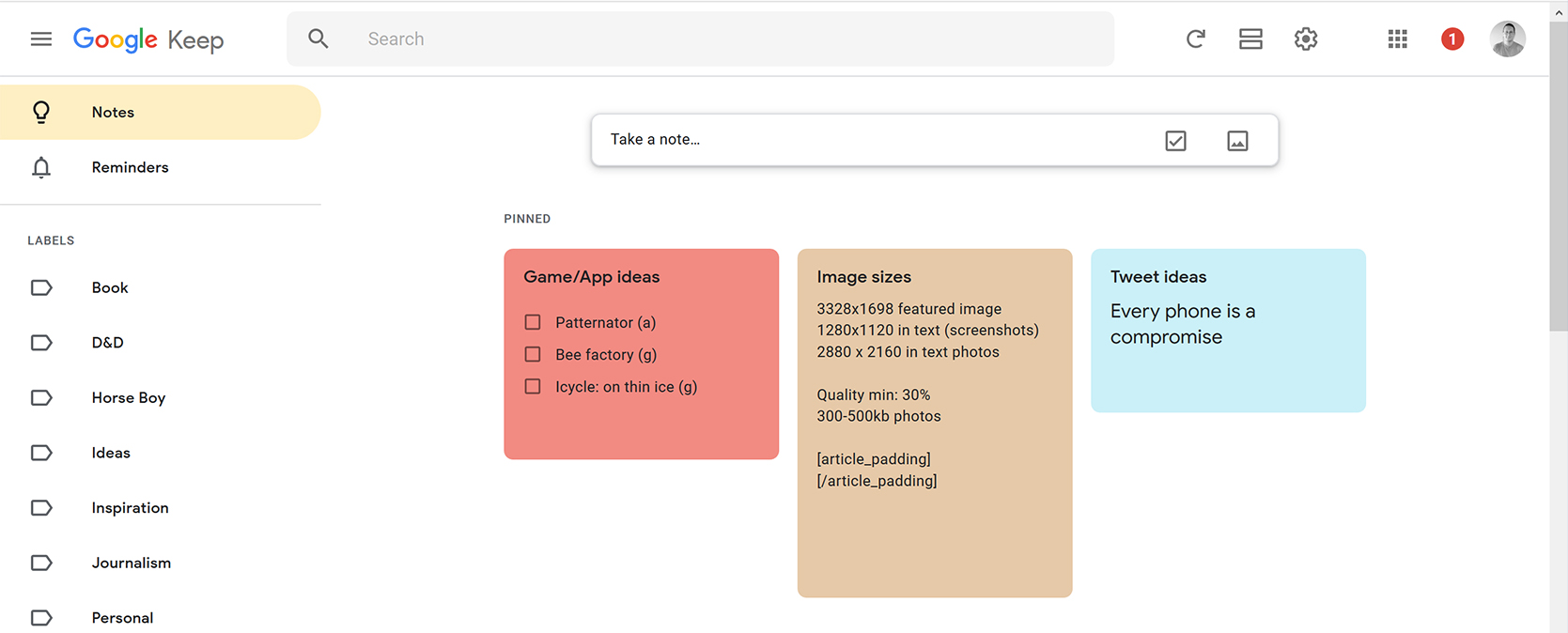
Additionally, Google has replaced the icons throughout with new hollow versions and rounded all the corners.
Google used its custom font for all the headers, while the body text is still Roboto.
The side menu has a new yellow bar that highlights which section you’re currently viewing. Finally, opening a note presents the same view, but again the corners are rounded.
While not everyone is a fan of the all-white look, I think it looks quite sharp. In an app like Keep Notes, which lets users pick several colours for their notes, the white background makes the note colours pop.
As usual, it’s a server-side rollout, so if you don’t have it yet don’t fear. You’ll likely see the change shortly.
Source: Android Police
MobileSyrup may earn a commission from purchases made via our links, which helps fund the journalism we provide free on our website. These links do not influence our editorial content. Support us here.
