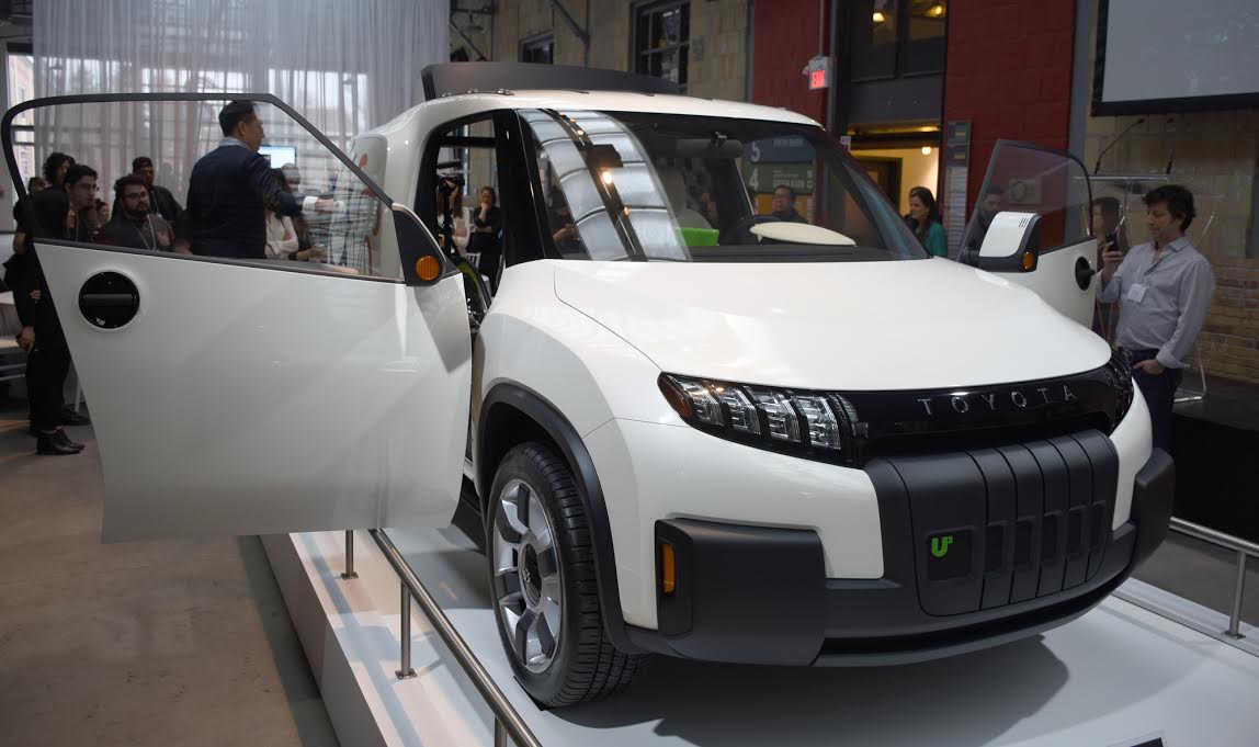
Toyota showed off a concept car in Toronto today that won’t be heading to an assembly line anytime soon, yet tackles the notion of a vehicle that is highly modular and flexible to a driver’s needs.
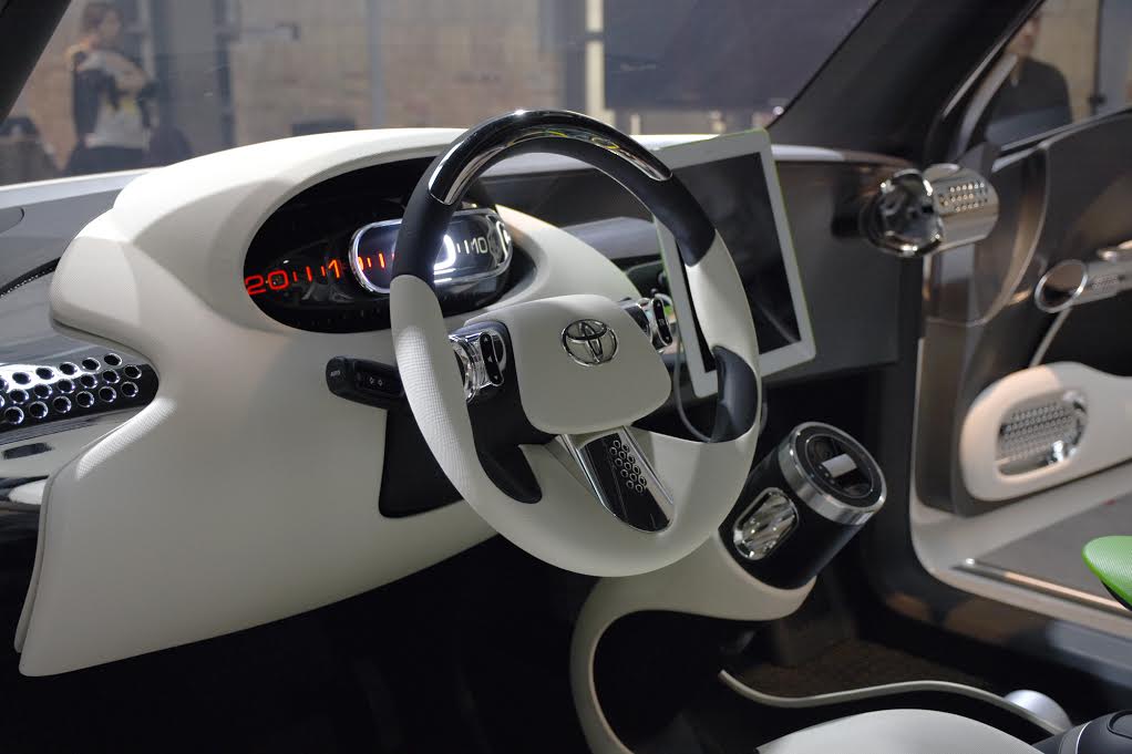
This also includes the dashboard, though it became clear early on that its designers cut a few corners because this isn’t, after all, a drivable vehicle yet.
Developed by Calty, Toyota’s North American design and research studio, the U2 (as in “U Squared”) is an “urban utility” vehicle making its global auto show debut in Toronto, showcasing some of the vision behind what a future urban living vehicle might look like.

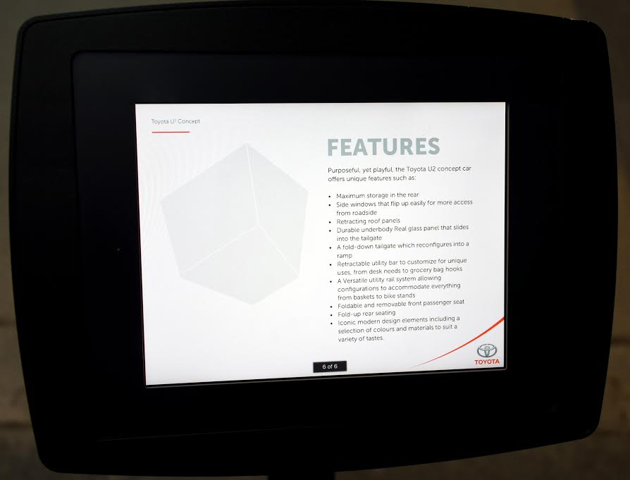
This includes retractable roof panels, a sliding rail system for hanging or latching objects, a rotary gear shift and removable seats. It almost looks like something that would come out of a Lego or toy box.
The car isn’t particularly attractive; after all, it presents ideas more than anything else. Case in point with the onboard technology. An iPad was mounted to act as the infotainment screen, though it’s highly improbable Toyota would ever do something like that for real without being able to lock down certain features. Watching YouTube videos while cruising the streets of any major city doesn’t exactly abide by distracted driving laws.
Except compliance wasn’t really the point here. The underlying takeaway with the U2 is that it addresses Toyota’s (and the wider industry’s) problem in managing shifting trends and advancements in technology. No one has really attempted a fully modular infotainment system, but the U2 at least shows what one could look like, where a 4th-gen iPad or Nexus 9 could be the main input for whatever features would be offered.
The iPad did nothing during the unveiling, and the U2 was blocked off from anyone entering, so it wasn’t easy to get a sense of how such a setup might feel in a tactile sense.

Indeed, the car didn’t really have a functioning infotainment system to speak of. Heck, it barely had a dashboard. The passenger side dash looked like a condensed version of the entrance to a public transit bus. Open and somewhat cavernous, plenty of legroom and lacking bells and whistles.
Instead, it was a sliding rail that joined the middle of the dash to the end on the passenger side, allowing for almost anything to be hung or latched to it. From a utilitarian perspective, it’s a basic design tweak that makes a lot of sense, at least for a vehicle that is a cross between a mini-SUV and mini-coupe. I could see a production version of the U2 being a roving delivery car, or a road trip with half a person’s life taking up all the empty space in the back.
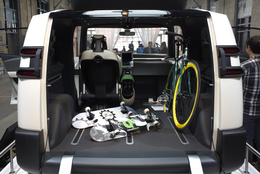
The seats in the back, which were not installed for this showcase, collapse and flip up to the side towards the windows, not forward or backward, opening up the entire height and width of the back. The idea is that the U2 could come with one, two or four seats, depending on the configuration. With only one seat in this one, a bicycle, skateboards and other items were laid out to show that space isn’t entirely at a premium, despite the relatively small body.

The utility and modularity are at the expense of comfort. I didn’t get to sit in it, and there was only one seat, but spokespeople on hand admitted that this vehicle had nothing to do with luxury. It wasn’t even clear what kind of audio system it would have, given the stripped down interior, though chromed speakers were evident on the doors and dash.
Toyota will be showing the U2 to the public at the Canadian International Auto Show taking place in Toronto from Feb. 12-21, alongside a number of other vehicles and the new technology rolling out in this year’s models.
MobileSyrup may earn a commission from purchases made via our links, which helps fund the journalism we provide free on our website. These links do not influence our editorial content. Support us here.


