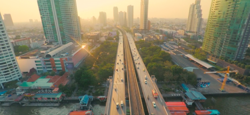
Uber has changed its brand to focus on its diverse operations, specifically moving away from the most recognizable black badge as being “everyone’s private driver” to focus on its enormous technology portfolio, and the cities in which it serves.
Uber is located in over 68 countries around the world, including many Canadian cities like Toronto, Ottawa, Edmonton, and Montreal. Now half a decade into its journey, CEO Travis Kalanick said Uber has changed its logo because it is “a fundamentally different company.” Gone is the badge and in its place is a new logo that “reflects where we’ve been, and where we’re headed… something timeless and inspiring.”
In a video, Uber explains that it is a bunch of “bits and atoms” where the bits is the technology that powers the ride-sharing service while the atoms are the people that use it on a daily basis.
A look 5 years in the making—see how our journey with you shaped who we are. https://t.co/Ff5e6x8XJvhttps://t.co/cWD59Wwm6U
— Uber (@Uber) February 2, 2016
“Most of don’t think about bits or atoms much, if ever. We think about how to get from here to there, the people in our lives, the millions of tiny droplets that play out across the world each day. The human stuff. Uber ultimately succeeds because we think about the human stuff first, but the way we do it… that’s our secret.”
[source] Uber [/source]
MobileSyrup may earn a commission from purchases made via our links, which helps fund the journalism we provide free on our website. These links do not influence our editorial content. Support us here.
