Four years and an Arrested Development revival later, Netflix is launching a new version of its website.
Built with mobile devices in mind, the website has been reworked to make it easier to navigate and discover new content, says the company. “We’ve created a richer, more visual experience, and a website that works more like an app and less like a series of linked web pages,” it writes on its blog.
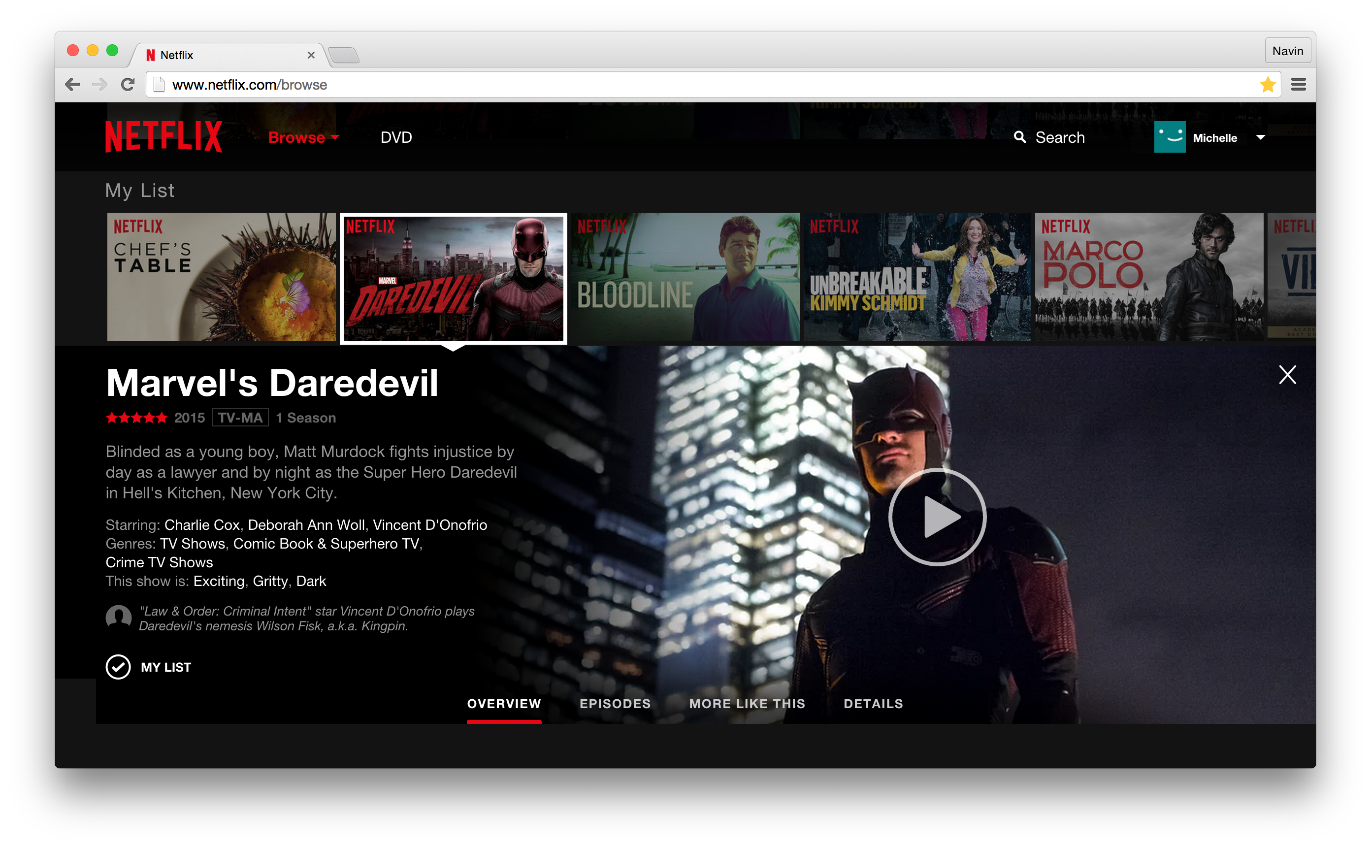
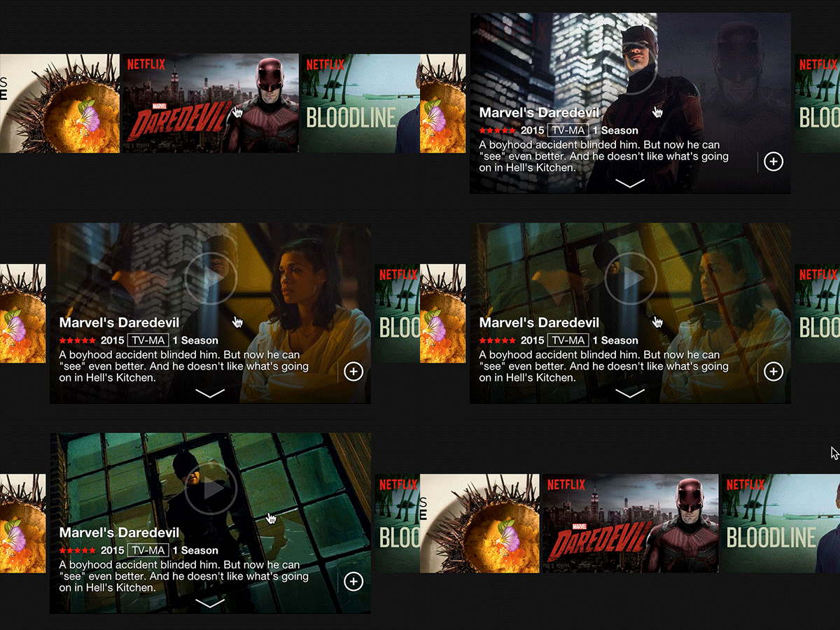
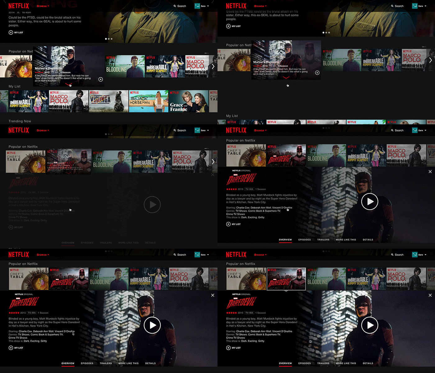
To accomplish this goal, Netflix ditched the “more info” pages that characterized the experiencing of trying to find out about a particular show or movie on its old website. Now, things like snow synopses and user reviews are all displayed inline when the user clicks on a thumbnail. Finding shows and movies that star the same actors is also done through this same interface.
Additionally, once clicked on, a thumbnail will display a slideshow of images from that particular show or movie. Netflix hopes these changes will make it easier to find new things to watch on the service.
Beyond the reworked thumbnails, the company says it has also made scrolling faster.

Any mobile browser that supports HTML5 will be able to visit and stream content from the new site, and the new website is supposed to be easy to navigate whether a mouse, trackpad or touch screen is used. For those that don’t want to, there’s no need to download the mobile app anymore.
The company says that the redesign is already in the process of rolling out and will be available to all subscribers within the next two weeks.
If you’ve had a chance to use the website, tell us what you think in the comments below.
[source]Netflix[/source]
MobileSyrup may earn a commission from purchases made via our links, which helps fund the journalism we provide free on our website. These links do not influence our editorial content. Support us here.


